You are viewing a single comment's thread from:
RE: Rock Paper Scissors - LOGO IDEA
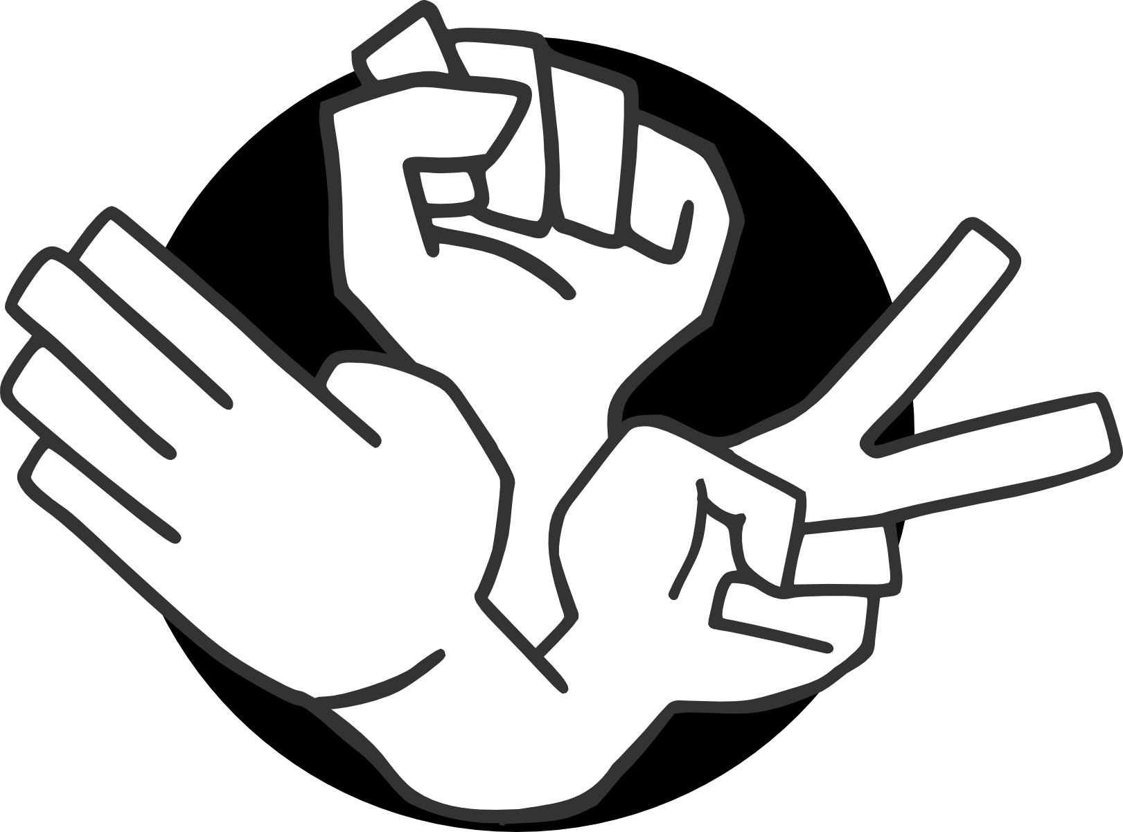
really good, probably the best entry so far. If you could somehow work out how to thicken the line up a bit without losing the clarity of the hand it's a classic. and maybe the winning shot !
Thanks again! I tried your suggestion of increasing the thickness and I think it looks good. If they choose my design I can give them options!
