10 Secrets Hidden Inside the Logos of Hollywood Film Studios
We’ve been familiar with these logos since we were kids, but few of us have ever thought about what they might signify.
DreamWorks Pictures
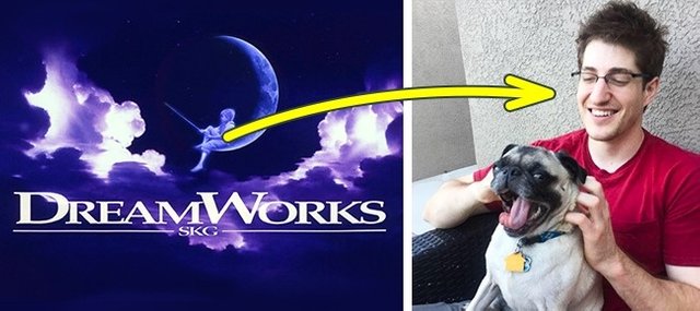
The logo for DreamWorks was originally meant to show a man sitting on the Moon fishing. The artist commissioned to draw it, Robert Hunt, decided to do an additional version with a child instead of a man. This was the one that was chosen in the end. Incidentally, Hunt based his image of the boy in the logo on his son, William, who became a composer and now works in the music industry.
Columbia Pictures
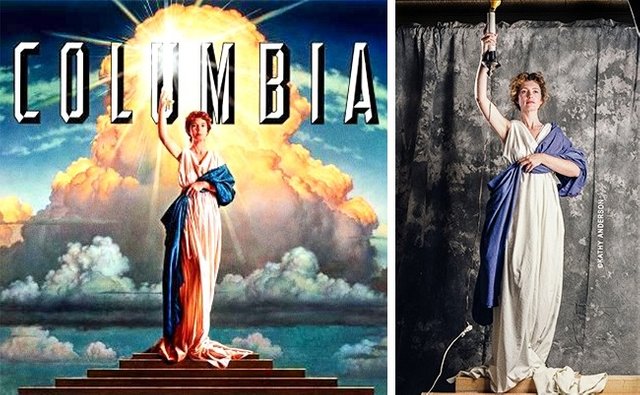
The woman holding a burning torch became the logo of Columbia Pictures in 1924. Interestingly, there was never a single model upon whom the image was based. Instead, it emerged from a combination of different ones. The most recent version, dating from 1992, is based on an image of an ordinary American housewife, Jennie Joseph, although her facial features were significantly altered for the final picture.
Metro-Goldwyn-Mayer
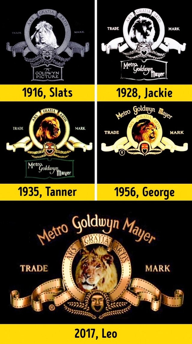
The idea for the MGM logo came from Howard Dietz in 1924. His alma mater — Columbia University — had a sports team called "The Lions.
"Since then, MGM has featured five different lions on its logo: Slats, Jackie, Tanner, George, and Leo. The last is their current star.
Paramount Pictures
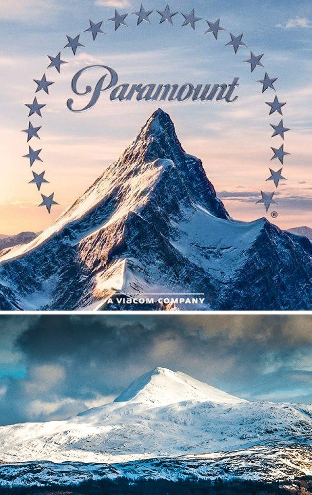
For the Paramount logo, the artist William Hodkinson drew a mountain very similar to Ben Lomond Mountain in Utah, where he grew up.
On the original version, made in 1914, there were 24 stars: this was the number of actors who had signed contracts with the studio. However, the modern version features only 22 stars, and no one knows why.
Warner Bros.
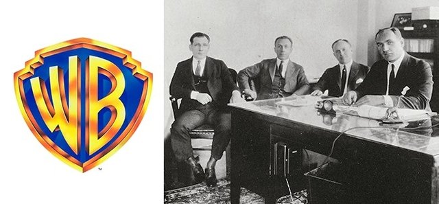
This logo seems quite straightforward: it looks like a shield with the initials of the company’s founders (the Warner brothers). However, there’s a degree of mendacity behind it, for this wasn’t their real last name. The parents of the movie studio’s owners were immigrants to America from the Russian Empire, and their real last name was Wonskolaser.
Walt Disney
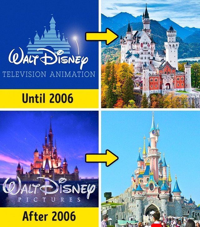
The logo of the world’s most famous animated movie studio has always depicted a fairy tale castle. Originally, the inspiration for this image was Neuschwanstein Castle in Germany. However, in 2006, it was replaced by Cinderella’s Castle from Disneyland Paris.
Pixar
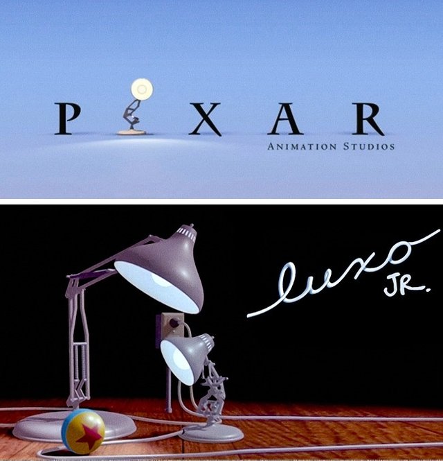
Pixar’s logo appeared as a result of the studio’s first successful movie. People liked “Luxo Jr.,“ an animated lamp from one of their short films made in 1986, so much it ended up replacing the letter ”i" in their name.
Castle Rock Entertainment
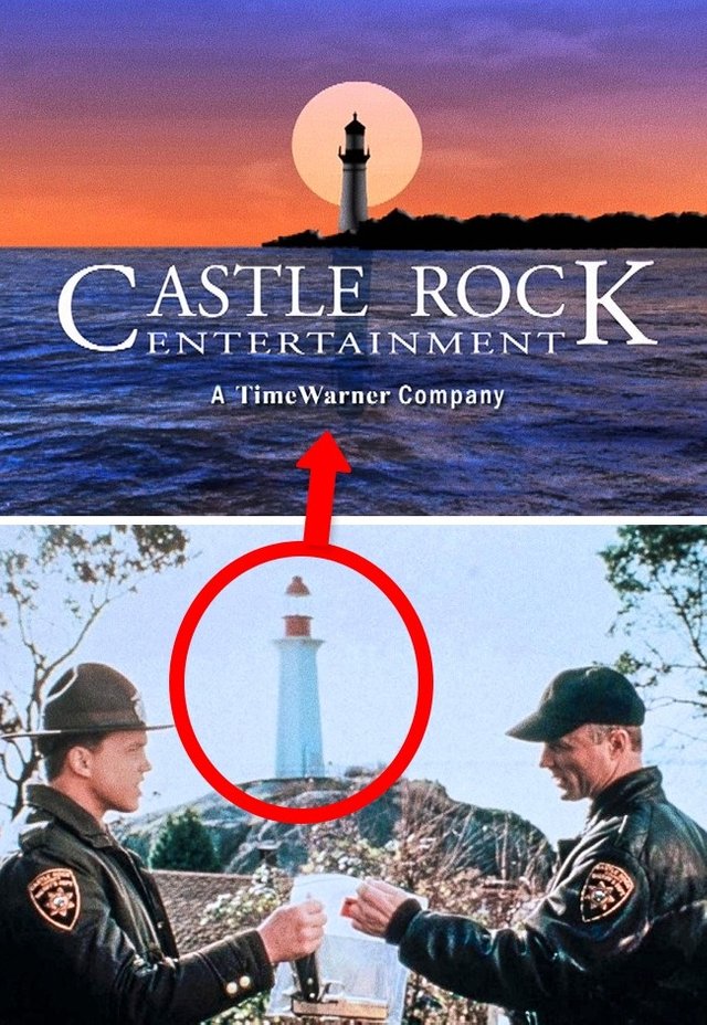
This movie studio has long since been taken over by Warner Bros., but originally (during the 1980s), Castle Rock Entertainment made film adaptations of Stephen King’s novels.The company got its name from the nonexistent town of Castle Rock that often features as the setting for King’s novels. Its logo shows the lighthouse from the 1993 horror movie based on King’s book of the same name, Needful Things.
Lionsgate
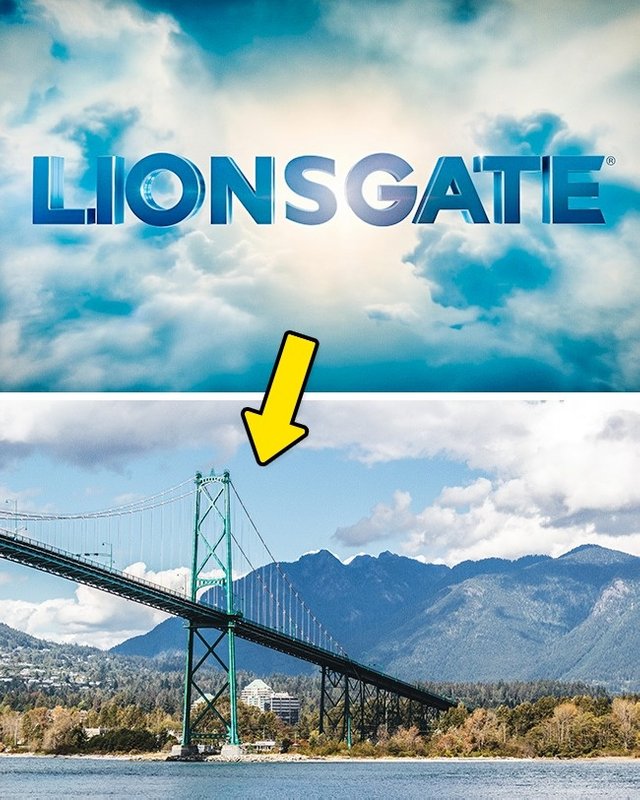
Lions Gate is a bridge in Vancouver — the place where the company’s founder, Robert Altman, was born. Unlike MGM, no lions were involved at any point in the studio’s history!
Scott Free
Director Ridley Scott has his own movie studio. Its logo is an animation showing a person turning into a bird. The impression is one of an individual attaining freedom. The artist who designed it — Italian illustrator Gianluigi Toccafondo — created it by drawing each individual movement and then photographing it.
Hi! I am a robot. I just upvoted you! I found similar content that readers might be interested in:
https://brightside.me/wonder-curiosities/10-secrets-hidden-inside-the-logos-of-hollywood-film-studios-342360/
keep going man, welcome to the comunity.
Nice work!