SEC | S20W3 | Data Analysis with Excel: (Charts, and data analysis techniques.)
I am very excited to join season 20 of the Steemit engagement challenge. I have studied the lesson shared by @josepha and @simonnwigwe and this is my entry to the assignment.
Designed with Canva
- Explain what you understand by Excel charts and discuss three (3) types of Excel charts that you know with clear screenshots.
We are now living in a data-driven world where data has become one of the most important aspects of our lives, and being able to understand and manipulate data today is a skill that everyone must have.
With the surge in the delivery of digital tools, there are now countless ways we can work with data to draw meaning out of it. Microsoft Excel is one of the widely used data analysis tools, and it has proven to be an excellent tool for that. One of the most outstanding features of Excel is the charts.
A chart is a graphical and meaningful form of data. Through charts, we can get meaning out of any data. Excel, as a data analysis software, uses the charts feature to represent data in a graphical and comprehensive manner.
Types of Excel Charts
There are several types of Excel charts, but for the context of this assignment, I will be discussing the three types below.
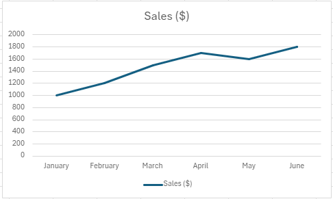
Line Charts: As the name implies, represent charts in the form of lines. The main purpose of this type of Excel chart is to show trends by connecting data points together to show ups and downs. Line charts have several use cases, and they are also widely used by traders to show the historical trend of prices of asset pairs.
Below is an example of a line chart that represents the trends of sales of a business in 6 months.
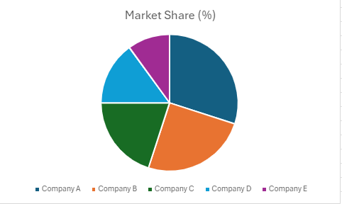
Pie Chart in Excel: This is another widely used type of Excel chart. It was used to show the proportionality of a series of data to the total sum of data. As the name implies, they look like pie. This type of chart can be used to showcase the performance of a series of data, and it is widely used in the business world and media outlets. For instance, election results can be represented in a pie chart showing each performance and its proportion to the total number of voters.
Below is an example of a pie chart that represents the market shares of 5 companies.
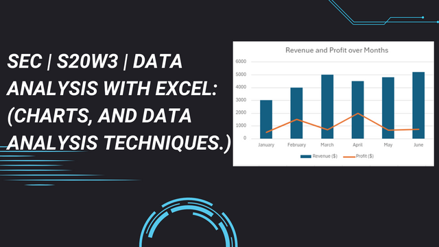
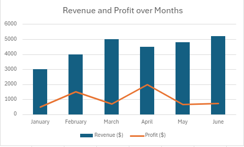
Combo Charts: This is a powerful type of chart in Excel that gives Excel the capability to combine multiple chart types to make data more understandable. This type of chart helps to draw meaning out of very complex data that varies across data series extensively.
Below is an example of a combo chart that shows a company's revenue and profits over a period of six months.
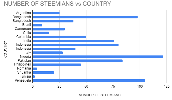
- Verify that you can read the information regarding chart location and creation in Excel and interpret it correctly using Bar Charts based on the data given below.
| Country | Steemians |
|---|---|
| Nigeria | 122 |
| Venezuela | 105 |
| Bangladesh | 98 |
| Pakistan | 84 |
| Indonesia | 80 |
| India | 76 |
| Columbia | 50 |
| Philippines | 45 |
| Indonesia | 40 |
| Bangladesh | 38 |
| Cameroon | 30 |
| Italy | 28 |
| Argentina | 25 |
| Sri Lanka | 20 |
| Chile | 15 |
| Brazil | 9 |
| Romania | 4 |
| Tunisia | 2 |
In order to work with the given data, these were the steps I took.
I copied and pasted the data into my Excel sheet.
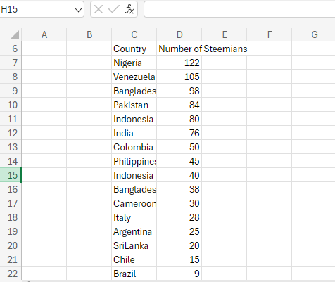
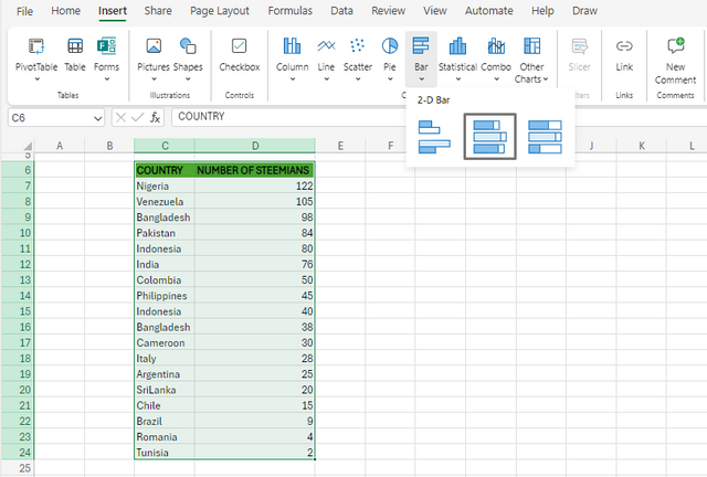
I selected the whole table and clicked on Insert Ribbon and selected bar charts.
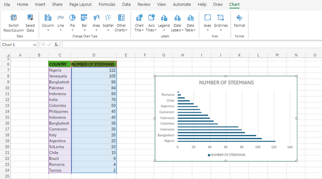
Below is the chart generated with the provided data.
- Briefly discuss Data Analysis Techniques In Excel and tell us how we can organize data in Excel for analysis.
Excel has a repository of very smart data analysis techniques that we can leverage to draw more meaning out of any form of data. Data analysis techniques are basically the tools and processes Excel offers to help transform data and make it more understandable or achieve our goals.
Descriptive statistics: primarily for drawing conclusions on quantitative data. Under this section, there are built-in Excel functions to help us achieve our analysis, and some of the built-in functions include mean(), medium, average, and more.
Sorting and filtering: This technique is applied to data so that we can be able to view a given set of data in a defined order. When we apply filtering to a data, it means we want to filter a given data out of the generalized. For instance, in working with data that contains Hive users and their countries, we can apply the Excel filter to view users from Nigeria only; we can further apply sorting to arrange the users according to their stem power.
Conditional formatting: We can use conditional formatting to know the trends and patterns of data. This technique can be used on different forms of data, and it is solely based on conditions. In conditional formatting, the changes we applied to the data apply only when the conditions are met.
For example, we can apply conditional formatting to a column of failed and passed cells by highlighting the cells with passed as green and failed cells as red.4. Pivot tables, data validation, and more.With all these techniques, we can analyze any form of data to make it more meaningful to anyone reading it.
When we are working with any form of data, the first thing to do is arrange the data accordingly in the form of rows and columns, and then, depending on the goal we want to achieve with the data, we can then apply the various techniques to achieve it.
- Using the data given in question 2, arrange the names of countries alphabetically using data sorting techniques. Screenshots are needed.
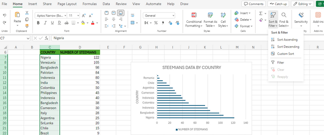
Sorting, as I explained in the previous section, is a powerful feature that helps us arrange data in Excel. Thanks to the excel sorting feature, I was able to arrange the countries from the data provided in question 2. Below is the process I took.
- I selected the column that contains the countries in my Excel table.
- In the home ribbon, I clicked on Sort and Filter in the top right corner and selected Sort Ascending.
 | |
 |
As seen below, data was sorted based on country names.
Below is the chart generated from the sorted data showing the number of Steemit users in all the countries provided.
In conclusion, this was indeed an engaging lesson, and I have learned a lot in Excel charts just by participating in this lesson. Excel charts are powerful too, which is easy to grasp, and this lesson has opened my eyes to very important concepts in charts, which made it sound easier than I thought it would be. I would like to use this opportunity to express my gratitude to the lesson teachers for this impactful lesson.
I would like to invite @gbenga, @nurdeen and @dk123 to this interesting lesson!
Thank you
NB: All images used in this post are screenshots from my pc