Canva - My First Impressions - Part 2 of 2
This is the second part of a two-part look into Canva to edit and create images if you haven’t read the first post please do so first.
The first thing I notice is that it presents you with a list of preset templates and impressively they appear to be at the proportions I previous entered (2560x320), its impressive because its a very unusual bespoke size and clearly, there is some AI at work here as they look well balanced and natural.
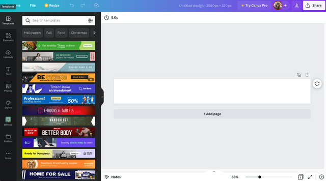
Scrolling down the list though they are clearly of the impression that this is for a banner, which makes sense long and thin is which is typical for a banner. However, for my use case, it's not what we need, although I did drag a few in to test them to make sure they actually were customisable and impressively every aspect of them from image to shape to text including fonts and sizes was editable.

Looking down the vertical column on the left of the page I can see there is a wide variety of presets to pick from other than templates, including images, text and clip art elements. Clipart is far from my favourite style but these were high quality and offer a decent selection to a user that would normally have to hunt the web for assets with no assurance of better quality or the rights to use them.
I also see I can upload my own assets which Is what I would expect and in combination with all the other presets offers the typical user and very robust infrastructure to create some more than average designs.
However, for my use case, I don't want to create a fancy layered graphic I just want to add a photo as steemit will already be overlaying content on top of this banner so what sort of options does it have for just image editing?
So for this test, I have uploaded my existing banner image set to 2048x512 as per the original instructions for the banner. I added it to the page but it seemed to make a very small version taking up the centre of the design and not filling most of it which would expect when adding a 2048x512 image into a 2560x320 space.

What it did allow me to scale my image proportionally by grabbing the corner boundary handles

Alternatively, I can clip the image by using the wide flatter handles in the middle of each edge to clip the viable area.

Finally, I can double-click the image to move the viewable part of the image around to make sure the part I want to see is in the centre of the viable area.

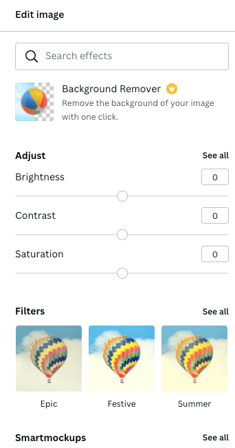
I also have the option to edit the image, crop it or flip it. If I choose edit I get a number of basic tools with which to adjust brightness, contrast and saturation or play with a few preset filters or auto tunings. There is a background remover too which is nice but that’s a premium feature.
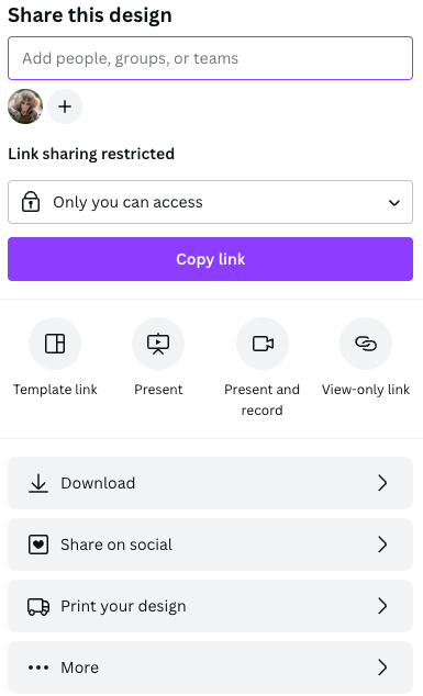
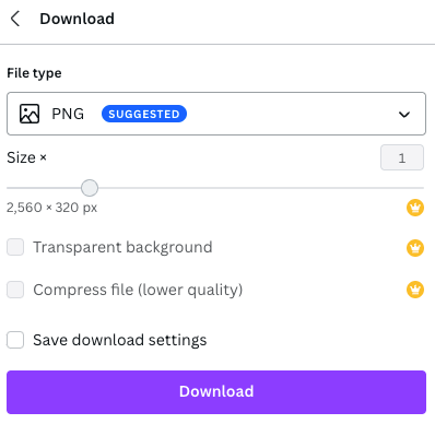
As this is a very minimal test for a simple image all I wanted here was to resize my image and see how it performed so once happy I need to save my design. This wasn’t so obvious but in order to do so I have to hit Share in the top right corner. This gave me more options than I would expect including collaboration, sharing on socials or printing the design or downloading the design, a long-winded way to get here in my opinion simple downloading should be a little more obvious in the interface if you ask me.
The Download options were also preset and a few features here were premium but that is to be expected in these freemium services and the options did cover a wide number of applications, including jpg, png, animated gif, or video which isn’t a bad array.
Summary
Whilst I had my doubts going into this I have to say I was pleasantly surprised, what is on offer is a very rich environment to create some very attractive assets with enough material available to create very visually different end products over multiple usages.
What it isn’t is a photo editor, the ability to adjust images is very limiting and I would certainly look at another product for that particular functionality, but if your source files are good to begin with, then, what this does do well at is combining assets together to make complex and appealing final products.
The payment wall only seemed close at two points during my experience. The first is if I wanted to resize the design, not a big issue if you know your dimensions going in but also I can see a case where you may want to create multiple-sized versions of the same design for different social media platforms etc and this would mean you had to create the same file at the new size each time, which is inconvenient.
The second is when I tried to share/download my design where creating retina based version of the file, transparent backgrounds or file compression all were premium features. Overall this is understandable if a little annoying but this is a business model and providing a service as well-rounded as this isn’t cheap so if you're a regular user then maybe dipping into paying a little every now and then may not be a bad thing.
Conclusion
Overall a decent service and I can see why it was one of the only products that got more than a couple of recommendations.
So would I use it in my own work? Sadly not this is a very superficial service and I am clearly not the intended audience however I would not be opposed to pointing one of my clients in its direction if they wanted to create their own assets without the expense of hiring a professional designer.
SteemWOW
If you would like to show your appreciation please support the @steemwow team and vote for our steemwow witness, you can do this by heading over to the Steemit Wallet Witness list, and scroll to the form at the bottom of the page. Just type steemwow into the box and hit vote as illustrated below.

Agree that it would frustrate an experienced designer, but be very useful for indecisive clients!