Website Accessibility: WAVE Web Accessibility Evaluation Tool, Part 1

This is the first part of a sub series exploring the WAVE Web Accessibility Evaluation Tool, this post was originally intended to be a single post but ended up so long that I have had to break it up into three posts in order to keep it manageable and easier to digest.
In this second part of the overall web accessibility series I wanted to discuss an invaluable accessibility development tool, whilst accessibility is our goal, without a way to test our work it can be difficult to measure success. The tool I rely on almost daily and has become an essential part of all my projects is the WAVE Web Accessibility Evaluation Tool made by the very clever folks over at the WebAIM project at Utah State University.
This tool sometimes feels like cheating it's so good and there are two ways in which you can use it absolutely FREE. The first is to head over to their website and enter the url of the page you would like to test at the top of the page. The second is to install it into your browser as an extension available for Chrome, Firefox and Edge free from their extensions page or through the browser specific extension marketplace.
I personally prefer the browser extension is I do a lot of local development which obviously I cannot check via the online method, I also like that I don't need to leave the page I want to test, I can toggle the tool on and off without leaving the page. Also, I occasionally find that the online version doesn’t always render properly and shows a page without any styles at all but this is rare and usually fine if I check back later.
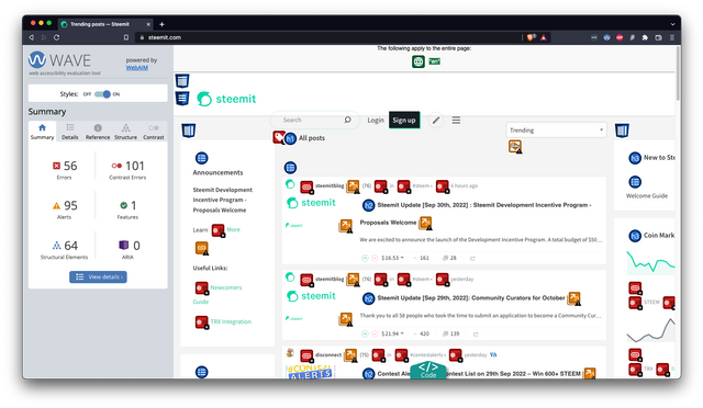
Now that we have our new tool to hand let's run our first test, unfortunately, my current client I intended to use for this series hasn’t launched their site yet so I am not at liberty to use them as an example so what better alternative is there than to use our beloved steemit homepage as our test case. And this is what we get.

The Summary Tab
Oh no that’s not looking too good, 56 Errors, 101 Contrast Errors and 95 Alerts, eek if only some clever developers could look into possible solutions :). But don't worry it may not be as bad as it looks, once we delve a little deeper we can see our tool is showing us each instance of every issue. This means if we start to look at the cause of each problem we should be able to make a huge impact with only a few minor tweaks, and that is usually what I find with accessibility, once you know the parts that are causing it to fail you can change the way you think about your projects and eliminate a lot of accessibility issues just by adopting a more enlightening development process.
As you can see the left hand summary panel is broken up into 6 sections, Errors, Contrast Errors, Alerts, Features, Structural Elements and ARIA. These do not directly match our four WCAG 2.1 principles of website accessibility Perceivable, Operable, Understandable and Robust, instead, it is giving us a hit list of issues that need to be addressed as well as an easy way to see our page in ways that other assistive technology may without the decoration on the page.
The Summary page speaks largely for itself, it gives us a quick snapshot of how the page is doing overall, the less red and yellow we see here the better, but once we see our quick appraisal we can jump over to the ‘Details’ tab to see the specifics more on that later.
The Preview Plane

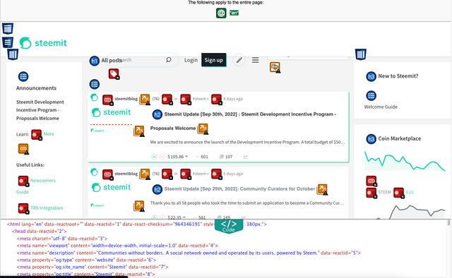
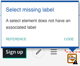
This is the part of the evaluation which shows us a snapshot of our page but with the parts the evaluation highlighted as needing our attention along with the appraisal criteria inserted into the view. If we click on any of the icons a tooltip modal appears.

From here we can either see the code for that particular item or display the context appropriate reference link opening in the reference tab to present us with more information we will cover the reference tab in a little more detail later.

The code view is a collapsable panel at the bottom of the page we can toggle to show or hide the underlining HTML, its a simple ‘see source code’ function that most developers would normally use directly within our browser, nothing complex here but can be a very useful tool when we come to trying to resolve our issues list.
Up next
Next, we will break up the items present via the summary page into their component parts and work our way through the details tab and look at the specifics and the issue it has highlighted.
Website accessibility series so far
- Website Accessibility: Series Introduction
- Website Accessibility: WAVE Web Accessibility Evaluation Tool, Part 1
- Website Accessibility: WAVE Web Accessibility Evaluation Tool, Part 2
- Website Accessibility: WAVE Web Accessibility Evaluation Tool, Part 3
SteemWOW
I know a few people out there have come across me by the work me and my friend @rexthetech have been doing as @steemwow, whilst @rexthetech has so far been the spokesperson, we plan on being jointly a lot more visible over the coming months. If you haven’t already seen it please take a look at the Zero to Witness Series and if you like what you see we would love your support, which you can provide free by voting for our witness node.
To vote for us please go to the Steemit Wallet Witness list, and scroll to the form at the bottom of the page, type steemwow into the box and hit vote.

@tipu curate
;) Holisss...
--
This is a manual curation from the @tipU Curation Project.
Upvoted 👌 (Mana: 7/8) Get profit votes with @tipU :)
-- If only indeed! 😄 Great work so far.