Website Accessibility: WAVE Web Accessibility Evaluation Tool, Part 2
This is the second part of the exploration into the WAVE Web Accessibility Evaluation Tool, in part one we introduced the WAVE Web Accessibility Evaluation Tool product and ran it over the steemit website and began to look at its summary assessment panel, preview plane and code view, in this second part we will take a look at the most important part of the tool, the contents of the details tab.
The Details Tab
On this tab, we are presented with a breakdown of each of the 6 sections covered by the Summary view. The points are listed vertically and broken down into groups with associated subheadings and an icon for each instance. This icon is interactive so we can use it to highlight the specific issue in our preview plane and scrolls us to the part of the page where the instance occurs.
Whilst this series isn’t going to deal with fixing the issues the good news is the nature of modern web development is to use common files be that an external style sheet or in the case of steemit reusable react components which means if we fix the issue in either of these places we can affect multiple instances of the issue with only one or a few changes.
The Errors
So upon further investigation, we have 4 separate issues and 56 total instances of them.
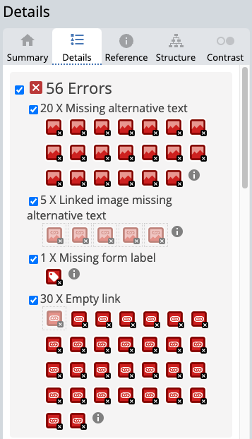
- 20x Missing Alternative text
- 5 x Linked images missing alternative text
- 1x Missing form label
- 30 x empty links
So these issues are mostly related to user-generated content, the author of a post should add markdown to add alternative text to an image, when we add an image we do actually auto generate the alt text so that’s some good news but by default, it's just the file name and I suspect most users don't know that they should change it or even what it is. I know I didn’t when I first started using it. In this case, however, images do have alt text on the actual post even if bad ones so the issue here is that the template for a post summary doesn’t include it and that’s a lot of images per page that are going to fail. If you're interested though this markdown guide shows you how it is done correctly.
Regarding missing form labels, the purpose of a form label is to provide assertive technology such as a screen reader a visible description and often a larger click/focus target to navigate through to the associated form field.
Empty Links, when a link contains no text the purpose of the link is not always clear to the user, whilst a typical user may see the relationship of the link to its destination an assistive technology may not, therefore all links should have at least some meaningful content to indicate purpose.
The Contrast Errors
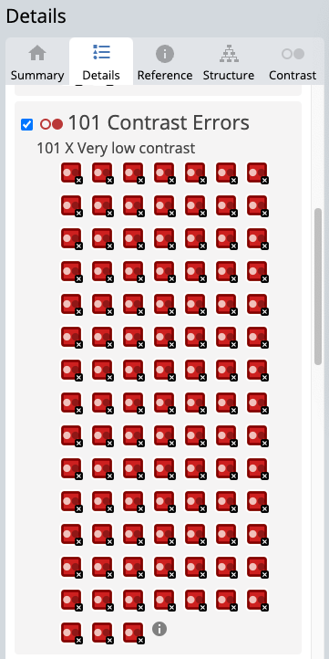
101 Instances of colour that don't offer enough contrast, this is usually the most common type of error I encounter and as we can see by these results often the most prolific. Most of these issues come down to two types of items, first is that unfortunately, the steem green used in the logo and all links are a mid-tone colour on a white background. That will not provide the 4.5:1 contrast ratio needed to pass. The second is the smaller dark grey text, whilst at a larger font size, this offers enough contrast the smaller the text gets the weaker the overall colour becomes, antialiasing smooths the edges graduating the dark out to white to make smoother softer text, unfortunately, this process also lowers our contrast ratio and ultimately causes the text to eventually fail to meet the assessment criteria.
The Alerts
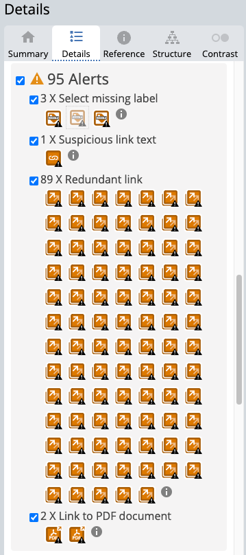
Whilst these aren't always a hard fail like the previous issues they do require a human touch to make sure they are compliant.
- 3x Select missing label
- 1x Suspicious link text
- 89x Redundant links
- 2x Link to PDF document
Similar to Form labels above a select field requires a label for exactly the same reason, the reason it is here, however, is that select fields are often used for other content than form submission which is why it is not bundled in with the above.
Suspicious links aren’t as bad as they sound, they aren't referring to a link with malicious intent but rather to the link text inside the hyperlink. Whilst previously we touched on the importance of not having empty links it is also true that the text we use also needs to show intent or indicate destination, a suspicious link is a link that contains neither. You will be aware of this sort of failure across the interweb, the most common example of a suspicious link is the 'click here' or 'more' link phrase which when viewed in isolation offers the user no valuable information.
Redundant links are adjacent links to the same location, in this case, all links that will take you to the actual post. Why have 5 links next to each other all going to the same place if only one will do the job? A screen reading will read out the hyperlink and its link text for every link on the page you can make the page work much better by only having it do that once.
Links to PDFs may seem odd as an alert, all that is happening here is PDFs can be accessible but often are not unless the author of the PDF makes it so, this is used to help encourage authors to make sure supplemental material is also accessible and if not, then to try to source accessible alternatives.
Features
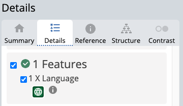
This one is green so it looks on the surface of it that it may be a pass, unfortunately, it is not. I can see from this item that the overall page is identified as being English, however, it's easy to see looking down our list of posts that clearly not all posts are English. From an accessibility point of view, we are actually taking none English text and telling the assistive technology that it is English and that it should use its English settings to interpret the content of the post. Actually misidentifying the language can often be worse than no language declaration at all as some technologies can assess the post and extrapolate the unidentified languages in order to predict the best fit. However, both options will fail accessibility testing.
Structures
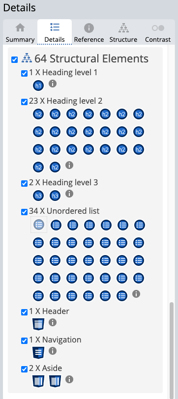
This section gives you the same icon approach and utility as above but isn’t telling you if it's good or bad it's just showing you an overview of your structure. This isn’t the most useful part when assessing the overall site structure, instead, the Structure tab can give better insight but we will be covering that in our next post.
ARIA

In this use case, we have no ARIA, which may mean you assume that this is good, but unfortunately, the absence of ARIA markup is in itself a bad thing. A quick summary of ARIA is described by mdn web docs as
Accessible Rich Internet Applications (ARIA) is a set of roles and attributes that define ways to make web content and web applications (especially those developed with JavaScript) more accessible to people with disabilities.
It supplements HTML so that interactions and widgets commonly used in applications can be passed to assistive technologies when there is not otherwise a mechanism. For example, ARIA enables accessible JavaScript widgets, form hints and error messages, live content updates, and more.
But I would strongly suggest reading their introduction article for more information.
Up next
Next, we will wrap up the series by working our way through the rest of the features of the tool so we can round out the gaps in our knowledge.
Website Accessibility Series
- Website Accessibility: Series Introduction
- Website Accessibility: WAVE Web Accessibility Evaluation Tool, Part 1
- Website Accessibility: WAVE Web Accessibility Evaluation Tool, Part 2
- Website Accessibility: WAVE Web Accessibility Evaluation Tool, Part 3
SteemWOW
If you like the series so far and would like to show your appreciation please support the @steemwow team and vote for our steemwow witness, you can do this by heading over to the Steemit Wallet Witness list, and scroll to the form at the bottom of the page. Just type steemwow into the box and hit vote as illustrated below.
