[Steemit-Feature] Suggested changes to TopRightMenu
OK, I finally got my local development up and running and am going to be able to suggest some features and visual tweaks.
Other than documentation, the first real fix I submitted was to add the username to the title of your profile page. Thanks to everyone on Github that helped with discussion on documentation fixes so I could get up and running, including @witness.svk @jesta @teego
(is there a mapping of Github usernames to Steemit? Might be useful? Wow I have a lot of bracketed side comments in this post)
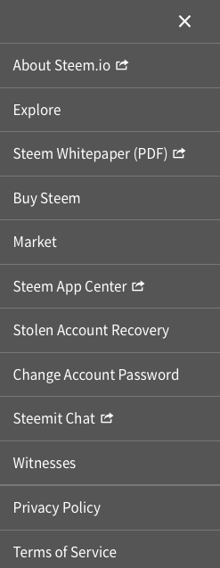
TopRightMenu is the grey menu that slides out at the right from the hamburger icon next to the user avatar silhouette. You'll notice Steemit Chat has a little arrow icon next to it, because it's the only one that opens in a new tab. However, there are a bunch of other items in the menu that are actually "external" links like Steemit Chat as well.
I put together a version where all the non-steemit-com links include the external link icon, as well as added the (PDF) note to the Whitepaper to indicate that's what you're opening.

Another thing that would be good would be tooltips when you hover over the links, explaining what the link is -- especially for the external links. If people leave suggested descriptions for the links, I can add those to the code as well.
Have other comments? Think the menu items should be in a different order? Like, should all the "external" links actually be grouped together at the bottom of the menu? Let's discuss in the comments.
(I'm not actually a fan of the TopRightMenu at all, especially right next to the user login menu that also drops down, but I don't have another suggested replacement right now)
Note: I'm just suggesting changes: It's up to the developers who own the code whether or not they accept it into the "main" version running here at Steemit.com. Interestingly enough, since we're all working with open source code and the same Steem blockchain, you can even run your own web interface locally!I've noticed that some end users are using the Github issues queue for all sorts of things, including pleas to feature postings and so on. I think it would be best if we use steem itself for those sorts of discussions. Github is best for actual bugs and technical discussions on implementation. If it's crowded with random, not well fleshed features and pleading, it gets very hard to actually move the code forward.
This is a #steemit-feature request / proposal.
It's currently titled: Suggested changes to TopRightMenu. Use #feature-toprightmenu to talk / post about it.
It's also tagged as: none