Steemit UI Improvements: Show Me (The Color Of) The Money :)
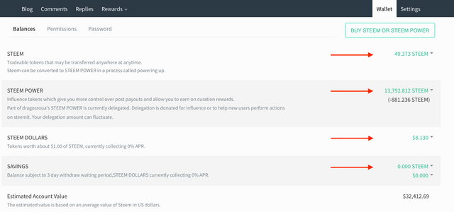
I woke up this Saturday with this greenery all over my wallet on Steemit.com:

The color of the money in the wallet changed to main Steemit accent color, this Medium-esque green, which, at times, might be a bit too much (at least for me). I'm neutral to positive towards this change, although it may be challenging for those who are not very fond of this green (like me, for instance). But from a UX point of view, the change is positive, as it clearly separates semantically the value of the assets from other elements on the page.
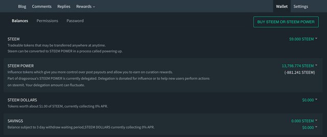
And, if I'll ever feel overwhelmed, there's always the night mode, which, to be honest, looks much better with this change:

All in all, good stuff to start the weekend.
I'm a serial entrepreneur, blogger and ultrarunner. You can find me mainly on my blog at Dragos Roua where I write about productivity, business, relationships and running. Here on Steemit you may stay updated by following me @dragosroua.

Wanna know when you're getting paid?

|
I know the feeling. That's why I created steem.supply, an easy to use and accurate tool for calculating your Steemit rewards |
Overall I don't like the changes. Hopefully the site will function better though.
yes off course lovely looking wallet with this green feature. and specially in night mode awesome look.
As for me i love the green.. seems like good luck to me lol. Dollar is Green
The look of that green feels good. Another reason to be refreshing my wallet....😁
I wish we saw more green on the market though - often seeing a sea of red!
Green is a color of peace, now we are in peace baby.
Let's hope that with this color of the money change soon the price will change as well...
O yeah, i did noticed it today, but i ignore it :/
rearranging the deck chairs.
I'm neutral in this one. For me the numbers are more important that the color :)