Dear Steemit Diary: The one where I win | Day 3 of 365 days of My Creative Journey | @Kawthar
Dear Steemit Diary,
Warning: This post features at least 5 winning discoveries that I made today. Read at your own risk.
Today's goal was to design Previous/Next post buttons for this Dear Steemit Diary series. Being that I'm still a newbie Steemian, I wasn't sure if such a thing was possible on this site. I figured if I design an image and then make it clickable then that would do the trick.. It took some tinkering, but I got it to work! A win!
Some Design Stuff:
First, I fired up photoshop to tinker around with some design ideas. I am not the type of graphic artist that is an expert at logos and banners and the like. I have so much failed experience with not getting those things to look right that I wasn't actually looking forward to this part. However, being that I totally don't have the ability to commission out this task, it was up to me to figure it out.
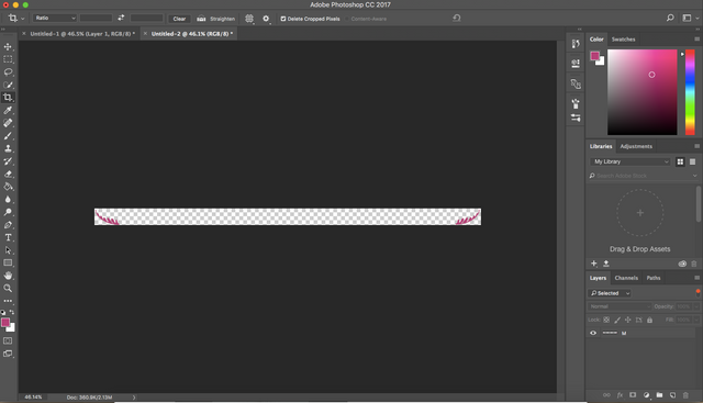
I browsed the different text options(and also downloaded a few new fonts) until I kinda got some that matched the idea in my head. The Bodoni Ornaments text is all characters, so I figured it would serve as a nice flourish aspect for my buttons. I knew that I wanted to space the buttons out at bottom corners of each post. So that is how I set up the flourishes as a test image.
Some Technical Stuff:

At first I couldn't figure out how to make image clickable. So I figured I had to just make a clickable link with the title "Yesterday" and revise my idea by making the flourishes an non-clickable accent image to the link.
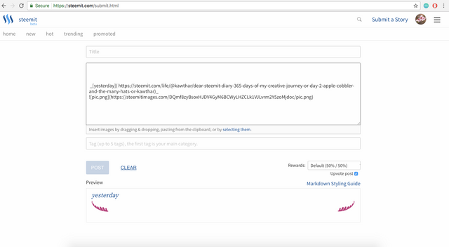
It looked O.K. ish. But it needed some more "oomph" if it was just going to be an accent picture. So, I added a second copy of the image above the link in the link thinking that I would sandwich the link between the 2 images. When I did that I inadverdently made the picture clickable!!! Victory. Was. Mine. (WIN!)
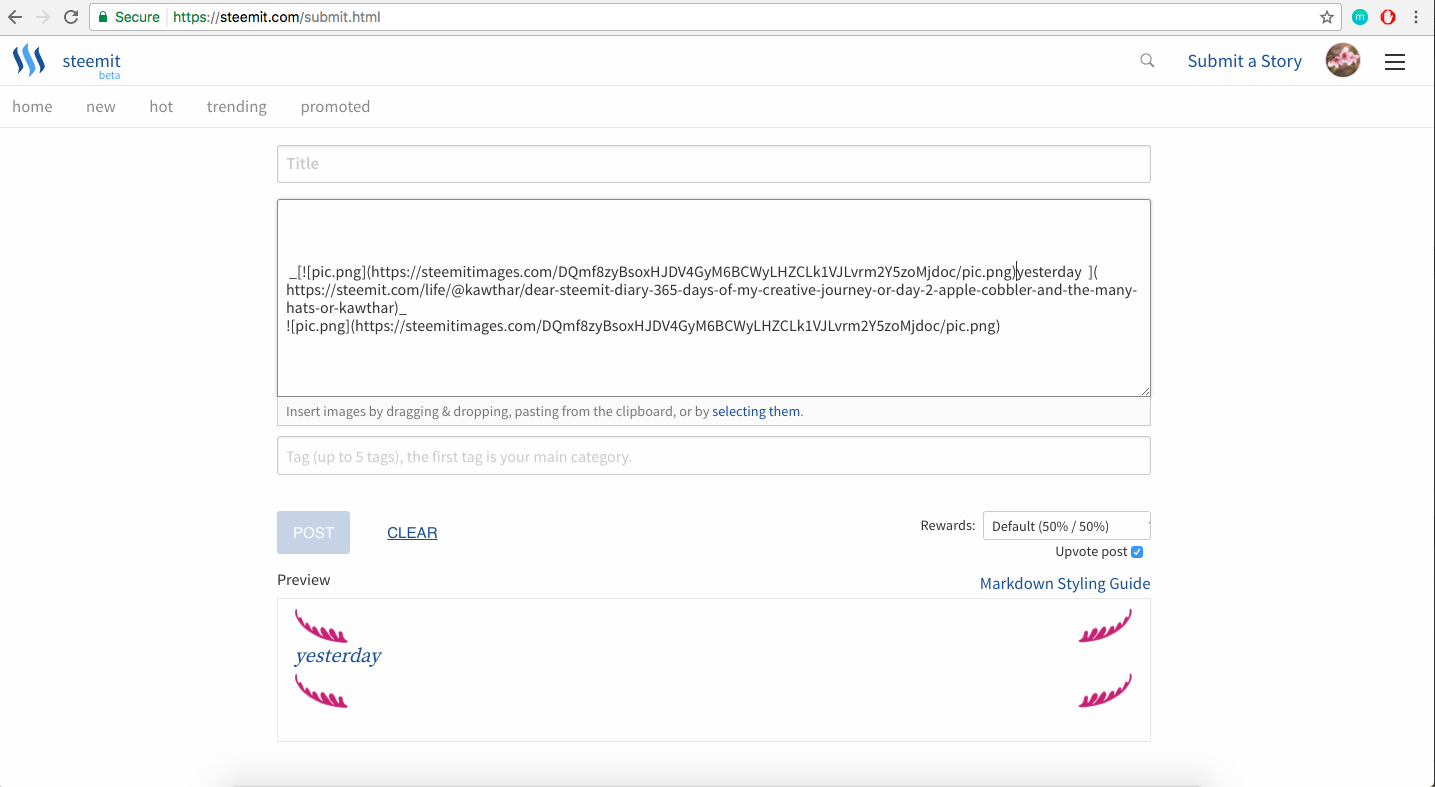
I was so excited!! I was then able to delete the separate link title text and just have the clickable image. This allowed me to go with my original idea of a completely custom link.
More Design Stuff:
I knew from the beginning that I wanted to do watercolor buttons. Because they're pretty. And cliche. And pretty. And I'm still new to branding design, so I'm just going with what I've seen that I thought looked cute. mmmkay?
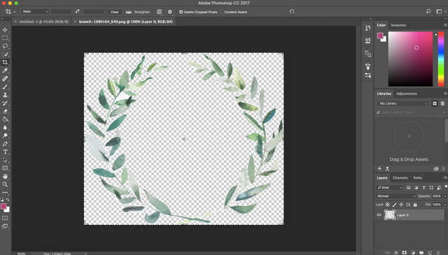
I found a tutorial on youtube that showed how to make text look like watercolor. That was my original plan, so I googled for royalty free water color stock images. I poked around on a site called pixabay until I found the image shown above. It was totally perfect and because it was already water colored and in the "flourishy" shape, I didn't have to use any text overlays. Which meant less work for me. W.I.N.
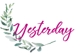
After a couple more hours, much trial and error, and research, I finally made 2 clickable images. Voila!!
WINNING
They are not perfectly scaled so I might revise them a little bit more before settling on them. But I am super happy with how they progressed. They captured the vision I had in my head so well.
If you have read this far, I hope you enjoyed this post. I'm creating a whole series dedicated to Steemit blog branding and layout design. If you're interested in that don't forget to follow me.
Until next time,
Peace,
Kawthar
P.S. Today is day 4 and this post is for day 3 but published on day 4 but written on day 3 so it is still day 3s post. So I technically haven't skipped a day yet. So yes, another win.

Love your work, love your energy even more. How fun (:
Hi Zacharius, Thanks for your feedback!
So cool, now can make clickable images in posts! You essentially just put the brackets around the image instead of a word, right? It's sounds logical, but I never knew. Now I do, thx @kawthar
Same! I never knew either(I also didn't know how to post links on here, Im a noob). Yes put the pics in the [] brackets. Glad it was beneficial!
Wins, even technical, a always good!
I agree. Love me some accidental discoveries.
I love your point of view in the P.S. section. Could be my own :-D
So I hope you don't have to write day 4 post on day 4 but publish it on day 8? ;-) Looking forward to it!
Haha! Fingers crossed that day 4 will be published sometime today!