You are viewing a single comment's thread from:
RE: An invitation to test-drive the latest features coming to steemit.com
Yup I've clicked around too, looks the same tbh, except for this -
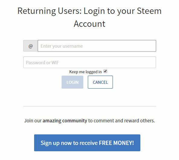
Loving the big button :) ok, and the header font looks different too
Yeah, because that doesnt sound scammy at all.
Yes might be best to review the wording there.
That part will be changed - the wording of that is not what we want it to be.
im glad (and i also figured/hoped that might be the case.)
Lol it does, actually, depending on audience. It's straight-forward for sure
I don't care how it sounds or how ugly it is as long as people click on it and create an account.
Oblivious much?
People won't click on it if it looks scammy. And if they do click on it, and you don't deliever on your implied promise, theyll walk away.
Did you seriously watch most of the platform's userbase and all of the platform's momentum seep away amid the scammy sounding hype and unfulfilled promises last august and september and learn nothing at all?
There was no signup button to click on in that view at all before, so even if a small percentage click, it will be an improvement.
Additionally, if it is as bad as you claim, when we A/B test it, it will get easily replaced by something better. :)