Steemit Mobile App - UI Prototype

I've received a lot of great feedback for my previous user interface design post dealing with possible improvements on Steemit's current site that a follow up post was a non-brainer. Sadly, this is not it! I'm still working hard on that one, but in the meantime I wanted to share some of my ideas for Steemit's future mobile app.
We all know Steemit is growing exponentially and Instagram, Facebook & Twitter apps (to name a few) were what literally put those services in the hands of the average joe and non-tech savvy users.
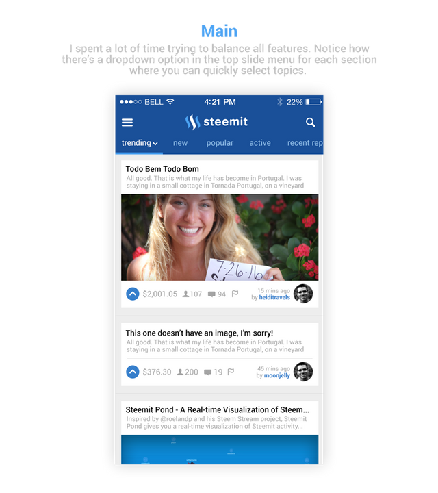
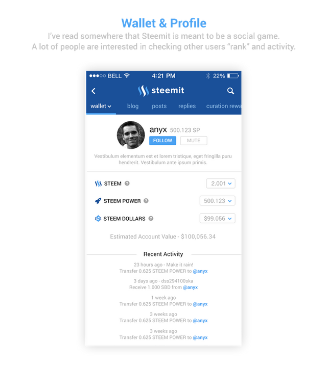
Here are some very early ideas (based on the current features and functionality).


If you enjoyed this post you may also enjoy this one:
Your images are not showing!
Thanks man, hope it's fixed now.
All good, have the app on my phone, will keep an interested on on it, thanks :)
Thanks again for the heads-ups, I appears it really hurt my upvotes but well, those are the rules.
Hi! This post has a Flesch-Kincaid grade level of 9.8 and reading ease of 65%. This puts the writing level on par with Michael Crichton and Mitt Romney.
Interesting post. Well done :)