NEW STEEM T SHIRT DESIGN!!! I NEED FEEDBACK!
The last time I created a post about the T shirt idea, I didn't get as much feedback as I thought I would have. The great thing about steemit though, is that you can try again until it works to your satisfaction. So I took that message as a sign to go back to the drawing board with @edgecelize and we attacked the artwork from another angle, I think you'll find the new design to be much cooler. We've spent hours on this design already and I really hope you guys like it.
HERE IT IS!
HOW THIS LOGO CAME ABOUT
The origin of this logo is a bit of a story that you would be crazy if this turns out to be a successful product launch. But it actually has a bit of a grassroots origin....
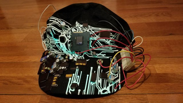
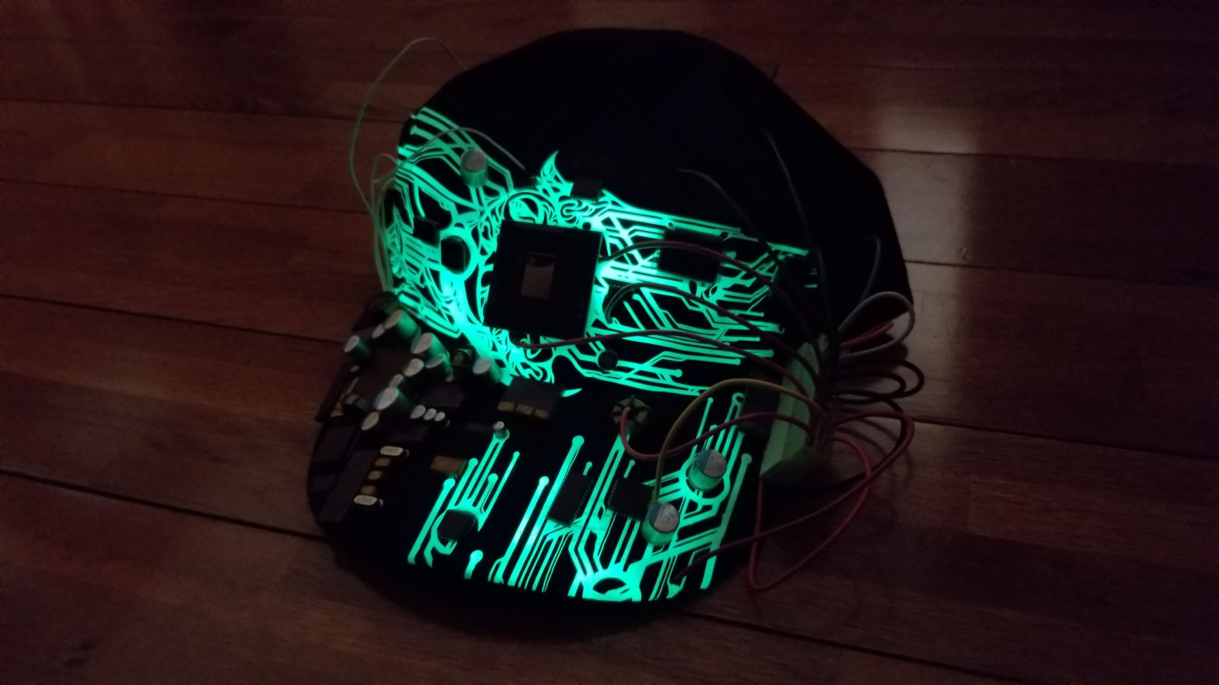
I met @dougkarr, who is the director of the @hardfork-series, at a STEEM meetup that was hosted by @andrarchy. It just so happens that @dougkarr was looking for a few extras to shoot a fight scene for their trailer so took a day off and helped out. He also asked the extras to bring some futuristic clothing so I turned to @edgecelize to see what we could come up with. He ended up creating a hat with processors and other computer parts. He also create the circuitry design to give it a future look. That hat actually looks like this:

And yes, it actually GLOWS IN THE DARK!

I don't know why it didn't occur to me to put it on a shirt since we already had the concept created.
RECGONIZING THE STEEM LOGO
I think the steem logo is easily recognizable because of its color and less recognizable because of its three blade design, which shows up in a lot of other logos. So I think keeping true to the color scheme is more important than anything else.
What do you guys think about putting the words "STEEM" in front of it or maybe vertically along the side of the shirt
In terms of placement, where do you guys think it belongs on a shirt
I want to know what you guys think of the logo. What color shirt should it be printed on? Would you want this logo on something besides a t-shirt? Stickers? What other garments you would like to see the artwork on Let me know!
As far as money goes, I think I'm going to abandon the idea of trying to make this shirt free because I don't think enough people will be able to see this post to help fund it. I also don't think it'll be fair to others to give it away for free in promise for up votes. So for now, I'm thinking about selling the shirt outright for STEEM or SBD.
If you like this post, please upvote and resteem and spread the message!
Tell me if you want a whole lineup of t-shirts using the circuit design. A monero, verge, btc shirt. Anything!
Steem on guys!
Sweet I've been waiting for this!
I like the logo. The only thing I'd change is to make the "steAm" (the offset black background behind the three "steEm" lines) transparent or line graphics. To be able to change colors easily, and print easier (I think print easier).
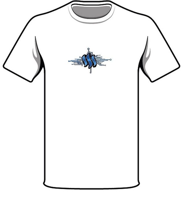
I think the current design would look good on a white background (see below). And as an alternative just black and white outline the logo on a white background (no example provided).

Whiteground with logo as is.
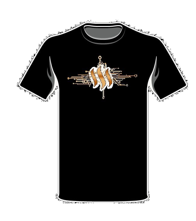
You could invert the color (see below) or just white it out (no example provided) and put it on a black background.

Blackground with inverted gold logo.
I forgive you for not responding to my response...
SWEET! Thanks for the work getting it on a shirt dude!!! Super props for helping on this project! Upvoted!
I like the gold design, but the original colors for the www.steem.io logo i think are important. While the gold does look cool as hell! I was thinking about a larger flamboyant logo though. That one seems small and cool, but we need to get the brand out there to help promote steem. The gold size one is better i think!
You know, I was thinking, what about we put the words "www.steem.io" in small letters on the outside facing sleeve. Or maybe just steem
or maybe "CRYPTOCURRENCY STEEM"
My only thing with hoodies, do we go zip up hoody, or wear over?
Yeah the size was completely arbitrary, as I was using MS Paint (ahahha). So it was more about the concept.
Actually for arguments sake lets see the blue on black on black....
Super basic, crappy MS paint version of the regular logo on blackground. Ignore the quality (and size) of the logo. Just for conceptual color purposes.
Great design @motoengineer. Background color need to be little sharp.
Maybe less thickness for the black around the three blades? I like the black, but maybe 40% thinner? And smooth like the blades rather than ragged?
Probably not. It’s the logo we want to focus on. Nike is recognized by the swoosh for good reasons.
Spot on
I don't think people will know what the logo means yet. The Swoosh logo is associated with "just do it" as much as it is logo by itself. Do we need a slogan that does t sound too posh?
"make content earn money" lol. Sounds corny.
"upvote, resteemed"?
"social media meets crypto"
?
Hoodies please :) It would look sharp on a black background.
I would say front center of the chest for shirts and hoodies...or you could get golf'ish too and put it on a polo or henley top left ...
And stickers, with black background!!! I mail thousands of packages from my Etsy shops each year...wouldn't it be cool to have it seen by 10 people per package? (and I would stick it on my laptop)
Stickers! We got 1 for stickers! I think this would make a great sticker if it was about 2 inches wide max? Maybe 1.5?
Yes :) 2.5 x 1.5 inch, oval? Or whatever width works with a 1.5 height?
If you get them made I would like a roll depending on the cost and what form of payment you need...they will get mailed worldwide :)
ill see what i can get as far as pricing on that! At this point, I want to only accept steem or SBD. I'm going to price things out in USD first though. but youll be the first on my list as far as getting stickers to!
Cool, thanks! I think pull on hoodie, so the logo can be bigger...but the steem.io would be nice on the sleeve of a t-shirt, and could be bigger on the back of a hoodie too. So logo on front, www on back?
Great design!
I would recommend sticking with neutral colored garments (grey, white, black) but you could vary the location of the logo on specific shirt/hoodie/hat designs. Patches are a good consideration, as they can be stitched onto most other wardrobe pieces. Stickers are a cheap bulk item to have made.
I think those 3 will be the dominant colors that I'll buy. The white one is a bit difficult, I think I'll need a different backdrop to make the digital circuits pop out. What color would buy Grey white or black shirt?
Love the linear designs but I feel(just my opinion) it need some more contrast on the outer part of the design. Other than that it's great.
I think you are right, but it depends on what color shirt it's on. If it's on black it might pop itself out. But if it's on white, it might get lost. What color would you use for the shirt? What about the backdrop of the logo to make it pop?
For a black shirt maybe white or a really intense light blue
The coolest design so for of the SteemIt-Logo. The black in the background distracts me a litte bit. Maybe a little bit thinner and more in shape of the Logo without this "digital noise".
But really nice work!
A few have said thinner on the black backdrop. Maybe we should use a black glow instead of the jagged digital noise as you said? Good comments!
If you did it with photoshop, you can rightclick filloptions, "shine out" or smoething like that and then make the shine black with a fixed border. Then it will have the shape of the Logo
thanks for the tip. Im going to work on the image over the weekend and get these finishing touches up.
nice one. Hope the results get good!
I want to have stamped a sort of slogan too along with the logo and the logo should be in blue or green and in the middle of the shirt.
What would you write? Any ideas?
I would write "Steemit Craze" below or even a simple " Steemit" would work well but preferably "Steemit Craze"
well, steemit is just this website. which is its own thing. im focused on the steem blockchain.
I wonder if i am even allowed to write www.steemit.com on a shirt and sell it?
I want a rsrsr, I liked this logo.
Looking pretty awesome :)
Thanks!