Steemit analysis #2 - Understanding how to increase your exposure using Steemit data
Hello Steemit,
If you're interested in having an edge when posting to increase your chances of having a trending post, read on!
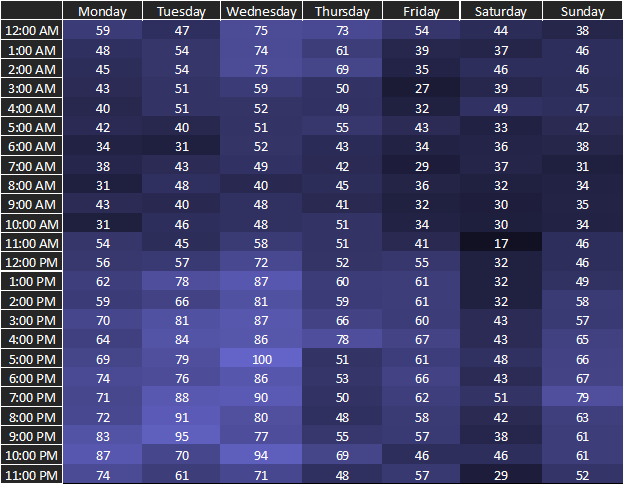
I was interested in analyzing the number of posts created at any given time during the week. I gathered information form close to 19000 posts since the creation of the site. They were taken only from users appearing on the richlist, as listed here. These users could be considered as "having something at stake" and should care about the long-term success of the platform (low incentive to spam). This first graph shows the normalized number of posts for different time slots during the week. Each number in the table is given by:
Number of posts in time slot/C*100
In which C is a normalizing constant equal to the maximum number of posts in a given time slot. This number turned out to be 207 and 19 for the first and second tables respectively. What you need to remember is this: the higher the value, the more posts were created at each given time slot. The colors are based on those numbers and serve as visual aid, in which darker colors represent a lower number of posts and brighter colors a higher number. The timezone used for all tables is UTC.
Total normalized number of posts

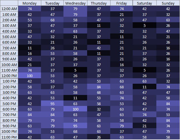
The second table was made in the same way, but represents only posts that gathered a total payout of 300 STEEM , currently worth close to $800 USD. This, to my standards at least, would be considered as a successful post. Keeping in mind that a relatively small number of posts satisfy this criteria - making the data less statistically significant - one can still arrive to interesting conclusions from this table.
Normalized number of posts worth more than 300 STEEM

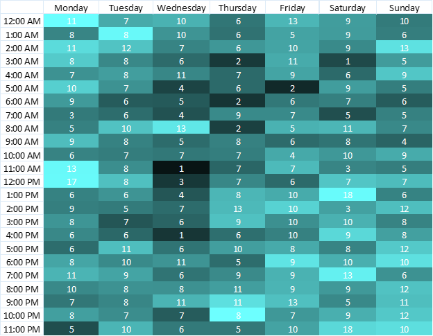
Finally, I thought it'd be interesting to highlight the percentage of successful posts at different times during a week. Note that this table uses a different color scale, and the numbers are simply given by:
Number of posts worth over 300 STEEM/Total number of posts*100Percentage of successful post

What do we get from this?
I personally think it's interesting to see the high percentage of successful posts. While these mostly come from the same people, it still represents close to 8% of all blog posts created by the 5000 users that have the most at stake (currently over 27 STEEM), which is a good fraction of active users on the platform.
Another thing we note is the centralization aspect hidden behind these numbers. It shouldn't come as such a shock that a mainly English language based website would exhibit a cyclic behavior, similar to that reddit. Interestingly, there's a drop of about 50% in success rate between blog posts created at 2 am and 7 am UTC. That's impressive for a only a 5 hour difference!
Curious to see who is sleeping at 7 am UTC? See the following image:

Things to remember from this experiment:
- There's still some centralization from both posters and upvoters.
- Posting at 7 am UTC increases your risks of not being seen by whales
- If you can, avoid posting in the middle of the week (Wednesday/Thursday), since that also decreases your exposure to influential upvoters.
In my next post, I'll discuss some of the effects of capital centralization and explore if it's a growing problem and how it might affect scalability.
Please let me know how I could improve and what kind of data you'd like to see.
Well done @owdy. Really interesting. I was wondering about this exact question. I plan to create some content but fear it will fall into the abyss unnoticed, so this may help.
It's interesting to see that early lunch time slot light up on Mondays. Perhaps people aren't quite ready to do their day jobs.
I curious about the amount of variance you see. How reliable is the data?
I'd say the first graph is getting there in terms of reliability. You can still see some outliers (Saturday at 11 am), but its overall low variance. With a total of ~19000 posts in that table, that's about 110 posts per time slot on average. The second table has much higher variance, I'll probably make an update in the future, once I gather more data points.
Excellent tool to help when creating quality blogs.
Interesting post. Well done :)