10 Ideas on Redesigning the Story Card
While browsing Steemit for the first time, I couldn’t help but think that it was possible to do a cleaner and better user interface. So I sat down and took a few notes, and sketched a cleaner design following those ideas.
The ideas I will share in this story are only about the story card and it focuses on both aesthetic and UX changes.
This is my way of contributing to the platform so if you like the work I’ve done, I can look at other areas too (or even a mobile app design). Please comment your feedback.
I used real story content from “trending” in my sketches to make it as relevant as possible.
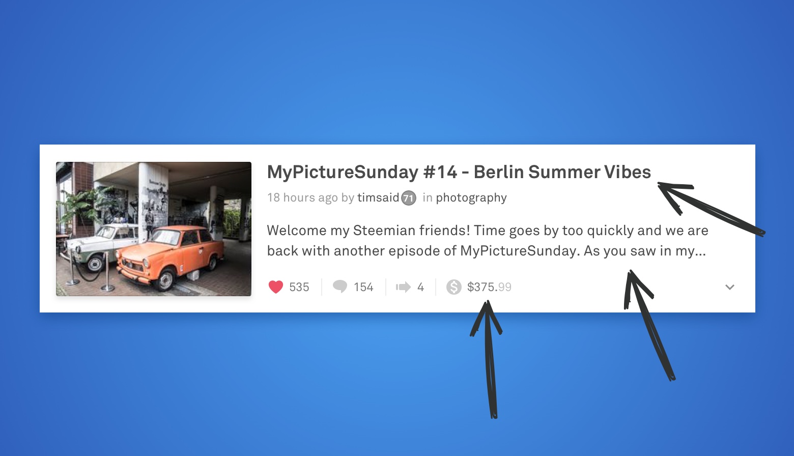
1. Where is the love?
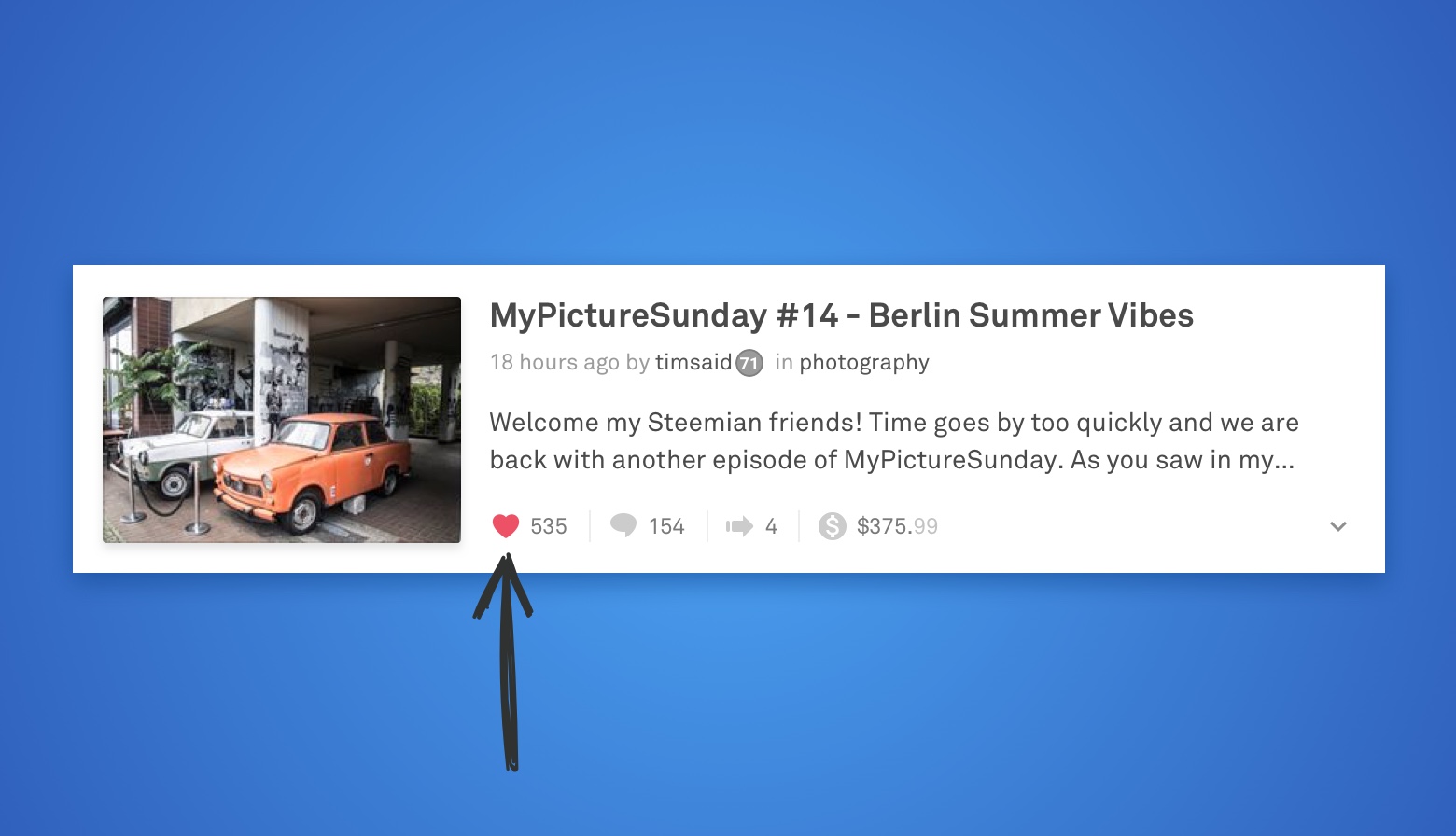
When there is an up button, users will look for a down button by intuition. In cases like Reddit and Stack Overflow makes sense with arrows as voting-indicators, but on Steemit, it’s only possible to vote up. So why not use a heart?
2. Prioritization
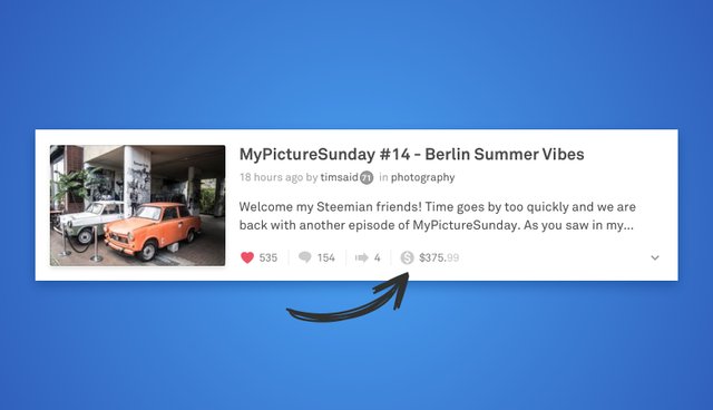
Even though it’s nice to see how much money an story has made, the dollar amount should not be prioritized first (IMO). It should rather be last in the row after votes, comments, and resteems since the value is based on those metrics.
3. Consistency = Legibility
When putting small pieces of information into a row, it can quickly become messy and hard to scan.
That’s why creating a bunch of icons with the same style, size, and spacing can really help the reader to read the layout.

4. Room for variables
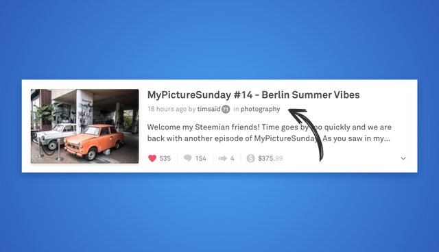
The byline consists of the story's time, author and main category. While the time label is pretty limited, the author's account name and the story category are both able to get pretty long and could, therefore, take up too much space in its current placement.
5. Contrasting font size
When doing story cards like these, it's a good idea to create a visible contrast between the title and body text, as it will give a clear hierarchy and make it easier to distinguish between the two. Font size is one way, font weight is another.

6. Give up space
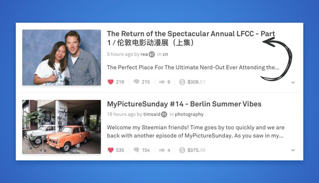
To maintain the height of each card, let the title “eat” space from the body text when it grows in a number of lines. Using the same line height in both title and body text, we ensure that the design will still look balanced and consistent when taking away one of the lines from the body text.
7. One font family
Another one about consistency… because consistency is good. In most cases, when designing a user interface, it’s a good idea to stick to only one or two fonts. When pairing two fonts, they should not be too similar, but rather compliment each other to match.
8. The featured image
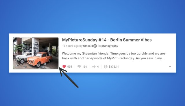
First of all, I gave the featured image a very subtle drop shadow to create a sense of depth in the interface. Secondly, I gave the images a slightly visible border on the image to account for really bright images almost matching the background color.
9. Story menu
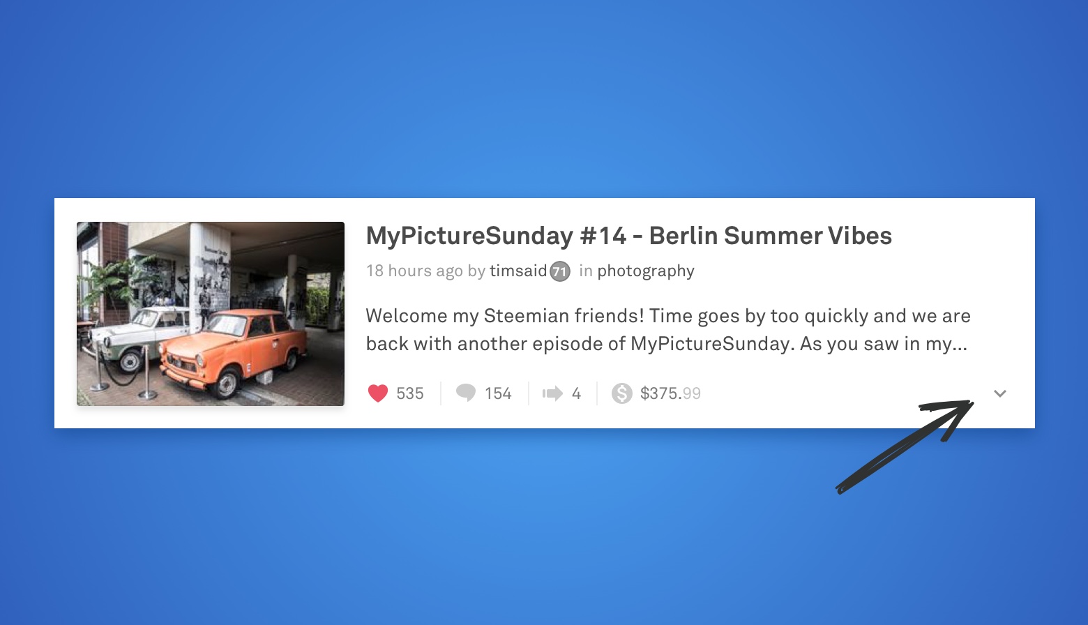
A story can already be voted, commented and resteemed, but when the list of actions grows, it might be too much to display on the story card. For that problem, a menu drop-down might be a good solution. Things such as report and share could be triggered from there.
10. Theme: Dark
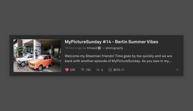
If you’re a night owl like me, you might like the idea of a dark theme, so the bright light from your screen doesn’t hurt your eyes. With this clean design, it’s easy to make it look just as good and readable with a dark background.
About me
I’m Thore Cardel, Digital Designer and Front-End Dev from Denmark. Check some of my work at thorecardel.net
Welcome to Steemit.com
Wellcome to steemit
Wellcome to family :)
You've got some good ideas here. They all work for me, but I suggest iy would be good if you could draw the witness's attention to them. I see you are very new here so may not have a clue what I;m talking about... think of these people as the equivalent of miners within the crpto currency world. They keep steemit running smoothly and when you read their blogs and profiles you will see that they are all actively improving things here . They are elected by our ongoing votes. If you go to the drop down menu at top right corner of your screen you will see "Vote for witnesses". This takes you to the list of about 50 people who would , I'm sure, like to read your post. I would suggest contacting them by commenting on a recent post of theirs. They are obviously all busy people so make sure your comment briefly and clearly explains that you are a designer and the purpose of your post. As you can see from comments here, a lot of people spam others to try and get their posts upvoted, and nobody appreciates this habit. Good luck! I've upvoted and followed, and will resteem later in week to keep this post going.
Hi @elaine54, thanks a lot for taking your time to comment and explaining that to me! I'm happy that you like it! I will make sure to send it to some of the witnesses. Thanks again for your help!
Fantastic ideas...and clearly explained. The dark theme alone would be enough for me (use dark themes in the daytime, too). But all of the other features you included are spot-on. I'd love to see these implemented in the future. Great post!
Thanks so much, @darwinruiz ! I totally agree. Dark themes are the best no matter what ;-)
I am very pleased that you like them. It's worth those couple of hours, just hearing that from someone.
Welcome to Steem @thorecardel I have upvoted and sent you a tip
Welcome to the Community, @Thorecardel!! Wish you much luck! Cheers! Follow me ...
Welcome to Steemit @thorecardel, I have upvoted and sent you a tip. Check my blogs if you are looking for tips on how to earn more Steem and SBD.
Hi! Your account seems new so I'm gonna support you. Have an upvote and rock on!
Getting those upvotes on a new account can be a daunting task, believe me, so my advice would be to give Steemfollower a go as you can earn up to 5x more steem than just upvoting by yourself! It's a simple and safe vote exchange that is free to use. I made this post to explain the system in more depth and it has become my most upvoted post yet.
welcome...thank you for giving something best. i have upvoted and following you! give me the best @kunani