Steem Monsters: Market icons on the the cards page - my proposal
I have a small problem - I forget about various things. And when I talk about it in relation to Steem Monsters, I mean, among other things, remembering the cards I put on market for sale. So when I go to the cards page - kill me - I can’t remember which cards I’m currently selling and I need to use For sale option from drop down menu. I guess that’s why this option was created in first place.
But even then there are still two problems:
- I can’t see my cards on sale in reference to all my cards (
Owned) unless I remember them myself. - Although there is no doubt that one card is sold “as a whole”, with more cards of the same kind it’s not so obvious.
All we need is a simple solution. Like new icons!
![]()
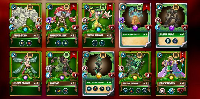
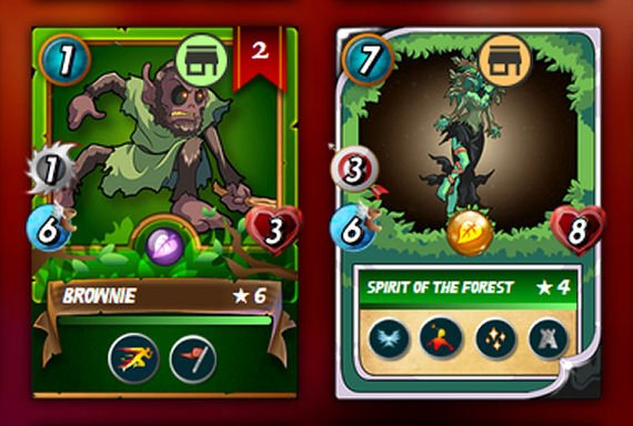
These two icons should appear directly on the cards depending on our actions:
- Orange version: it’s only one card and it’s on sale or there are more cards of same kind and all of them are on sale.
- Green version: there are more cards of same kind but only part of them are on sale.
On the cards page it will look like this:

I think the top right corner next to the number of cards is the best place for these icons since there are not so many options to choose from. The other sides of cards are occupied by other markings.

What do you think about this idea? Will it help you somehow?
Icon was taken from svg file from Steem Monsters webpage.
Great idea! Only maybe a smaller icon. 👍👍👍

Size and place of icon on card doesn't matter - but let it be there.
Very cool idea man I like it, would make it so much easier to review your deck and the market when looking for cards
Every time I want to sell any card I miss this idea...
Every time I
Want to sell any card I
Miss this idea...
- lukmarcus
I'm a bot. I detect haiku.
good idea bro