5 Best Practices For Thumbnails And Featured Images

Thumbnails are the first impression of your articles. These are the first things your audience notice and you need to make it attractive. The same goes for the featured images, Pinterest pins, and other display images.
The criteria for thumbnails and images for different platforms differ. But, here are a few things to keep in mind if you are making a thumbnail for any platform, no matter which platform.
These tips will help with driving traffic in different ways
Properly Name Your Thumbnail [File Name]
No, I’m not talking about the words on your thumbnail here. Most people starting out make this mistake. You need to name the image file of your thumbnail before uploading. Here is why.
Search engines read your image file with their names. Adding the file name the same as your keyword, or a closely related topic or a relevant name will give the advantage in SEO of your content.
Have you ever noticed if you have a poor internet connection, some images don’t load instead they show the name or a number? Naming your image, giving a description and alt text, properly will help the reader understand what the image is about, in case of blogs.
Make The Topic Clear
There are many ways to make a thumbnail or a display image. You need to make sure this image reflects what you are going to deliver in your content. This need not be your entire title, but may be a fraction of it or a message you are going to talk about.
The best performing thumbnails and featured images change according to the niche too. You can display a picture of the food itself for the recipe you are posting. Add a part of the title on the thumbnail of the YouTube video. Make your Pin for Pinterest more informative.
These practices will give an overall view of what they can expect from your post.
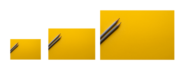
Optimize The Image Size
Different platforms have different dimensions that work the best. Even if you are posting the same content in different platforms, make sure you optimize and create the thumbnails accordingly. Sometimes you may be able to upload the image to a media but it will be cropping out the best part of your thumbnail.

Therefore, whatever the platform you are uploading the thumbnail to, make sure you are using the best dimensions for that platform.
Evoke An Emotion, Any Emotion
Thumbnails that perform the best are found to be the ones which can relate to an emotion. You can bring this out in different ways. It differs for each and every niche. You can make someone loves beaches click on your video with a clear picture of beach waves.
You can evoke the curiosity of someone with a surprise text on your thumbnail. You can make someone clicks on that infographic thumbnail to see everything you have written there clearly.
But, always remember, once they click on it, make sure you are giving something valuable through your content. Otherwise, you will be turning away someone from clicking on your content.
Do Not Overdo It
With the hype over thumbnails being very attractive, people tend to overdo it sometimes. Keep it simple and readable. Overcrowded thumbnails with too many texts or designs is going to make people keep scrolling.
You know how whitespace helps with blogging, it’s the same for thumbnails
Conclusion
There are different patterns and dimensions for thumbnails that work for different platforms. This makes it necessary to customize the thumbnails for each platform. But, never forget to name your image before uploading with the keyword. A thumbnail that clearly delivers the message wins the race. A thumbnail that evokes emotion can also make people click on your content. You need to make sure you deliver the good content to make them come back to your site or page or social media account.
Posted from my blog with SteemPress : https://malayalaminfocentral.com/5-best-practices-for-thumbnails-and-featured-images/