Voting is now Live for the 2018 Steem Silver Round design!
This is the voting post for the Steem Silver Round design. You will have until this post pays out in 7 days to cast your votes. We will be doing this in multiple rounds, like 2 but perhaps 3 if it's required. This first round we expect to have 8-4 clear front runners and they they will move into a next round of voting. From that we do hope to have a clear winner, but if not we will move to a final head to head round with the top 2 designs from round 3.
Official Rules
- Winners will be chosen by numbers of votes not value
- Bot or other automated or trail votes do not count
- Please only vote for 1-3 designs max.
- Only votes in the official comments by me, below will be counted and not any additional comments or sub comments.
Each design will be in the post with the design then underneath a #, designers name and link to there initial post. Many designs have a background or story behind the design, and I will right STORY with those designs as well to suggest you read the background that goes with the design, but otherwise this post would just be far to long. You will also find a comment with the number and image of each design, that is where you need to cast your vote.
Designs.
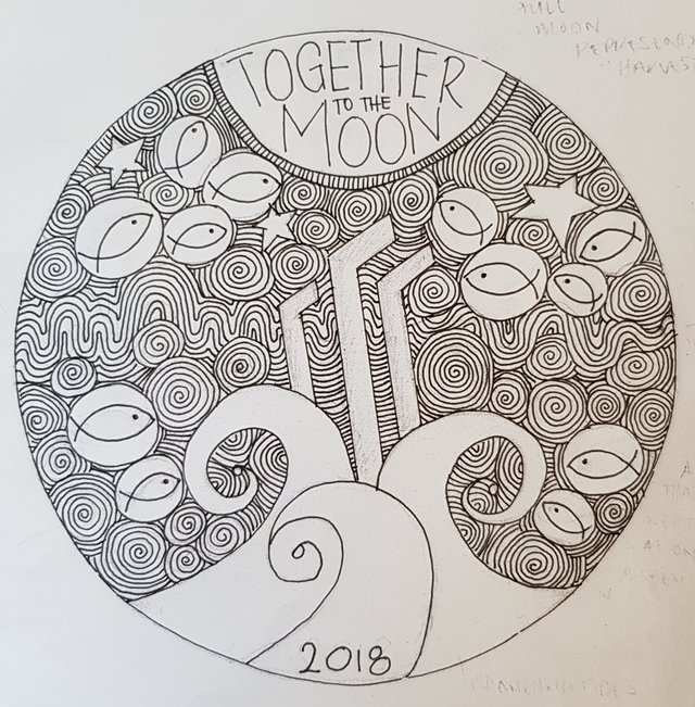
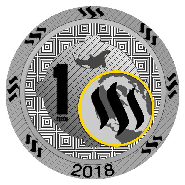
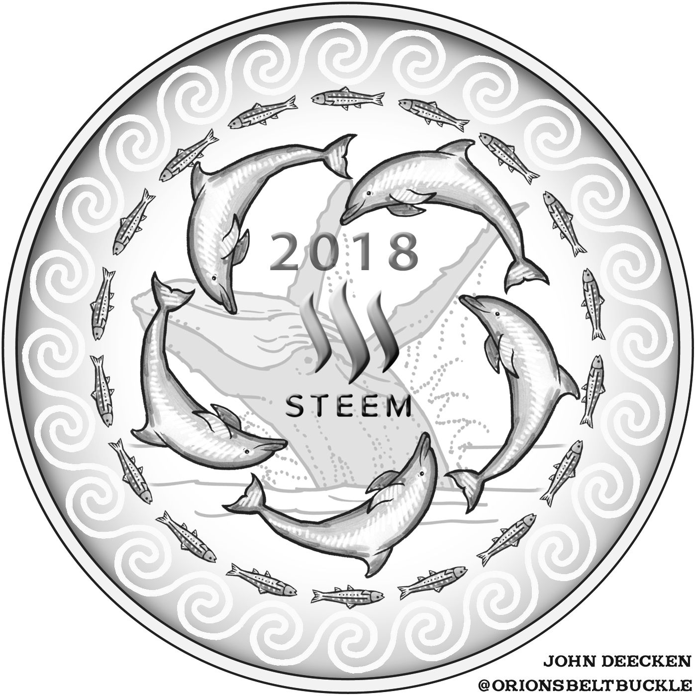
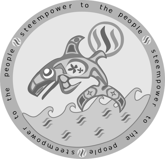
#1, @bearone Post-STORY
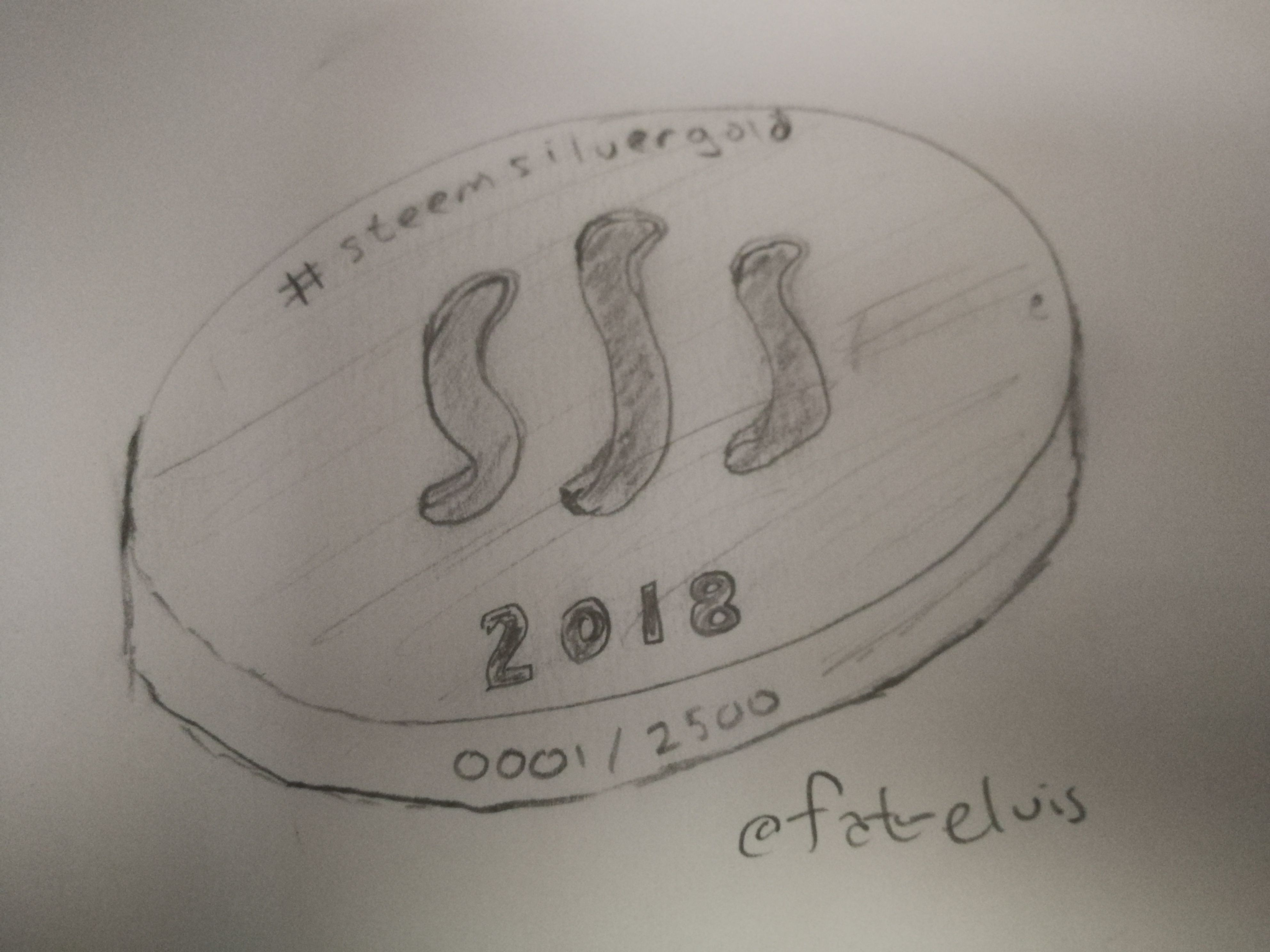
#2 @fat-elvis POST
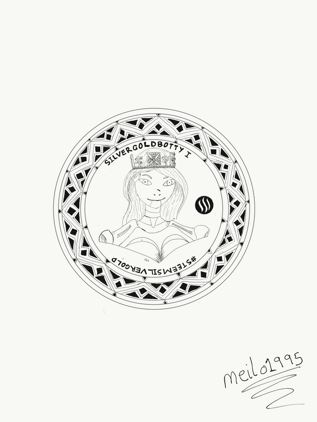
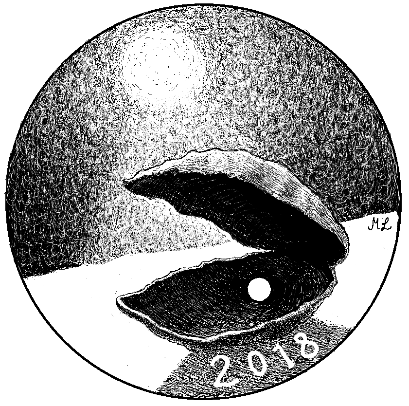
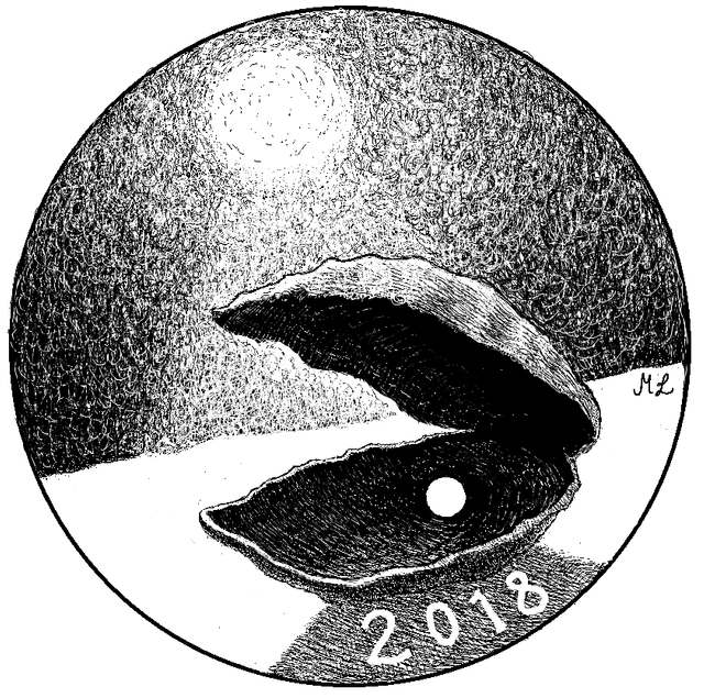
#3 @meilo1995 POST

#4 @edxerverus POST

#6 @knowledge-seeker Post-STORY

#10 @edxseverus POST
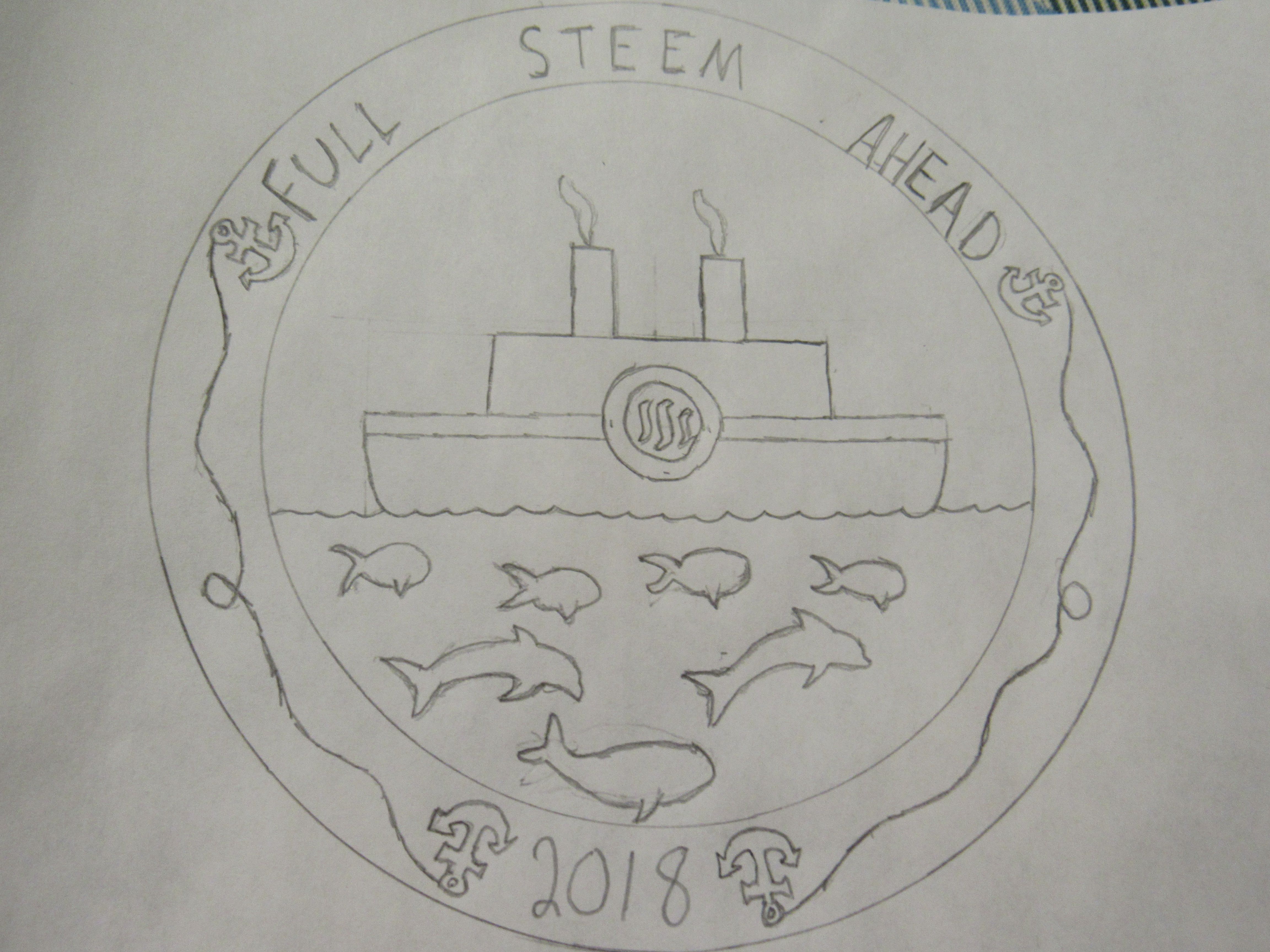
#13 @ricko66 Post-STORY
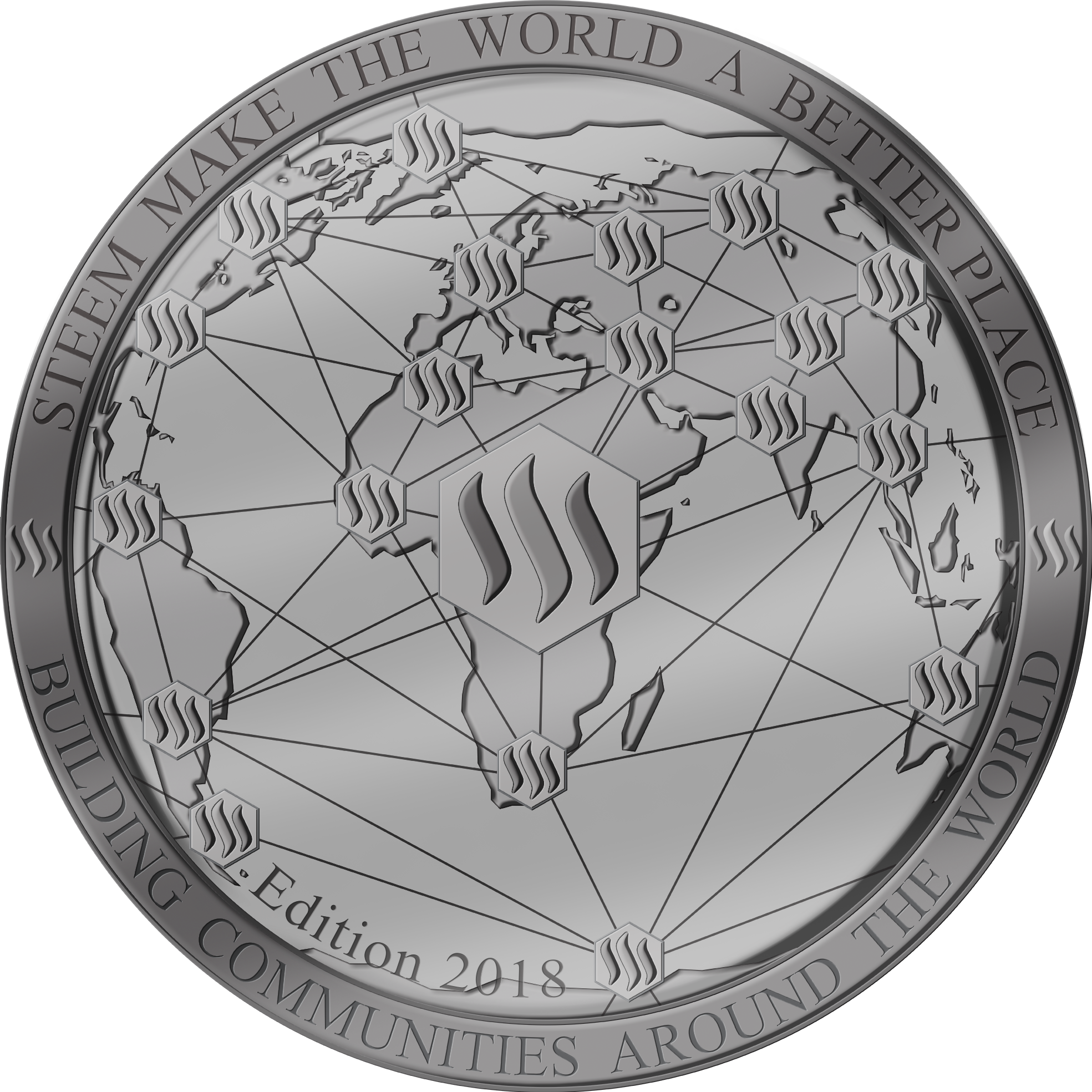
#14 @ricko66 Post-STORY
#15 @photoquest POST


#17 @yesaye Post-STORY


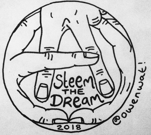
#22 @owenwat Post-STORY
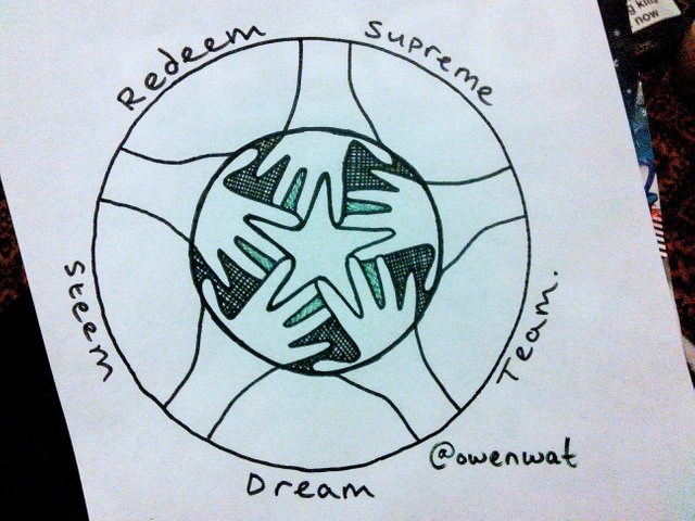
#23 @owenwat Post-STORY
#26 @edxserverus POST
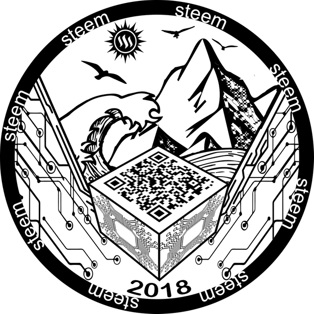
#27 @dandesign86 POST Unfortunately I need to include a disclaimer with this one, that cost to produce the round with the cut out center are much to prohibitive so bear in mind it would be the second version.
Well that's it, only 27 designs!
Please support your favorite designs. Once the design is picked we will submit it to the mint and get a more concrete timeline, at that point we may also consider taking preorders, otherwise please not sales inquiries at this time.
As previously all SBD earned from this post's payout will be donated to @steemsilverround to help fund the project and keep costs down for everyone. You may also feel free to send any donations to that account as well.
May the best design win!
#27 (with no cut out)

We can not achieve the punched through design-Please see further discussion and vote accordingly
I gotta' vote on this one too, but with cut-out, even if it amped the cost. It's stunning!
We realize if we did a cut out of the steem logo the other side would be mirrored...... backward.....
There is no denying this is a stunning looking coin, my only concern would be the lack of design on the other side. It would have to match as the "punched out" section would be repeated.
I saw it as not going all
The way through...
that would be a good point, super polished recessed steem logo, like mirror finished?
Sexy!
I think it makes more sense to have a round that is cost-effective to make. I really like this design, but if it's going to be cost-prohibitive to manufacture, we could do a different design for the coin and use this one as a logo for the group.
Just weighing in... i’n sure the community will make the correct choice.
yup would get 10 of that one
I also want the micro chip to be real and rfid ready so it can have vessel embedded inside and so I can scan and pay for stuff with my Steem and steal market share from apple, visa, & mastercard over the next 10 years.....that's not asking too much is it?
I think it's completely reasonable haha
see...i knew the designer would agree
It is the cut out that takes this design to another level, it would be a shame to let cost dictate our decisions. All of us with a serial number under 100 could pay for the coin up front or a donation towards the extra cost, whatever it takes to make this coin a reality, even if to reduce the manufacturing cost we make 100 of the cut outs and the rest are not cut out.
Now the modified pic with the logo filled in is just as nice and still gets my vote and the date on the chip is just class. We could have a slot in the top of it to fit a lithium battery and have built in micro led's that all light up and have a wireless usb memory drive built into it and a locator chip should it ever get stolen, oh and if you whistle it beeps
You just got people thinking about next years design for sure! :)
Ooooh ooooh and it could also be programmed with keyless entry technology for your car so it unlocks the doors when you approach and turns on the ignition for that matter. But i was a fool to think about merely inserting a lithium battery, its silver and solar pannels are somewhat silver! incorporate its own tiny solar pannel! its injenius!!! It would have more technology than the moon landings
i saw a thing about nanobots made of silver, powered by bacteria. Maybe a sweat powered pocket piece with led's that charges in the day and glows at night :)
There we go, bacteria munching nanobots; stick a couple of them in it, i would let them evolve and see if they avdance enough to invent rocket technology and attempt to fly to another silver coin system, land on and colonise a 2014 kookaburra! One small step for nanobots, one giant (inaudible) for steemit rounds.
now that's some ambitious features !
You can always negotiate with @dandesign86 to purchase a copy of the 3D file; then adapt it for your desired features ;)
It's an elegant design even without the cut-out
poor taste....cut-outs are like rip jeans, it's sexy
fashion comes and goes, elegance is forever
sexy is forever and then a bit more
...a bit of drool
Stunning, clear vote for #27!
Gorgeous coin!
A nice clean design, and just think about all the extra coins that could be minted with all those cut outs ;-D
Beautiful design!
I like this one
I would love to see this one with cut-out... even as a second, 2oz limited release edition at a premium price, it there were enough pre-orders to cover all costs.
WE WANT THE PUNCH!
The only thing #27 needs is the year
Certainly a futuristic and cool design... well done @dandesigns86
By far the stand out entry for me! Very clean and simple yet conveying a strong identity of our community! It's got to be the winner!😆👍
Absolutely love it! You can send me a bag full of these please ;P
Absolutely love the design! Very cool.
Amazing design!
I like this one. In my opinion, this one have everything to win this contest. Good luck to everyone.
Perhaps make a standard and a limited special edition with the cuts? Either way this one gets one out three of my votes.
Is this meant to replace the obverse of the 2017 round? Or will we end up with a round that just has 2 big STEEM logos on it?
Don't get me wrong, I think this is a killer design!
I'm just not too keen on having a silver round that is just 2 STEEM logos. If we use this to replace the obverse from 2017 and still pick a second design from the others submitted I'm 100% on board with that!
Just my 0.02 SBD...
This one is sexy as hell.
Me too. Cut out in or out.
I think including some kind of community symbol on the upper microchip would make this design even better ;)
Instead of fully cutting it out, you could also do a very deep imprint on that side, so the Steem logo is very recessed. That would ensure the other side is flat for whatever design is printed there. Might have to make the coin just a little thicker to accommodate.
Definitely with the cut out. That's too cool for school!
#27 all the way. I love this design. Very elegant and classic. Thumbs up from me.
Is this for replacing the front or will the front and back be basically the same?
What happend to the whole push of trying to keep it like the one from last year so they stay a series?
Have we moved away from having a direction or a message to the lack of everything?
IDK
I like this better then some of the messages people are trying to push on their coin but am confused as how this meets up with anything people were saying this years new coin should have in it.
We are only going to replace the side of the coin that bearone designed. This side will stay the same:
Yeah thats what i thought too, so both sides will be basically the same.
lol
I agree with you, it is not to discredit his great work, but I also did after front designs that could also compete if we want to have two equal sides
i like fat elvis's front side ideas of no rim, but i dont like the idea of both sides basically the same.
the cut through i like it reminds me of my old subway tokens i been saving from my childhood but without the cut out its kinda ehh IMO.
with that said if its that over thee same pict on both sides vs some genocide slogan of a race by way of artistic pessuasion then i pick the no slogan medocore circut board noncense.
LOl
Remember thats IMO and im a prick cause im honest.
:D
Yeah.. Which is why I think we stay away from this design for this round.
Looks like the upvote bots like it.
:D
He with the most alt accounts and upvote bots makes the choice i think.
lol
I like it better then some, the full punch through was badass but it cant b done so yeah
If it could have been done it would have been KILLER!
Those upvote bots are going to town on it! haha
steemit life.
lol
There can only be "ONE"😂😂😂
Can the designer provide a render without the cut? I think that it would be better to vote on that one because I believe that if we cant see it, we cant vote on it.
I also loved the design when I first saw it but this photo is kind of misleading if this will not be the final design.
I made the updated design and sent to @phelimint, I think he will update it soon
I agree I love it with the cutout but not so much without it, it's a bit misleading I agree because people are voting for the cutout design when that isn't what we will get!
Plus the design on the reverse would be greatly hindered due to the cut-out.
Without the cutout I don't think this design should win, because there's a big Steem logo on the other side of the coin, unless this was for the other side of the coin!
hmmm... does that open the possibility for there to be two winning designs ?
this one for the front, another for the back ?
Of course that would require this one be adapted to hold the extra information like purity, etc, you can see on the 2017 Steem Round's front side.
Yes. Once people realize the punch out is prohibitive at this time I think it will not win. It is an awesome design and something that should be considered in the future, but may not give it as much uniqueness like some of the other designs.
This one for me.
my vote to #27 @dandesign86
I personally like #27. Nice job.
Hopefully I can get one of these rounds when they come out. It'd be a nice addition to the silver I already have.
1 vote for this one! (3 of 3)
this is sick I think
This one is legit
It is a handsome design :P
I like this design jb
Thanks buddy !
This one is brilliant
#1

I vote for this design. This design is very filipino in character it reminds of the art of Filipino Master Painter Ricarte Puruganan. He was propagating the filipino art should go back to it's roots which the filipino Folk art which can be seen in ur native designs and structures. I love how you put the details in it. 😊
Vote on this one definitely!
Another great design, but who's snorkelling under those waves??
Those little intricate circles would look great on silver. 👍
Definitely this one! I love it!
My vote is for this one!! #1
to the moon!
imagine those fishes going to the moon!!! i gotta vote this one.. this is brilliance @bearone :)
I vote for this one 😁.
Vote vote vote! 😁
I vote @bearone work 😁.
I'll vote for this one, the #1. :-)
Vote for this masterpiece! 🥂
Go team steemph! Please show your support to @bearone 😁.
upvoted! Aja @bearone! 😊
This time i'm watching and will not be left out. I'd love to get a 2018 edition steem silver round. It would be lovely if @bearone's design wins! <3
Another great design
Thanks so much you guys 😊😊
#1 i go for this one 😁
You rule bearone!
#1 looks great...to the moon!
My vote is for this one. Its lovely!
I vote @bearone :)
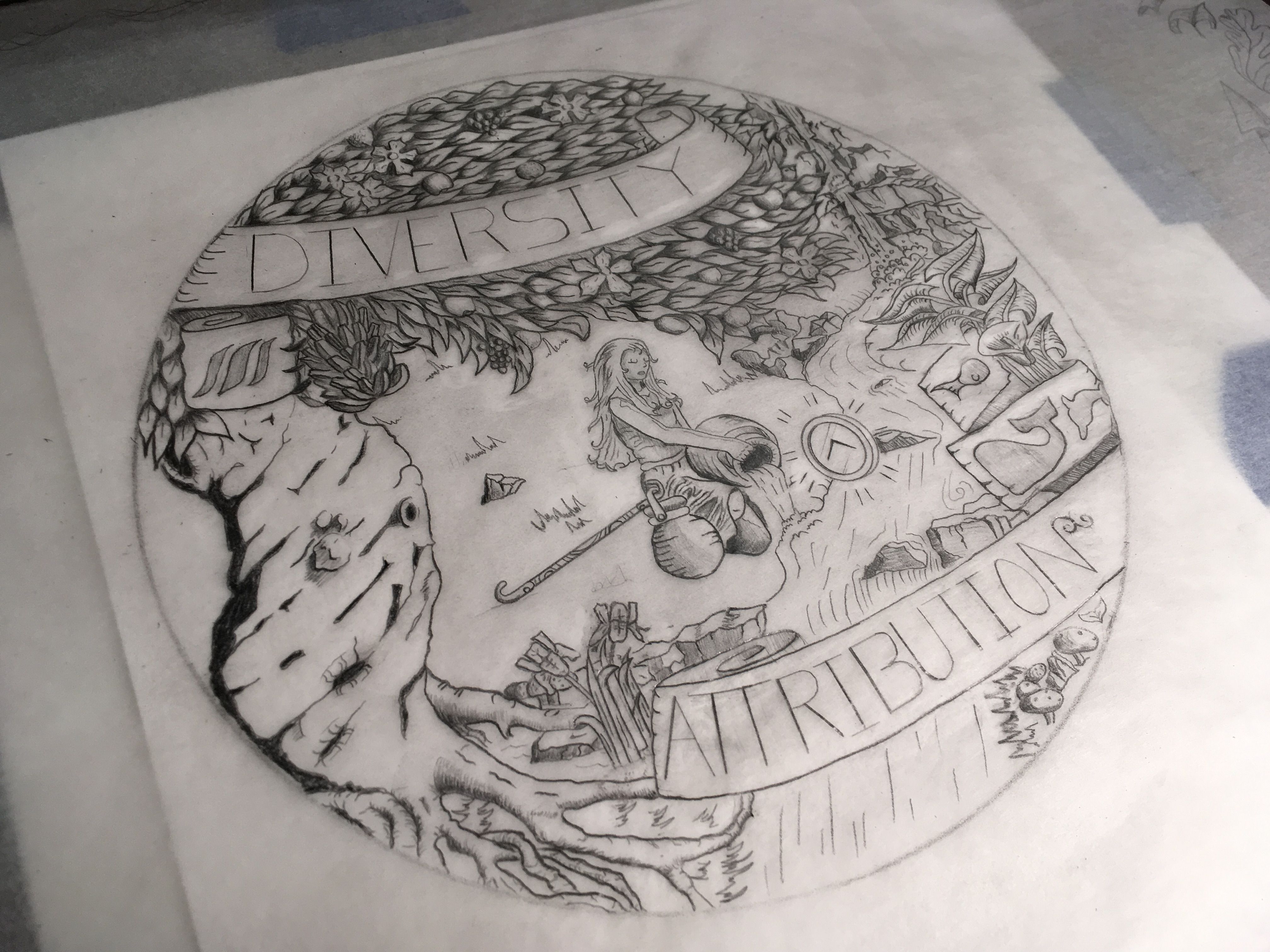
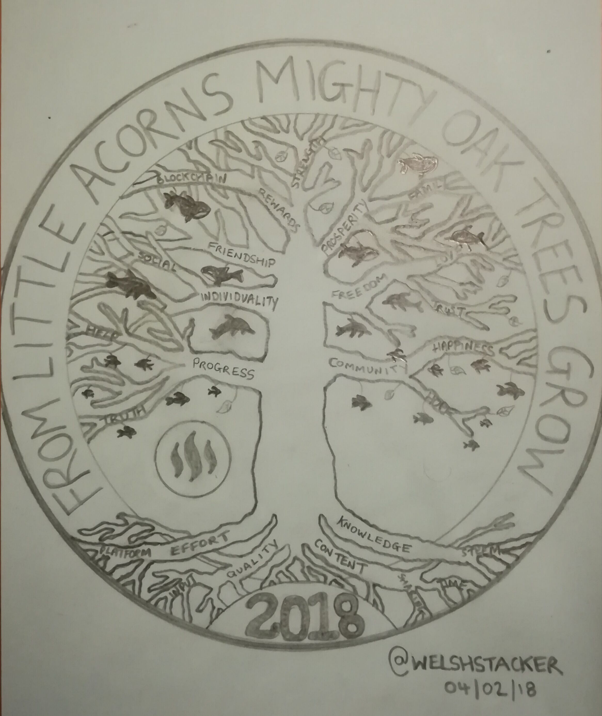
#12

I vote for this one #12 it's so meaningful. @welshstacker
This is a great design and it is getting my vote, along with a 2nd design. I'll leave it at that.
I really like this one awesome design
vote
vote
vote
I've liked this design since I first saw it. Reminds me of the Connecticut Charter Oak on US Colonial coins. We ARE all, in a way, Colonials here on Steemit, cutting our own path.
I love this design! I vote for this. Nicely done @welshstacker
Great job @welshstacker, lovely design. 👍🏼
Epic.
I vote for this one too!!!
I really like the organic vibe of #12 well done @welshstacker
epic design !
Love the symbolism in it, with the mix of fishes and representing the growth of the platform :)
vote
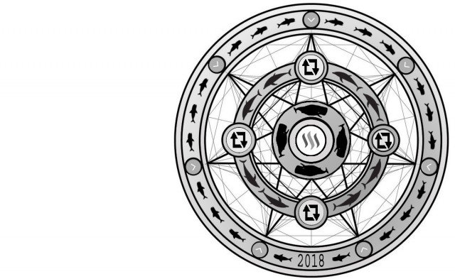
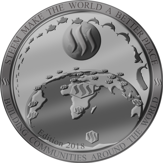
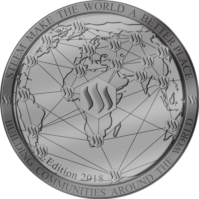
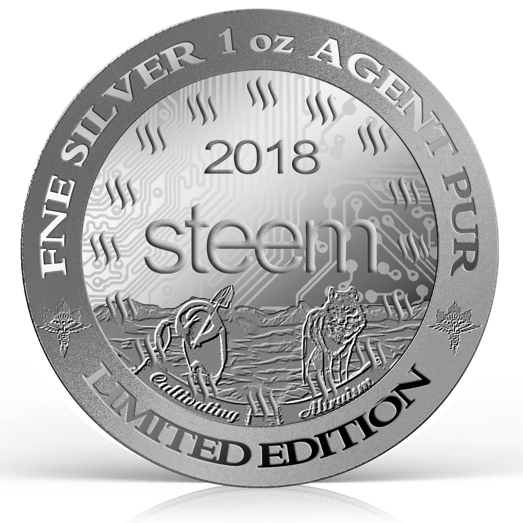
#14

vote for #14
vote for #14 is the best
#14 i like this one
vote for #14
My Vote for This
vote #14 reasonable
I vote for this coin #14
Oh perfect coin , i like it so wonderful , got my vote
Vote #14 beautiful design
#14 i vote
Vote for #14 like this design
Vote for #14
the design is spectacular I love it. ✌😊
Vote for #14, It represent the most concept of the global community.
Vote #14 this is my very favorite.
nice coin vote #14
i vote for #14
I vote for this coin 14
Vote #14 beautiful design
Yes that true
Vote #14
Vote #14
#14 i vote
Vote for #14 New design!
i vote for this coin designed by Mr. @ricko66
I vote for this coin. It shows how Steem connects people around the world and the design is modern and cool.
Like this coin, I think it shows the meaning of being a global community.
Vote # 14
I vote # 14
vote #14
Vote for #14 I think is the best option and beautiful design!
#14 I like the map on coins.
vote for #14 show how steemit grow and better place for everyone can investment
#14 doesn’t need Edition. Just the year
I love the map and lines linking continents and people.
Vote #14 beautiful design...
#14 I like this one
Vote for #14
Vote for # 14 Just love the symbolism on it!
I like this it makes it look like steem is taking over the world, an empire of consciousness!!!
Some tough choices. I like this one! Even if it didn't say' "No Prey, No pay!" wait that line's already been taken.
#14 look strong.
Vote #14
#14 got the vote from me. I like this one.
#8

I really like this drawing and think this would look great on a coin.
This one is really cool.
I vote for this one too
This is one of my favorites! It would look incredible on a 3d coin!
This is my favorite.
I Love the detail on #8
I really hope this one gets more votes it would look stunning on a coin!!
I really like this one too. I was just gonna vote for one but I just can't decide between my 2 favorites.
This is still my favorite, but I'll be back to vote for 2 more that I really like. All the artwork is fabulous. The artists did a great job.
I vote for this one!!
I also like this design jb
vote
And I love this one too! so one vote for this as well.
#25
This is a great design as well. I think it would look great as the 2018 round.
Fucking love this!
I agree this is real art! Hope it gets more votes it's in my top 3 😀
The. Best.
Agreed. As a designer, this is the "best" design, but the best doesn't always win in crowd sourced contests.
It says so much with so little. S’looking like the hi tech design is the early fave though.
this is my very favorite
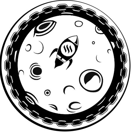
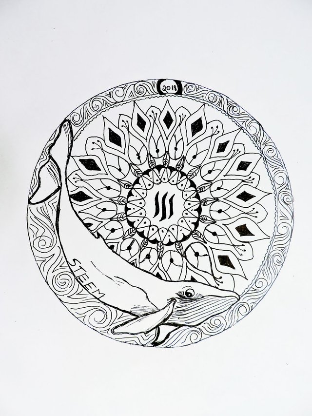
#20
I votes for this one. Simple. @ironshield
This is a beautiful design! I loved it the first time I saw it and it's still my favorite!!
thanks @deerjay! my design loves you too! 👍
I like how not crowded this is. It looks simple and clean.
that's cause i utilized the proportions of the Golden Ratio.. for size and placement of elements.
Beautiful!
very nice indeed!
1 vote for this one! (1 of 3)
I like this very much. Making a coin with #20 on one side and #19 on the opposite side would be very collectable in my opinion.
My favorite design of all.
i vote for this post
#21

this work is well done with very nice details, I hope I get a good place
My vote is for the number 21 for its innovative design@mariae
YOUR GREAT BETTER CONTRIBUTION!!!
Me encanta el diseño #21 mucha inspiración en esta moneda!
I like the incorporation of the steem logo in this coin, plus every luxury detail, congratulations to @mariae #21 is a great job.
este diseño es muy atractivo imagino gran trabajo del diseñador, si así se ve cuando la acuñen creo que tendría cierta demanda.
Captivating desing. I like the style that the author used. My vote at #21
Mi voto es para el #21, me encanta este diseño quedara muy bien si llega ser acuñado, suerte
All the designs are excellent, a difficult decision but my vote is for # 21 its design covers all the elements and details necessary for its perfection.
Mi voto es para la #21 es un diseño muy creativo y sensacional. Felicitaciones a su autora @mariae. Éxitos
my vote is for design #21, I find it sober, elegant and powerful. A good representation of the coin. Congratulations @mariae.
Excelente diseño #21, me encantó 100%, tiene mi voto.
I love this design, it is elegant with a specials details, it is beautiful and really modern. Looks great!! My upvote for the #21! Very powerfull!!
My vote is for #21 the design is spectacular I love it.
My selection is number 21. Unique and avant-garde design. A model that will break paradigms to be selected as the winner.
Mi voto es para el #21, me encanta el diseño.
Me encanta la #21 es la mejor éxitos
Hola, mi preferida es la #21, excelente combinacion de letras e imagenes.
The design of coin # 21 is my favorite.
Voto por la numero 21, es genial la moneda, los relieves se ven hermosos
This is great, it deserves first place, my vote for #21.
My vote is for currency # 21, it is a currency that I would like to use
Excelente diseño, me encanta.. mi voto para el #21
My vote is for #21 @mariae, I loved this design.
My vote for you, my friend @mariae #21. I liked your design. luck in the contest. best regards!
Excellent design # 21, I am struck by the different textures that can be seen on the coin, for me it is the best...
I love the design of @mariae is great, it is fresh and full of details that make a distinction in coin, my vote is for #21.
Impresionante diseño @mariae
Cada detalle sumamente cuidado
Me fascina y encantada te doy mi voto...!!!
this coin looks lovely, I congratulate you @mariae
wow all these designs are good, I can not imagine creating something like that, if you have to choose one I would stay with the #21, it is very elegant, modern and updated, gives a touch of glamour to the coin.
Excelente trabajo, muy original me gusta. Mi voto es para la nro #21
me encanto este diseño mucha creatividad, es mi voto para la nro #21.
The #21 I think is the best option!
Excelent designs @ mariae, my vote is for #21.
Undoubtedly this is my favorite, luck to all
My vote is here. #21 Original currency design Let's go Venezuela !!!
21 is favorite! I love it!
My vote is definitely for this one. I love the natural desing on it and small details. Great work @mariae i hope you win! its really beatifull.
My vote is for the #21, cause that is a masterpiece, good job
Muy bien detallada! Me encanta!
Mi voto es # 21 sin duda alguna el diseño esta bien estructurada
Amazing design, good details in te whole coin, i notice a relief ad I'm think is perfec, it has style, i like it, I upvote for the #21.
my vote is for design #21 as it is a friendly model, which connects all the main elements of the crypto coin, plus it has a landscape that makes it stand out.
Mi voto es para el #21 me encanto su diseño.
Voto por esta excelente propuesta llena de creatividad, me parece propia para nuestra comunidad, saludos
Muy buen diseñ, atractivo a la vista felicitaciones mi voto para el numero 21
Definitivamente mi voto es para la n°21 . EXCELENTE. Cumple las expectativas.
Que diseño tan bonito @mariae
Encantada de apoyarte
Muchos Éxitos!
I like it so much
my vote is for #21.
Wooouu this design is wonderful. Excellent work. I really love it.
great looks real
#4

I like this in many ways - but it is very masculine. None of the figures look even slightly female. So. I can't vote for it.
Without that mens will be perfect
#10

I like this coins too. The visual does a really good job in telling the story behind Steem.