Avoid cognitive overload in students when using Powerpoint (how to)
@biologyprofe
Link to my post on lesson sequencing and reducing intrinsic load
Link to my post on why I think Powerpoint is good for teaching
Reducing extraneous load in your Powerpoints
A good poster on the basics of cognitive load theory here
Working memories are fragile; on average people can only hold and process maybe 6 items at any one time. If too much is happening, and there is too much information to process then we can suffer from cognitive overload and our ability to think comes to a halt. We don't want to overload our students just because our presentation isn't up to scratch. Both the presentation of new concepts and the presentation of questions and answer should be considered; we need to remove all the surplus information, but also create a design that allows the reader to focus their attention on what is important. This is called reducing the extraneous load, so that more working memory capacity is available for processing what is important. I give some quick tips below:
My best grades at GCSE were actually in Art, but science was always my passion. So, I’m also interested in the design of both my questions and my lesson material. My wife is also a graphic designer, so we often discuss the best way to present things.
Font type and font size
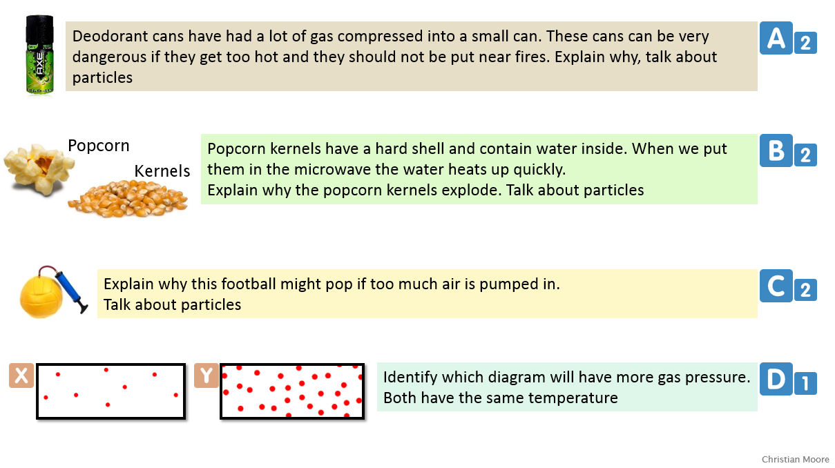
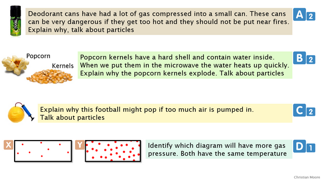
I use the font “Lucida Sans” because it was designed to be easily read on screen. The letters and the spaces between letters are designed for easy recognition. This helps reduce extraneous load. I find that a font size of 20 is ideal, but when I really have to, I can get away with font size 18. If you go to 16, then students at the back with less than perfect sight might have problems; instead of focusing their energy on the content of the question, they use some working memory capacity to decipher the words they can't see well.
Here is an example of some questions in both Lucida Sans (20) and Calibre (20), it's a small but important difference and in the end of the day, switching your font to Lucida Sans is not a lot of work:
Calibre (worse):
Lucida Sans (better):
Presenting short-answer questions
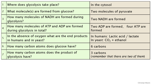
For short-answer questions, it is better to use a table format. The presentation is easier to read; students have clear lines separating each question. Students are also more easily able to relate an answer to the original question. I think this is important and a lesson I have learnt from when my questions and answers were in separate blocks, which added extra load to the working memories when I wanted them to focus their capacity on considering their answers appropriately without just ticking and crossing. Here's two images comparing the old blocked questions and answers, with Questions and Answers in a table format (notice how much harder it is to move your vision from the answer back to the original question:
Blocked (worse):
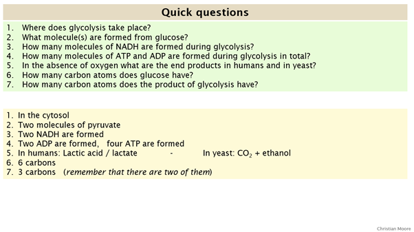
Table format (better):
Separating texts
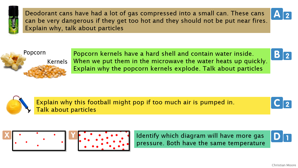
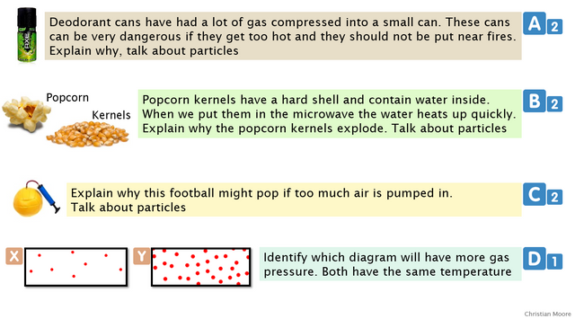
Blocks of text can be separated using colours, but they should be pale pastel colours to allow maximum contrast with any writing.
Here is a comparison of questions in saturated colours (bad), and then in more pastel colours (better). Again, the difference is small but important, and it all adds up:
Saturated colours (worse):
Pastel colours (better):
Multiple images, one format
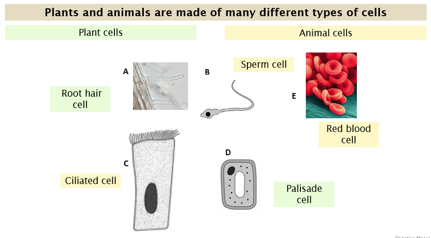
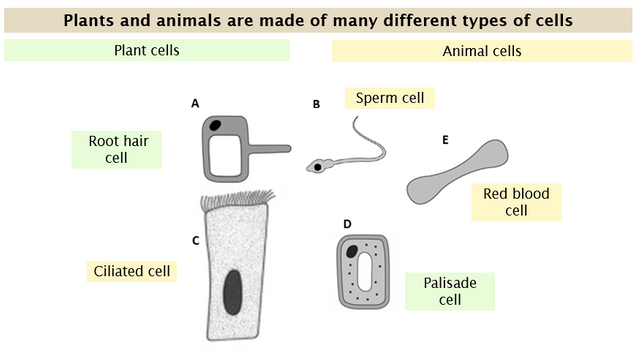
If multiple images are used they should all be the same format (black and white or in colour, cartoon style or photos, for example). All extra noise in the image should be removed so that students can only focus on what is important. In the picture below, I made sure I found pictures of cells drawn in the same style and had only the basic features (Year 7 science), compare this to the image below in which formats are mixed:
Bad:
Good:
Dual coding
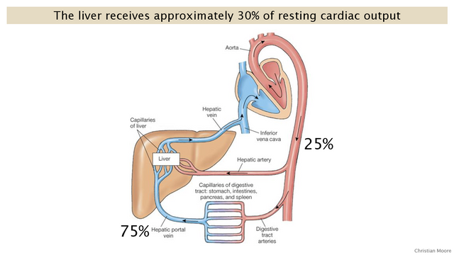
Dual coding is presenting the same material in two formats: visual and oral. The brain works well in this manner and it is beneficial to learning. The images are processed by the visuospartial sketchpad, whereas what we hear is processed by the phonological loop. However, if students have to read any text it is first processed as an image but later, what the students read is spoken in the students head and then processed by the phonological loop. This causes the split attention effect; the students cannot read and listen at the same time.For dual coding purposes, images are great when talked over (with non or minimal text shown), but I can also forget to say certain points I want to make at specific times when teaching. Many teachers will put the text on the slide so they don't forget, but it is better to use the notes section of the powerpoint (found below the slide), so that when presenting I can see it on my computer screen, but the students can’t see it on the board.
Here's what I see on my laptop screen (notice the notes on the right, things I want to remember to say):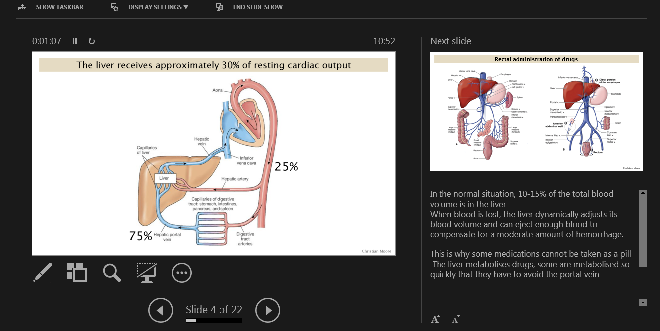
and here is what the students see on the board:
Make a template
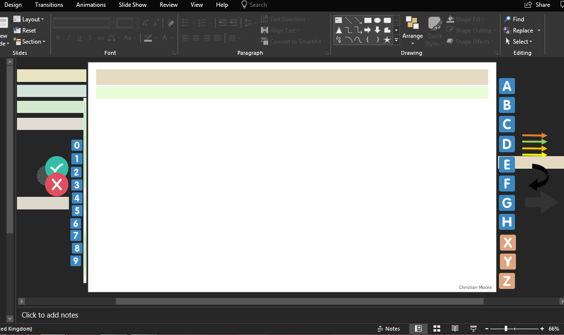
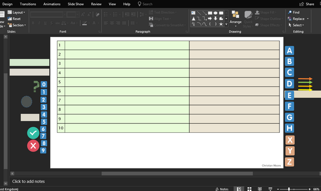
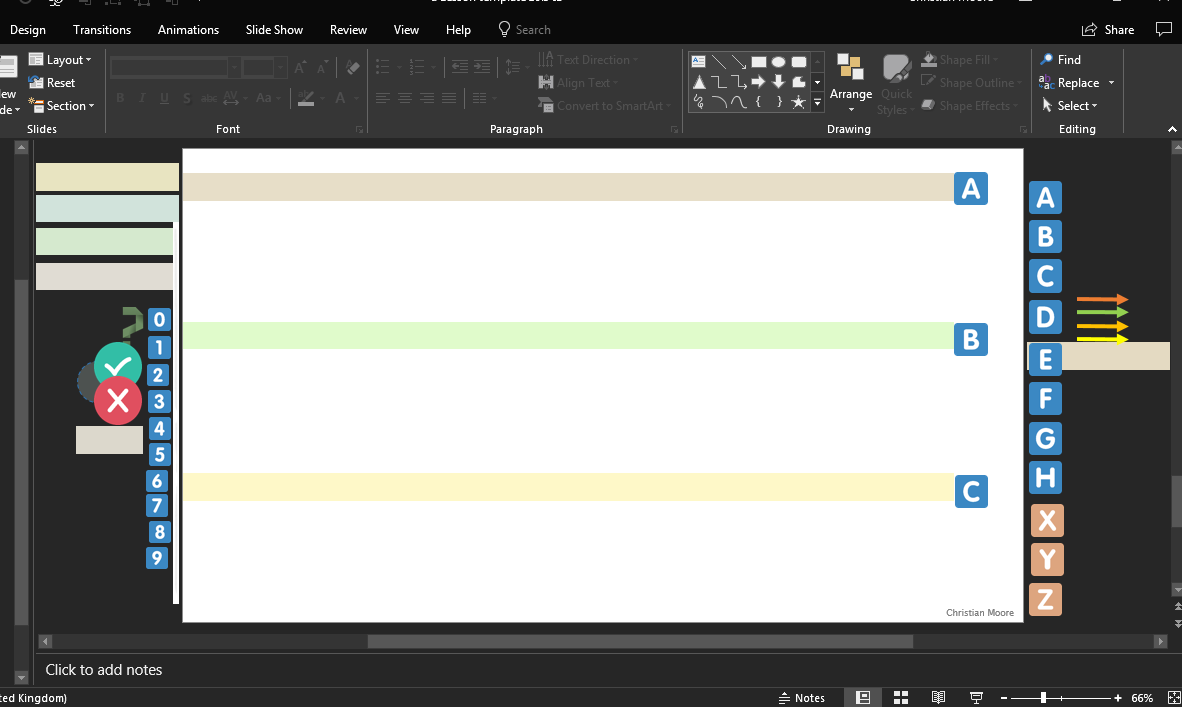
Have everything you need at hand. Just the basics; text boxes already waiting in the right font, font size, and colour. I have arrows of different types waiting to be dragged in, and also a set of numbers and letters for clear labelling. I leave them all around the edge of the slide so they cannot be seen in presentation mode, but I can access them straight away when needed. I have one template file, and I open this to design a new lesson, or set of questions, then I just save it in the correct location. I also have a slide with a table for my short-answer questions, so that I don't have to remake it every time. Here's what I see (the three template slides I need):
Link to my post on why I think Powerpoint is good for teaching
Link to my post on lesson sequencing and reducing intrinsic load