Understanding Bitcoin Price Charts
Whether you already own bitcoin or plan to get some, sooner or later you’ll want to know how much the cryptocoins are worth when converted to your currency of choice.
Later, you may want to know whether to hang onto your coins or to sell them – hopefully making a little profit in the process. However, analyzing price charts and understanding trading terms from the financial world can be rather daunting, especially for the beginner.
This guide serves as a useful primer of the basics.
What is bitcoin’s current price?
The best place to find out the latest price of bitcoin (currency symbol: BTC or XBT) is the exchange you bought them from (Bitstamp, Bitfinex and BTC-e being the most popular exchanges at the moment), or Coindesk’s own Bitcoin Price Index.
Knowing bitcoin’s current price is one thing, but pretty soon you’ll want to know where prices will go in the future.
Methods for predicting price trends
Forecasting price movements of anything traded at an exchange is a risky probabilities game – nobody is right all the time. Many traders have lost lots of money, if not their life savings, into such attempts.
The two main approaches to predicting price development are called fundamental analysis and technical analysis. While fundamental analysis examines the underlying forces of an economy, a company or a security, technical analysis attempts to forecast the direction of prices based on past market data, primarily historical prices and volumes found on price charts.
Where to find bitcoin price charts
To perform technical analysis on bitcoin price and volume history, you’ll need bitcoin price charts that display data in a more readable manner than just plain number tables. Good places to start are the charts on Coindesk’s Bitcoin Price Index.
To start with: a simple price chart
The most basic type of price chart displays prices as a line:
Coindesk Bitcoin Price Index chart
Closing prices of any given period of time (a month, a week, a day, one hour, etc) are used to draw the price line. This kind of chart can be used to get a quick overview of what prices have been doing lately, but traders need more data to draw their conclusions.
Trader’s choice: the candlestick chart
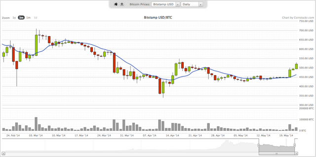
The most widespread type of chart among traders is the candlestick price chart, as seen below:

Coinstackr bitcoin price chart
Candlestick charts display more data than just the closing price: each 'candle' shows the opening price, the lowest and highest price of the given time-period as well as the closing price.
In addition, the color of the candle body indicates whether the closing price was higher than the opening price (usually a green bar, called an 'up-bar’) or lower than the opening price (usually with a red body, called a 'down-bar’).
Image via Wikipedia
Image via Wikipedia
The candlestick chart belongs to the family of OHLC (open high, low close) price charts, but there’s a multitude of other chart types/styles to suit any advanced trader’s preference.
Another type worth mentioning is the non-time based (NTB) range chart. Beginners may find them less intuitive and more difficult to grasp, however.
Candlestick price charts contain a lot of useful information for the skilled trader’s eyes, such as whether a candle’s spread is wide or narrow (illustrates the difference between high and low prices), where the closing price is relative to the high and low etc.
Together with the patterns that groups of candlesticks form, this is what traders base their trend biases on: either bullish (rising prices), bearish (falling prices) or ranging sideways.
Other popular platforms with many of these features are Bitcoinity, Bitcoin Wisdom, Zeroblock and TradeBlock.
source: https://www.coindesk.com/information/understanding-bitcoin-price-charts/
Hi! I am a robot. I just upvoted you! I found similar content that readers might be interested in:
https://comfycrypto.wordpress.com/2017/04/29/reading-charts-and-understanding-price/