Steemit's Front Page UI Makeover - A Very Quick Mockup

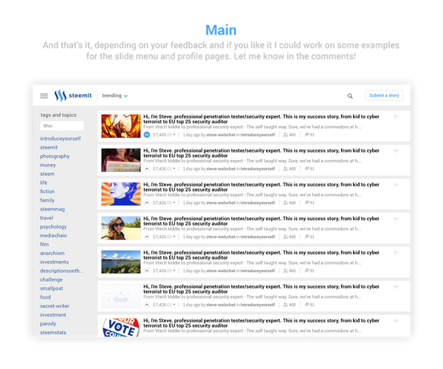
Like I wrote in an earlier post I'm a freelance UI designer with a little too much time in my hands. As many of you I've spend a lot of time browsing Steemit during the last weeks and I felt some simple changes could improve the hierarchy of the front page making the whole layout a little more clean and easy to browse. Let's dig in!


I like!
Thanks! I appreciate it.
Good job I hope some of this is seen by the devs!
Well Steemit is still in beta and I know they will be adding a lot of other features but I was just thinking short term improvements. Thanks for your support!
You're very welcome!
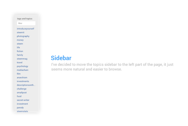
The UI that you propose is very user-friendly. Personally I prefer the tabs on the left instead of right. Kindly like FB page/group tabs. Hope steemit can consider your ideas. :)
so it looks really cool!
Do it))
I'll sure give it a try during the week, thanks for your comment ;)
@ned and @dan, please hire him / her!
well done!
Sidebar better place right. Let it be left to the main content, the right additional options (tags).
Yes you may be right, I mostly focused on other elements so I'll see how it works out when I design the slide menu, thanks for your suggestion.
Great start 😎
great! I like very much to know this.