If you run a small business then you need to read this. A detailed run-down on UK consumer confidence.
As someone who runs a real-life brick n mortar business based in what is essentially a discretionary category of consumer spending, then consumer confidence means a lot to me.
As such I spend a lot of my time watching consumer census data which I use to forecast business decisions and make plans.
You can do this too. It's worth trying because it often yields genuinely good insights about the nature of the economy which you will not discover if you watch generalised statistics such as GDP growth and full time employment stats and so forth.
Another interesting experiment you can do, is to take a chart of your income every month and fit it to the CCI to see exactly how relevant consumer sentiment is to you. If there is a close match, then it's even more important to you to pay attention to this.
This is because consumer confidence is basically a front line abstract and tends to lead weightier statistics like unemployment and GDP.
Why? Because ultimately a lot of the UK economy depends on our willingness to go out and spend money. By spending money we confer employment and opportunity and growth upon the businesses we spend our money in. As such, our spending habits lead employment and gdp growth and such and thus Consumer Confidence indexes based on census data are often better barometers regarding what is happening or going to happen in the economy.
So here is a chart of the UK Consumer Confidence Index from GFK

Wow okay. Volatile right? Certainly. The mob is fickle after all.
Now, one of my core beliefs here is that we can apply technical analysis to this to make projections and to provide evaluations. So lets draw some of the most obvious patterns and trends onto this chart.
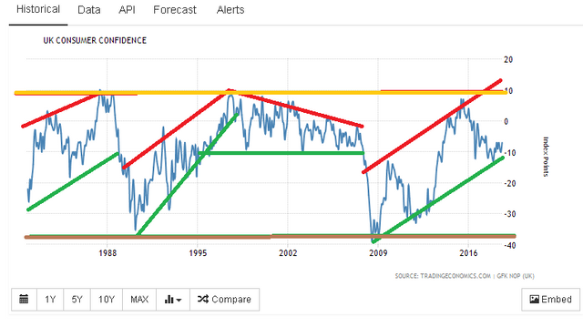
To explain the colour coding:
I use an orange line for the historical highs (this to me would always signify warning that things are a lil too good and can only get worse).
I use a brown line for the historical lows (this to be would be super-bullish as things could only get better from here).
I use a red line for the main trend of negative sentiment.
I use a green line for the main trend of positive sentiment.
You can see that these trends are actually pretty clear with my absolute favourite being the latest one.
I will segregate the market into individual trends and allocate each "era" a letter.
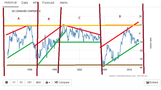
A - Represents the era from the end of the 1970's Labour government when the IMF were called in to the crash of Black Monday in 1991 and the ERM debacle.
B - Represents the era from the end of the Black Monday crash and the post-ERM era to the Labour majority won by Tony Blair in 1997 and the first rout of the Conservative Party.
C - Represents the Blair/Brown era and the first decade of the noughties.
D - Represents our current era in the post-credit crunch world.
Why have I segregated the era's like this? Well, because ultimately you can see that they are ALL (except C - I'll come to that shortly) representative of turning points in consumer confidence and thus consumer habits.
So lets look at A first. This one is particular relevant to analysis of our current period and is worth examining.
I have pulled this period up on a close-up view of the charts
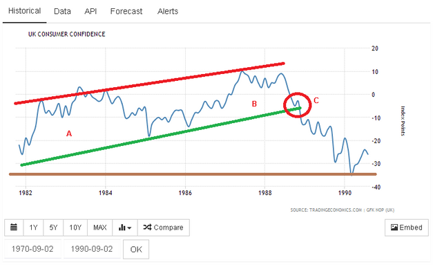
So here what we see is the cycle of the market broken up into two waves - A and B with a contraction period of about -10 in consumer confidence turns in the middle. Finally, we reach C when the market turns sour and the ERM crisis begins and the trend is violated after a small pullback and sentiment capitulates and collapses.
The waves A and B occur due to the way markets operate on cycles. This is normal as is the contractionary period in between them. What's interesting about the contractionary period is that it did not cause a recession in official terms and is not listed as being one. However, I would certainly argue that it was ultimately a -20 drop and was certainly a "Consumer Confidence Recession" if not an official GDP recession.
Now try to keep this in mind as we go through a breakdown of the different periods, as this section of the CCI is very relevant to our present situation.
The next era represents the minimum of the market in around 1991 through to the post-millennial era.
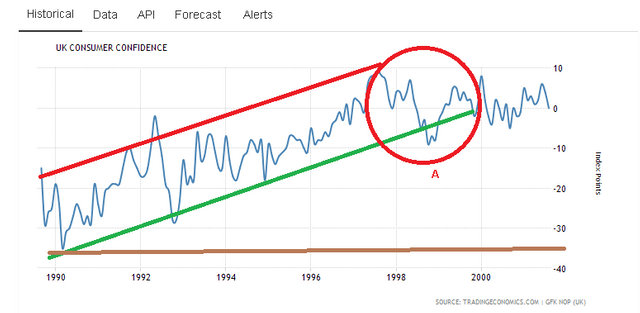
This was a fantastic rally from the lows of Black Monday through to the end of this area around the year 2000 when consumer confidence collapses as a result of the global early 2000 era recession (https://en.wikipedia.org/wiki/Early_2000s_recession).
It is worth noting that the UK officially avoided a recession though we can clearly see the fingerprints of it on the CCI here as the 90's boom era is graphically brought to an end with a -10 consumer confidence drop resulting in the end of the steady CCI growth of the 90's marked out at A.
So although we avoided being dragged down to the bedrock point at -40 again, it's worth noting that external events and their impact upon the CCI still manage to effectively end the prevailing trend and begin a new one at A.
This chart represents the noughties through to the credit crunch. Unique about this chart is the nature of it.
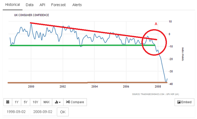
We see no real evidence of any clear market cycle. Rather, the chart effectively moves sideways for a whole decade with a slow erosion of peak optimism and a persistent bout of -10 scores.
You can see how peak optimism gradually erodes down to the main static support line over the course of the chart as demonstrated by the red downward resistance line. Shortly before it meets the static support, there is a crisis and confidence capitulates and collapses in a linear fashion down to the -40 point (Which is where the credit crunch began).
One must remember her what the credit crunch actually was. The pipeline of consumer credit was turned off very quickly as banks stopped lending and credit controls were radically tightened up. This made discretionary spending all but impossible for lots of households.
I suggest that this is ultimately what we're seeing in the red here. The slow downslope was due to a gradual tightening of credit controls in the country. When we get to a de facto credit crunch, then everyone panics and the markets collapse aggravating the already plunging consumer confidence index.
This brings us neatly to our final chart and present times - the 2008 to 2018 period.
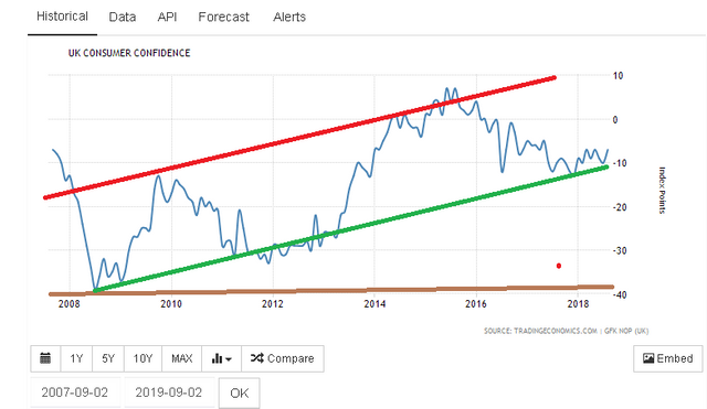
Now this displays the rout back up to optimism from the -40 drop we saw in the credit crunch.
This shows a beautiful set of two distinct waves here displaying the market cycle very neatly and this is what I would expect to see in a properly functioning market.
You may also remember, I told you to keep the first chart in mind. This is because it is highly comparable to this final one.
Lets put them on top of each other for comparison purposes.


The interesting thing here is that we have two very similar scenarios - both politically and both in terms of the technicals of the charts. History has literally repeated itself and I'll explain why. I'll also explain why things are different this time.
In both instances, the big drop at the end of each chart which gives birth to a new technical era of Consumer Confidence was caused by Eurozone politics. In the early 90's, it was the ERM debacle. In the 2010's it is again... the debacle over Brexit.
We also have very clear view of the market cycle in each. In 1990... this ended up with a violation of the trend and collapse as the UK crashed out of the ERM.
However this time things are different and we are resting very clearly on support without actually violating it as we did in 1990.
If I give you a closeup of the recent CCI fall, then you'll see that this support line has been tested not once but twice (I also highlight the immediate impact of the Brexit vote upon the CCI here in the red circle).
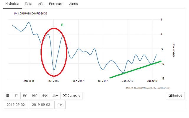
Now normally I would read this as a bullish sign for the support wave because ultimately it has been tested not just once but twice and so far has rebounded.
I estimate that this wave is gaining about 2.5 points per year judging from the performance of it so far averaging out it's gains since the credit crunch.
This means that the UK is at the make or break point which ties in to what is going on politically. If we see continued improvement in things nationwide as well as on the Brexit debate and trade and all other important areas then we should easily make it back to the peak of consumer optimism within 4 years IF THE TREND DOES NOT BREAK.
To reiterate that point, for things to improve for the country and for businesses then we need the big green support line to continue it's course and successfully repel negative sentiment.
This is what you must watch as a business because if the line breaks we will almost certainly head into recession. If the line holds, then we can expect a boom.
Currently, my business is expanding so I am bullish because my logic is that save for some unforeseen twist of fate then in real terms the panic has already been worn-out and I think things can only get better as we are the bottom of what will hopefully be a third wave of consumer optimism (to clarify, just because the 1980s CCI had two waves, does not mean that this one can not have 3) which will take us into peak consumer confidence again.
I could be wrong, but this is the kind of judgement which you must make as a business.
IGNORE the doom and gloom or promises of the land of milk and honey from the press. All that matters here is how robust consumer confidence is. I will be giving further updates as I go.