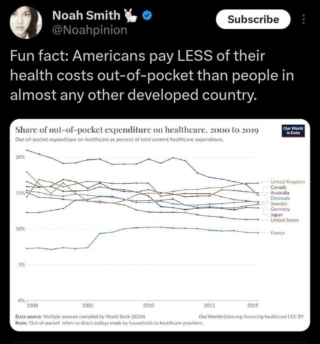
Healthcare costs by country.

This chart is very misleading. The US has higher healthcare expenditures, so if you looked at raw out of pocket spending rather than as a percent of healthcare expenditures, we'd be higher.
We also have lower healthcare utilization than these countries- we go to the doctor fewer times and spend fewer days in the hospital. In part due to access and cost issues. So the US being lower is in part due to barriers to healthcare.
And this data is grouping all out of pocket spending regardless of type. So dental care, prescription drug spending, long term care spending, etc is included with inpatient and outpatient care. It is why Canada and the UK are so high even though they have no patient charges for physician/hospital services.