Contribution For KISS Launcher New Logo
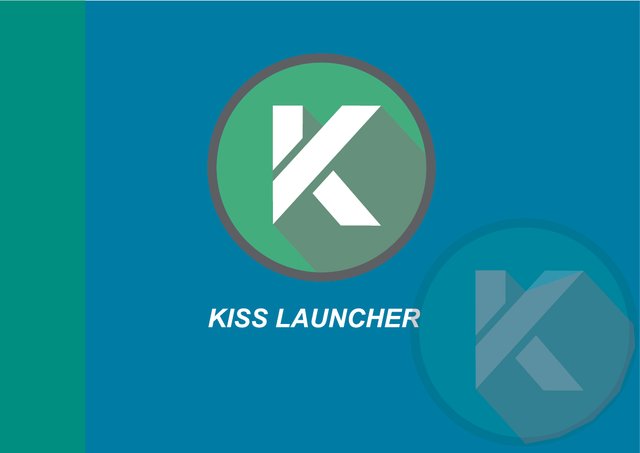
Details
Hello there,
Today I want to contribution for the good open source application which I search in playstore that is KISS Launcher. This apps is a launcher for android and its free, you can check the code in here. KISS Launcher allows Android users to simplify the home of their interface, to purify their screens and access the functions they need as quickly and as simply as possible. KISS Technology has been developed to allow users to save time and battery power. You can read the full description in here. I think the logo is need to change to the new logo because its too simple. So in this section I want to contribute this app logo with many variation and make this app logo look better than before.
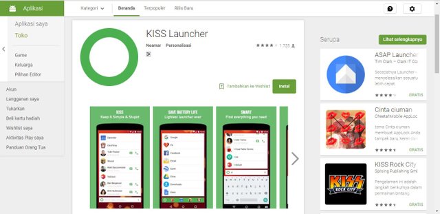
Original Icon/Logo
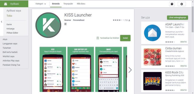
Proposal Icon/Logo
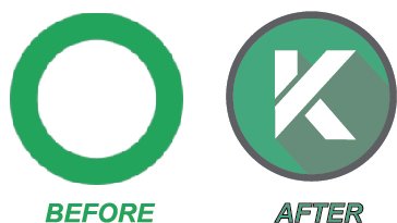
Comparison of original and proposal logo
Logo Variations and colors
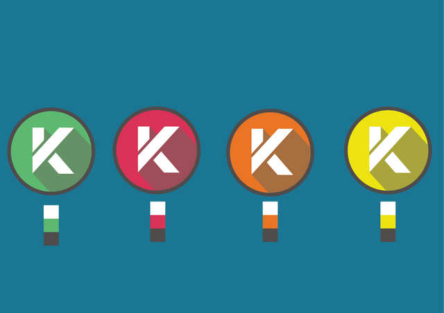
In this contribution I choose the green color because this color is looking good for this apps and look elegant.
Code Color of Logo Variation
FEFEFF,4E4A4A,5DB96F
FEFEFF,4E4A4A,DA3056
FEFEFF,4E4A4A,E97424
FEFEFF,4E4A4A,ECE113
Logotypes
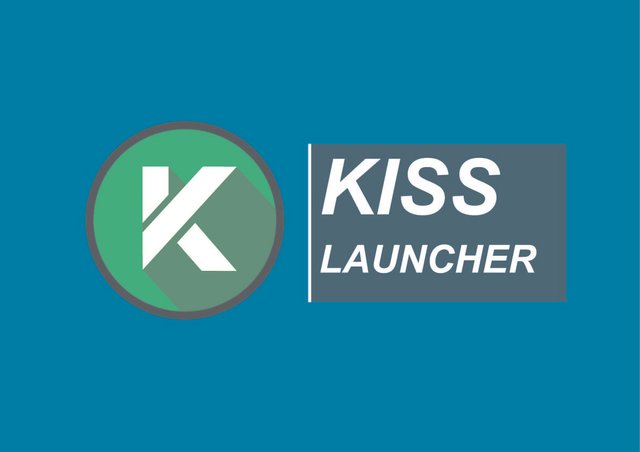
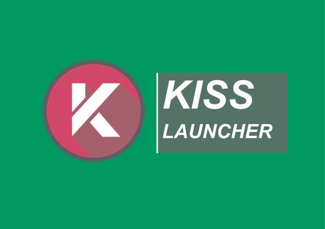
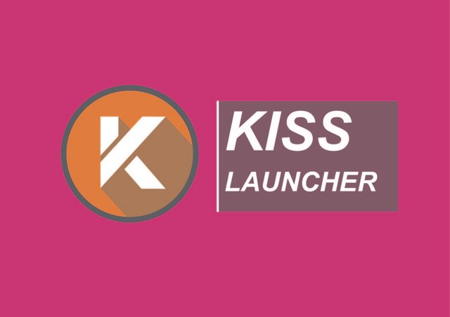
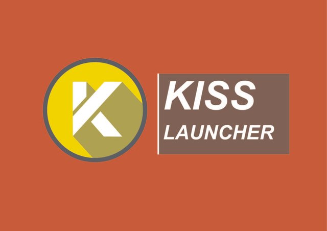
Sizes
144px
256px
512px
Font Used
Arial download
Benefits / Improvements
I made this logo with green, dark grey outline of the logo and still circle with add a modified "K" character that meaning is KISS. With Flat Design of the new logo it looks Elegant, Simple and good to look at. Im sure that if this logo is choose for this apps it can make the costumer of playstore interest to use this app.
Tools
In this part, I use Adobe Illustrator CS6 for design this logo and this is the first time I use it. There are so much vector tools that support me to make this logo.
Step to create the logo
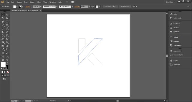
First I use pen tool to make modified "K" character
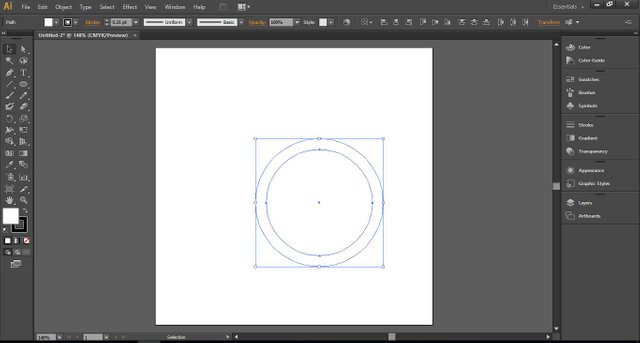
Next I make two circles to make the outline of logos and then use exclude technique in pathfinder tools
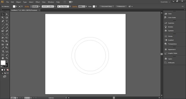
Result of exclude in pathfinder tools
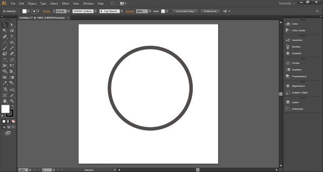
Then I give the dark grey color
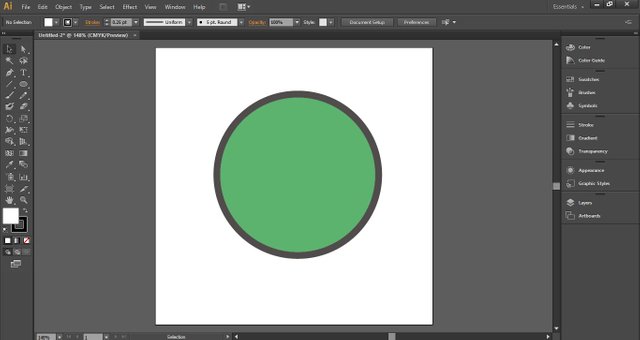
Next time I create the circle inside the first circle and give it a green color
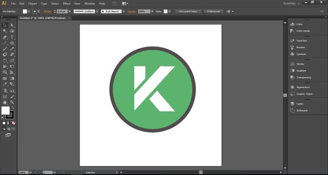
Then I add the "K" character the first time I made and put on the top of the layer
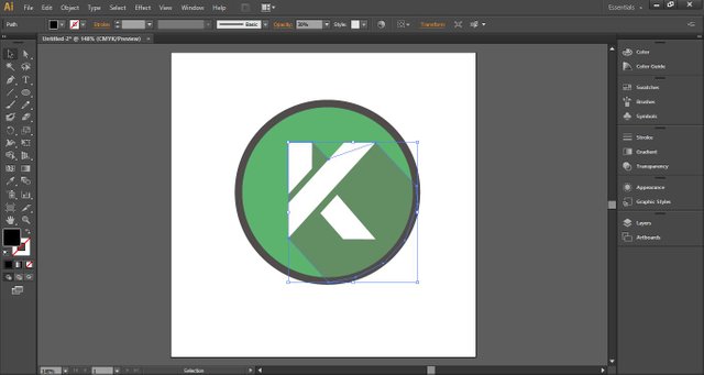
Then I make the shadow
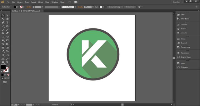
Result of the logo
Original files
All editable files are available in GDrive
Posted on Utopian.io - Rewarding Open Source Contributors


@adit9, I always try to support who contribute to open source project, upvote you.
thanks @steemitstats
Congratulations @adit9! You have completed some achievement on Steemit and have been rewarded with new badge(s) :
Click on any badge to view your own Board of Honor on SteemitBoard.
For more information about SteemitBoard, click here
If you no longer want to receive notifications, reply to this comment with the word
STOPUtopian moderator
sorry mod, Im not understand.
Thanks
all stuff around logotype
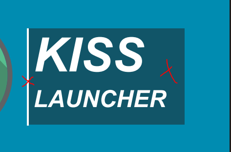
one or the other
no
Your contribution cannot be approved because it does not follow the Utopian Rules.
You can contact us on Discord.
[utopian-moderator]