You are viewing a single comment's thread from:
RE: knacksteem.org dashboard - New UI Design
Thank you for your contribution,
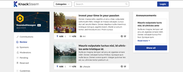
I really like the simlicity and readability of your design. Its easy to read and navigate.
Only thing I dont like is using grey not only on background, but important elements as well, this makes them blend to background and reducing readability a little.
I would advise giving them white background:
Your contribution has been evaluated according to Utopian policies and guidelines, as well as a predefined set of questions pertaining to the category.
To view those questions and the relevant answers related to your post, click here.
Need help? Write a ticket on https://support.utopian.io/.
Chat with us on Discord.
[utopian-moderator]
Thank you for your review, @andrejcibik!
So far this week you've reviewed 6 contributions. Keep up the good work!
Thank you for your feedback, really appreciate it. I have to agree: it makes the readability slightly worst. The reason why i used grey it is easier to the eye: most of the people hate pure white and pure black, because it hurts their eye.