Hey @zuur ,
Thank you for the contribution, I liked how you used negative space on logo design. However, I think that you can provide better presentation. Please spend more time when you provide presentation because as you know, we are designers and we need to present our work as best as we can do.
You can;
- show safety area of your logo design,
- the details of color palette which you used,
- suitable and better mock-up design.
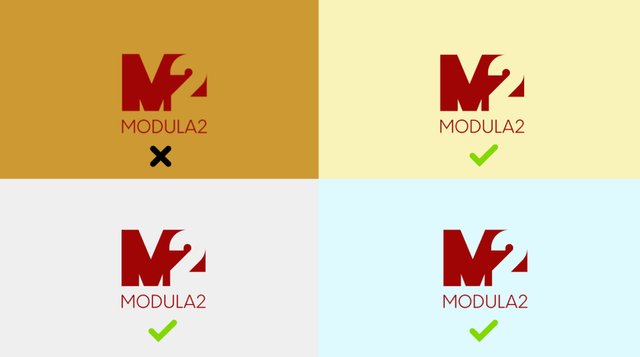
Also, contrast is not enough on your cover page. You used dark background and foreground together. It reduces visibility and professional appearance.

Your contribution has been evaluated according to Utopian policies and guidelines, as well as a predefined set of questions pertaining to the category.
To view those questions and the relevant answers related to your post, click here.
Need help? Write a ticket on https://support.utopian.io/.
Chat with us on Discord.
[utopian-moderator]