Moving of senders message to the right side of the chat page.
Components
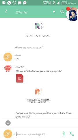
I notice both sender and receivers message are on the left hand side of the chat page which do not allow user to quickly identify his/her message from that of the receiver
Proposal
I suggest the senders message should be move to the right hand side of the chacolour. , and should be in a different colour from that of recivers reply, while that of the receiver should remain on the left hand side for a proper identification of messages.
Mockups / Examples
Present state of the arrangements

Propose example/how it will look like


Benefits
**It will allow sender to know his/her mesaage from the reply of the receiver
**It will just look like a new and nice arrangement for the chat room especially with a different colour.
*It won't allow mixed up in the message room
*There will be clear differences from a message sent and the received ones .
*It won't allow mixed up in the message room
*There will be clear differences from a message sent and the received ones .
Posted on Utopian.io - Rewarding Open Source Contributors
Thank you for the contribution. It has been approved.
Provide more benefit for the suggested feature on the project
You can contact us on Discord.
[utopian-moderator]
Hey @hadex I am @utopian-io. I have just upvoted you!
Achievements
Suggestions
Get Noticed!
Community-Driven Witness!
I am the first and only Steem Community-Driven Witness. Participate on Discord. Lets GROW TOGETHER!
Up-vote this comment to grow my power and help Open Source contributions like this one. Want to chat? Join me on Discord https://discord.gg/Pc8HG9x