Learn Bootstrap 4 - Part 1 (Introduction)
Learn Bootstrap 4 -Part 1 (Introduction)
Hey everyone! I Bootstrap 4 is latest version of Bootstrap. I found it very easy and useful in front-end designing of websites. So, I decided that I will teach it through tutorials to all of you.S First of all I want to tell you that this series is for beginners who are interested in front-end design of in web development. I will be helpful for even those people who cannot not done advance work in HTML. It will be helpful to those experts who done same work using HTML, CSS and JavaScripts but this series of tutorial can save their time and make them easy. I will discuss about all aspects of Bootstrap 4 from basics to end one by one. At the end of this series of tutorials you will find it like a complete book through which you can able to design a responsive front-end of a complete website in few hours with low efforts.
In this post, i will discuss about following:
- Basic understandings of Bootstrap 4.
- How to code by using Bootstrap 4.
- Some code examples.
- Some features like grid system, typography, colors, images etc.
Basically Bootstrap is not a language but a framework which is combination of following:
- HTML
- CSS (Design Templates)
- JavaScript (Plugins)
I try to explain it with an example. If you want to make a tea, you will need three basic things: Tea bags, Sugar and hot water. There are two options for you: First option is buy built-in sugar and tea bags from any shop or store, the 2nd option is that go to the fields and get sugar cane then go to the sugar factory and and try to make sugar from sugar cane and then go back to home to make tea (same for tea bags). So, which is easy option for you? Obviously first option, why? because through first option you can save your time and efforts and can make tea easily just in minutes. But if you follow second option then you can waste may be many days to make tea ( that is not a good way).
If I apply this example to Bootstrap then you will find that there are two options for you to make a front end of a website: first is that, use Bootstrap framework which has built-in HTML, CSS and JavaScript functionalities. The second option is that make a front-end of website by using HTML, CSS and JavaScript. So, which option is better? obviously the first one (like a tea example). Why? because it can save your time, efforts and can give better results.
So, we will learn from this example that
Bootstrap is:
- Faster
- Easier
- Responsive
Requirements
- Basic knowledge of HTML.
- Simple Computer System.
- Text editor e.g. notepad.
Difficulty
- Basic
- Intermediate
Environment Setup
Just Downlowd Notepad++ and install it in your system for windows. ( You can also use simple notepad provided by Microsoft Windows)
The second step is related to Bootstrap. There are two ways to get Bootstrap 4.
- You can download Bootstrap 4 from this https://getbootstrap.com/docs/4.0/getting-started/download/
- You can add it from CDN:
For CSS, add following line of code in your head tag:
<link rel="stylesheet" href="https://maxcdn.bootstrapcdn.com/bootstrap/4.0.0/css/bootstrap.min.css">
For J Query Library, add this line of code in head tag:
<script src="https://ajax.googleapis.com/ajax/libs/jquery/3.3.1/jquery.min.js"></script>
For Popper JavaScript, add this line of code in head tag:
<script src="https://cdnjs.cloudflare.com/ajax/libs/popper.js/1.12.9/umd/popper.min.js"></script>
For JavaScript, add this line of code in head tag:
<script src="https://maxcdn.bootstrapcdn.com/bootstrap/4.0.0/js/bootstrap.min.js"></script>
You can get CDN from this Link also.
When you successfully added CDN, it will look like following:
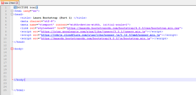
In above screenshot, I have added an extra line:
<meta name="viewport" content="width=device-width, initial-scale=1">
What is purpose of this line?
Basically, Bootstrap 4 supports responsive designs to mobile devices, above meta tag enable this responsive functionality in design. This tag ensures proper rendering and touch zooming.
Concept of Grids in Bootstrap 4
We already know that Bootstrap is easy to use. It easiness allow us to control the screen efficiently and effectively. For this purpose, Screen is divided into 12 columns (1x12) or (2x6) or (3x4) or (4x3) or (6x2). It means that we can use any desired number of columns for our content. The maximum number columns should be equal to 12 but the there is no limit for minimum number of columns you use. I found an image from google images to create proper understandings of grid system:
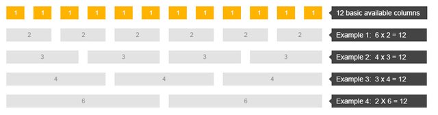
You can see in this picture what i have explained above.
Remember it, this grid system is responsive, it means the grids can re-arrange automatically according to the size of screen.
Now I will discuss about some Bootstrap 4 classes that are used to define grids:
- .col- is used for extra small devices.
- .col-sm- is used for small devices.
- .col-md- is used for medium devices.
- .col-lg- is used for large devices.
- .col-xl- is used for extra large devices.
For details about size of devices, you can go to this Link
Now i will give you a basic example that how you can divide screen into three equal columns:
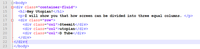
Write above code in body tag. I also give code here for you so that you can copy it easily:
<!DOCTYPE html>
<html lang="en">
<head>
    <title> Learn Bootstrap (Part 1) </title>
    <meta charset="utf-8">
    <meta name="learnwithme" content="width=device-width, initial-scale=1">
    <link rel="stylesheet" href="https://maxcdn.bootstrapcdn.com/bootstrap/4.0.0/css/bootstrap.min.css">
    <script src="https://ajax.googleapis.com/ajax/libs/jquery/3.3.1/jquery.min.js"></script>
    <script src="https://cdnjs.cloudflare.com/ajax/libs/popper.js/1.12.9/umd/popper.min.js"></script>
    <script src="https://maxcdn.bootstrapcdn.com/bootstrap/4.0.0/js/bootstrap.min.js"></script>
</head>

<body>
<div class="container-fluid">
  <h1>Hey Utopian!</h1>
  <p>I will show you that how screen can be divided into three equal columns. </p>
  <div class="row">
    <div class="col">Steemit</div>
    <div class="col">utopian</div>
    <div class="col">D Tube</div>
  </div>
</div>
</body>
</html>
For above code, you will get following output:
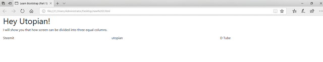
In above image, you can see that screen has divided into three equal columns.
Now its time to move forward. Now I am going to tell you that how you can divide your screen in two unequal columns and i also introduce the concept of colors in Bootstrap 4.
You can see the code written in my notepad++ in following image:
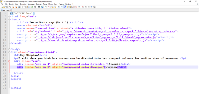
I am also sharing this code here because it will be easy for you to copy this code:
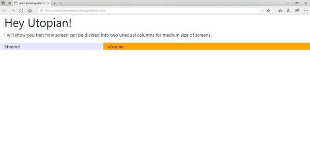
<div class="container-fluid">
  <h1>Hey Utopian!</h1>
  <p>I will show you that how screen can be divided into two unequal columns for medium size of screens. </p>
  <div class="row">
    <div class="col-sm-4" style="background-color:lavender;">Steemit</div>
    <div class="col-sm-8" style="background-color:Orange;">utopian</div>

  </div>
Just paste above code in body tag.
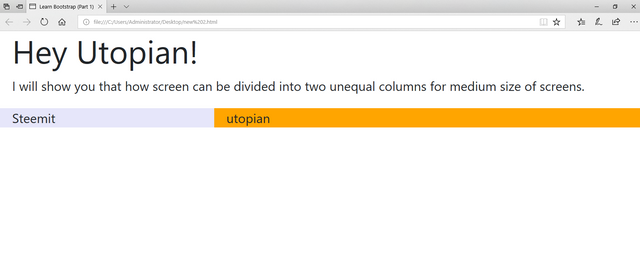
The output of this code will be:
Colors
You can clearly see in above last picture that the screen has divided into two unequal columns and the concept of colors also introduced in above example of code. Above color concept was for background colors. You can also use colors for text. For text colors just add below classes in div tag.
- .text-muted
- .text-primary
- .text-info
- .text-success
- .text-danger-
- .text-warning
- .text-secondary
- .text-white
- .text-light
- .text-dark
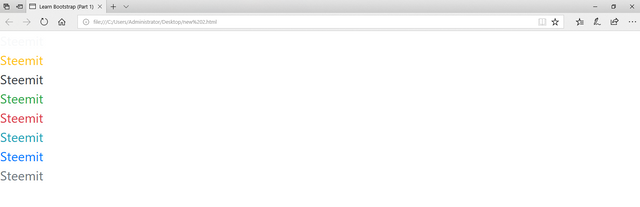
you can use these classes like below:
<div class="text-light"> Steemit </div>
<div class="text-warning"> Steemit </div>
<div class="text-dark"> Steemit </div>
<div class="text-success"> Steemit </div>
<div class="text-danger"> Steemit </div>
<div class="text-info"> Steemit </div>
<div class="text-primary"> Steemit </div>
<div class="text-secondary"> Steemit </div>
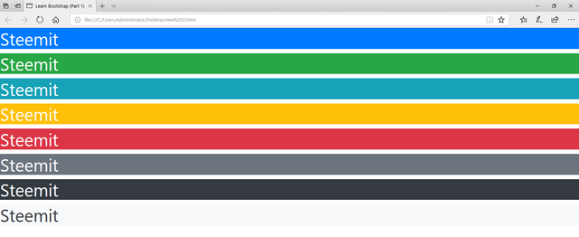
When you will run above code, you will find following output:
You can apply colors also to background of text by using below code:
  <h2 class="bg-primary text-white">Steemit</h2>
  <h2 class="bg-success text-white">Steemit</h2>
  <h2 class="bg-info text-white">Steemit</h2>
  <h2 class="bg-warning text-white">Steemit</h2>
  <h2 class="bg-danger text-white">Steemit</h2>
  <h2 class="bg-secondary text-white">Steemit</h2>
  <h2 class="bg-dark text-white">Steemit</h2>
  <h2 class="bg-light text-dark">Steemit</h2>
You will find following output after running above code:
How Bootstrap 4 is Responsive?
In below image, you can see the output of full screen of my desktop and follow the text and colored columns:
Now I am minimizing the size of screen and again follow the text and colored columns in below image:
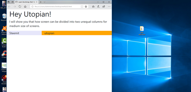
You can clearly see in above image that text and columns automatically adjusted themselves according to the size of screen.
Now i am more minimizing the size of scree to make it clear that how Bootstrap 4 is responsive, See below image and again follow the text and colored columns:
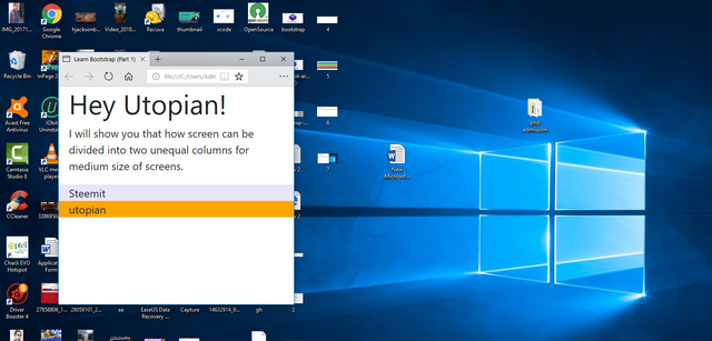
Oh wow! you can see that how magically everything is adjusted automatically according to the size of screen, yeah this is Bootstrap 4. I am not just teaching you but I am also promoting this magical framework.
How Bootstrap 4 is easy time saving?
I think, there is no doubt about that Bootstrap 4 is easy and time saving framework. You can do same thing without Bootstrap but it will take many days, more efforts and low results. But if you are using Bootstrap then you can do all of it in hours. It saves your time, efforts, and give high results.
You have learned that:
- What is Bootstrap?
- How to start with start with Bootstrap 4?
- What is concept of grids in Bootstrap 4?
- What are classes used for Grid system?
- What are color classes and how to use them?
- How Bootstrap 4 is Responsive?
- How it is easy and time saving?
But this was just basic understanding of Bootstrap 4. We have done nothing but just understood Bootstrap 4. There are lot of things remaining in Bootstrap 4. We will learn in next tutorials about tables, Images, Buttons, alerts, Badges etc etc. And also make impressive navigation bars, headers, footers and contents also. believe me we will design magical complete templates on different topics like education, e commerce, business, dogs etc. I hope you enjoyed it a lot, and wait for my new tutorials of this series. Really, I enjoyed a lot on utopian-io. I have just posted 2 times and I found it extremely well. Thanks for your time, See you again :)
References
Posted on Utopian.io - Rewarding Open Source Contributors
Your contribution cannot be approved because it does not follow the Utopian Rules.
Related Rule:
Suggestions:
You can contact us on Discord.
[utopian-moderator]
Congratulations @hraaqib007! You received a personal award!
You can view your badges on your Steem Board and compare to others on the Steem Ranking
Do not miss the last post from @steemitboard:
Vote for @Steemitboard as a witness to get one more award and increased upvotes!
Congratulations @hraaqib007! You received a personal award!
You can view your badges on your Steem Board and compare to others on the Steem Ranking
Do not miss the last post from @steemitboard:
Vote for @Steemitboard as a witness to get one more award and increased upvotes!