New design for ethtags and subsequent bugfixes
Firstly, some short info about ethtags. Ethtags is a project with the aim to give the user the ability to link his name and a short text to his ethereum address. This is called a dogtag. The user can then share his dogtag or use it as a signature anywhere, where they support iframes. The whole project in currently running in an ethereum test network called Ropsten. Feel free to check it out right here.
I thought it was about time to move away from the stylesheet which is provided as an addon to the meteor dapps, so I have created a completely new design for the whole ethtags project. It took quite a long time and a bunch of tinkerin before I ended up with a nice design which I like.
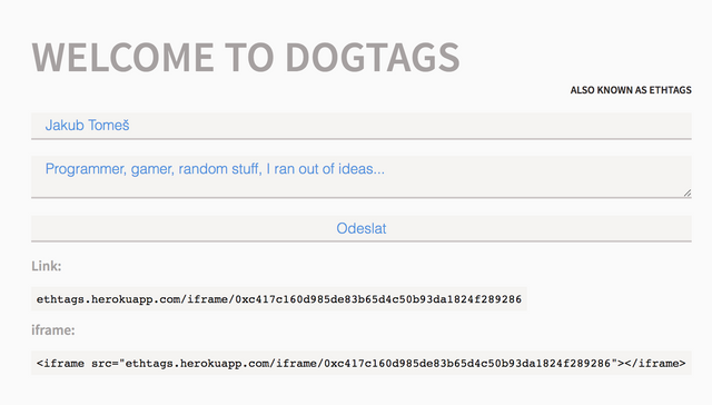
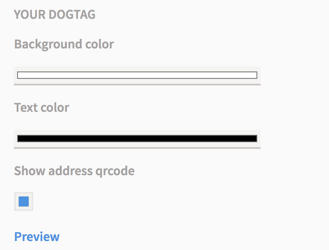
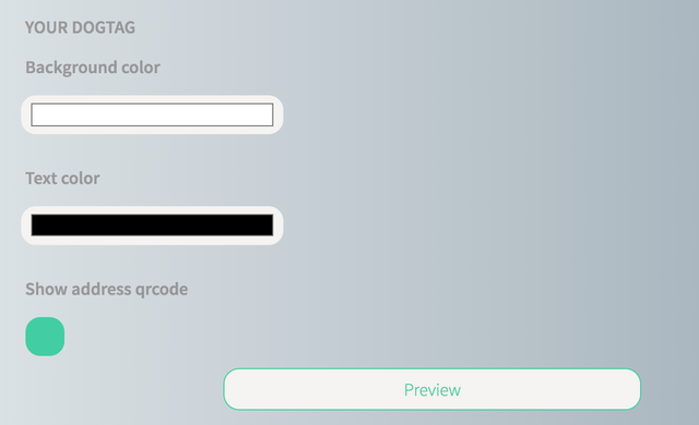
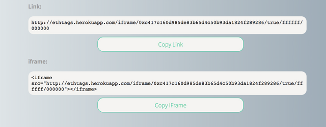
I will start by providing some before and after screenshots:
Before
The main UI

Style tab

After
The main UI

Style tab

Bottom containing the links

All new menu

Edit: Some posts do not open the links directly on the right files in the commit, so I have listed the names of the files, because the commit is a little messy. It works in chrome.
Here is the link to the commit (main.less). You can see that nearly 90% of the main.less file has changed. I think that the new style is a bit less sterile and everything seems to fit together much more than with the old one.
I have also introduced two new sections one section which will serve as a FAQ in the future and one section which tells you more about the project, this also lead to introduction of the new menu, which was not present before. You can check the changes right here (main.html).
Bugfixes
All of these changes led to some new and interesting bugs and I also managed to track down and fix one persisting issue. Here is a short list:
- Some components of the page changed width during page load and after changing styles. This issue was caused by reactive variables loading in during the page load and afterwards. The fix was rather simple after I tracked this bug down. I have set the reactive variables up with dummy values so their length does not change. Link (main.js, lines: 15, 16, 135).
- Fixed a bug which was cause by addition of a button instead of a link to open a preview of a dogtag. The button was moved outside of the form and all its events were disabled. Link
- Tweak to some colors in order to increase contrast and legibiliti. Link
- Added background to the about page in order to make the text more legible Link
Posted on Utopian.io - Rewarding Open Source Contributors
Thank you for the contribution. It has been approved.
Don't hesitate to showcase some of your code in your posts. We're about open source after all.
And yes, it still works. ;-)

You can contact us on Discord.
[utopian-moderator]
Hey @jtomes123 I am @utopian-io. I have just upvoted you!
Achievements
Community-Driven Witness!
I am the first and only Steem Community-Driven Witness. Participate on Discord. Lets GROW TOGETHER!
Up-vote this comment to grow my power and help Open Source contributions like this one. Want to chat? Join me on Discord https://discord.gg/Pc8HG9x