Scrollspy Tutorial With Bootstrap

Ever guns you open a website and there is a link menu navigation that will update or look active when we are in a certain part of our time scroll? This can be called a Scrollspy. Scrollspy is usually suitable for web singling page, to let users know where the position or section is being read by them.
Well Bootstrap turned out to have tools or plugins like this. Using CSS and Javascript from Bootstrap, today we will make a scrollshy. This tutorial will a simple way to do Scrollspy, so you know easily how implement it in web documents.
In this tutorial we will need 2 elements, the first element is the navigation menu. And the second is Content (can be articles, sections, div). So let's get started.
Create a new HTML document, and add name (up to you) demoscrollspy.html
Import Bootstraps.
The first thing we should do is import the bootstrap, both css and javascript. We also need to use jquery.
<link rel="stylesheet" href="http://maxcdn.bootstrapcdn.com/bootstrap/3.3.5/css/bootstrap.min.css">

<script src="https://ajax.googleapis.com/ajax/libs/jquery/1.11.3/jquery.min.js"></script>

<script src="http://maxcdn.bootstrapcdn.com/bootstrap/3.3.5/js/bootstrap.min.js"></script>
The element we need in Scrollspy is navigation (), I hope everyone can already create a nav with Bootstrap. Navigation that we will make is Pils type, that is navigation with rounded background.
<nav id="Scrollspy">

<ul class="nav nav-pills nav-stacked">

<h3><strong>Side Navigation</strong></h3>

<li><a href="#about">About Me</a></li>

<li><a href="#followme">Follow Me</a></li>

</ul>

</nav>
In this menu we give nav list of links that we will address to our content section. In this case I use 2 section which is About and also Follow. To note we add 'i (d = "Scrollspy")', this selector is as a marker that this navigation menu will be created scrollspy. And also we need to insert 'id' from each section into link 'href'.
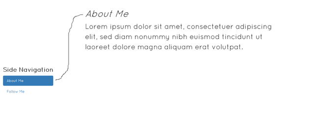
Let not confused, this section in the tutroial page this time:
<div id="about">

<h1><em>About Me</em></h1>

<p>Lorem ipsum dolor sit amet, consectetuer adipiscing elit, sed diam nonummy nibh euismod tincidunt ut laoreet dolore magna aliquam erat volutpat.</p>

</div>

<div id="followme">

<h1>Follow Me</h1>

<p>Lorem ipsum dolor sit amet, consectetuer adipiscing elit, sed diam nonummy nibh euismod tincidunt ut laoreet dolore magna aliquam erat volutpat.</p>

</div>
You see? link "About Me", pointing to #about. So it will show the section with id = about. You get the idea, right?
And that's just the element we need, if you want to add a section, then you just have to create a new div with id, and also add to list nav menu that will go to div we make.
The last thing we need is, add the data-spy and also the data-target in the tag. This is a way to call the scrollspy library of bootstrap javascript. We just need to call him, and let Bootstrap work.
<body data-spy="scroll" data-target="#Scrollspy">
data-target on the body should / need we navigate to our website navigation links.
That's it, here's full source code from this tutorial demo. (Of course already given some style)
FULL SOURCE CODE
<!DOCTYPE html>

<html lang="en">

<head>

  <title>Demo Bootstrap Scrollspy</title>

  <meta charset="utf-8">

  <meta name="viewport" content="width=device-width, initial-scale=1">

  <link rel="stylesheet" href="http://maxcdn.bootstrapcdn.com/bootstrap/3.3.5/css/bootstrap.min.css">

  <link href='http://fonts.googleapis.com/css?family=Quicksand' rel='stylesheet' type='text/css'>

  <script src="https://ajax.googleapis.com/ajax/libs/jquery/1.11.3/jquery.min.js"></script>

  <script src="http://maxcdn.bootstrapcdn.com/bootstrap/3.3.5/js/bootstrap.min.js"></script>

  <style>

  body {

      font-family: 'Quicksand';

  }

  ul.nav-pills {

      top: 250px;

      position: fixed;

  }

  div.col-sm-9 div {

      height: 500px;

      font-size: 28px;

      padding: 30px;

  }

  </style>

</head>

<body data-spy="scroll" data-target="#Scrollspy">

<div class="container-fluid" style="height: 250px;">

  <center>

    <h1>DEMO Bootstrap Scrollspy </h1>

    <h3>by: hasyemiraws</h3>

  </center>

</div>

<div class="container">

  <div class="row">

    <nav class="col-sm-3" id="Scrollspy">


      <ul class="nav nav-pills nav-stacked">

        <h3><strong>Side Navigation</strong></h3>

        <li><a href="#about">About Me</a></li>

        <li><a href="#followme">Follow Me</a></li>

      </ul>

    </nav>

    <div class="col-sm-9">

      <div id="about">

        <h1><em>About Me</em></h1>

        <p>Lorem ipsum dolor sit amet, consectetuer adipiscing elit, sed diam nonummy nibh euismod tincidunt ut laoreet dolore magna aliquam erat volutpat.</p>

      </div>

      <div id="followme">

        <h1>Follow Me</h1>

        <div class="row">

           <div class="col-sm-4">

            <img src="http://ajr.org/wp-content/themes/AJR-theme/images/twitter-icon.png" class="img-responsive">

            <h2>@hasyemiraws</h2>

           </div>

           <div class="col-sm-4">

            <img src="http://www.allwesttrophies.com/v/vspfiles/assets/images/facebook_round_logo.png" class="img-responsive">

            <h2>hasyemi rafsanjani</h2>

           </div>

           <div class="col-sm-4">

            <img src="http://www.palmspringslife.com/Instagram-Round-256.png" class="img-responsive">

            <h2>hasyemiraws</h2>

           </div>

        </div>

      </div>

    </div>

  </div>

</div>

</body>

</html>
Like this is the result good luck

Posted on Utopian.io - Rewarding Open Source Contributors
Like your contribution, upvote.
Your contribution cannot be approved because it does not follow the Utopian Rules.
In the future I recommend using the given template as it will make it easier for you to see if your tutorial covers a minimum of three substantial concepts, while also making it easier for the reader to follow along.
You can contact us on Discord.
[utopian-moderator]
thanks you