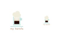
Those coffee icons from freepik displayed in a dark background so those color are convenient to use on a darker background not on a white background. There is no contrast between your logo and the white background.
Black and white version is unclear as well, different elements should be seperated like that foam/hat shape.
Logotype is too small compared to logomark. Should be bigger to read without any extra effort.
Next time be sure that project has an installation and usage guide, I can see there are several json files on the repository but I can't confirm if it's a working project or not.
You populated your post with many ready to use mock-ups, yet I didn't see the link to phone image/mock-up.
Your contribution has been evaluated according to Utopian policies and guidelines, as well as a predefined set of questions pertaining to the category.
To view those questions and the relevant answers related to your post, click here.
Need help? Write a ticket on https://support.utopian.io/.
Chat with us on Discord.
[utopian-moderator]
Thank you for your review, @oups!
So far this week you've reviewed 5 contributions. Keep up the good work!