Steemblr - Improved dashboard UI design
Repository
Linked Task Request
Task-request: Improve UI of the steemblr dashboard and post component by @snwolak
Details
Steemblr is a microblogging platform written in javascript. It allows user to post and explore content which is smaller and more frivolous in its nature. Currently app is in development stage and you can see every posts from steemit. In the future it will show posts relative to steemblr app.
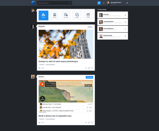
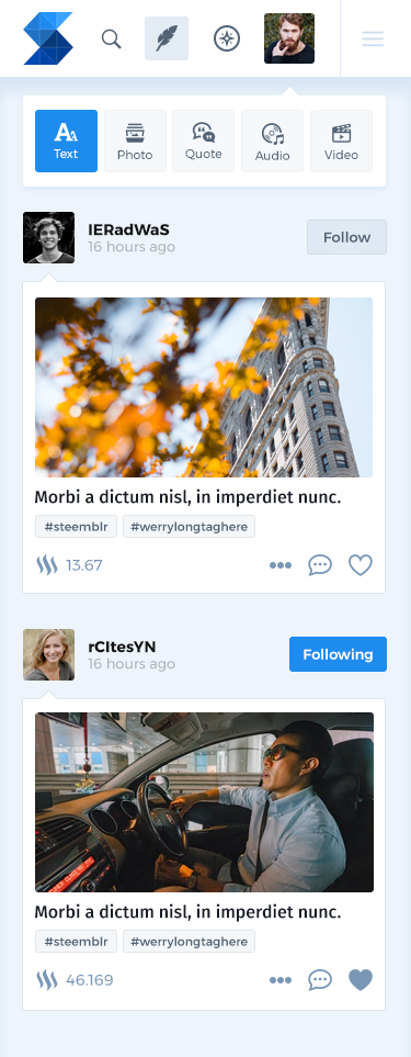
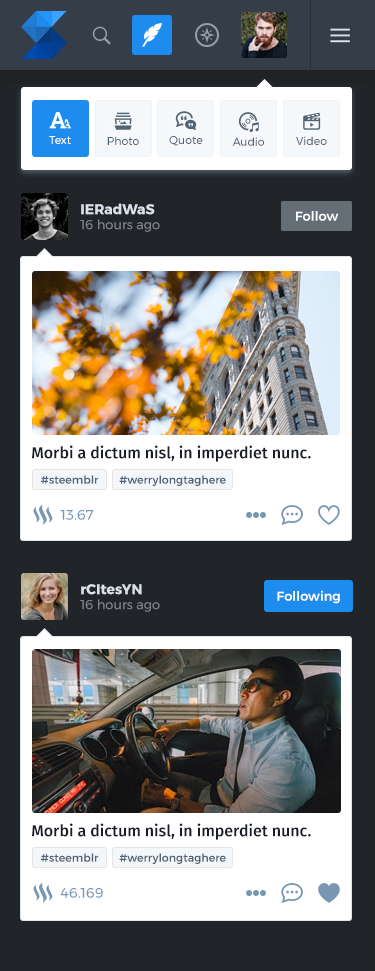
@snwolak was looking for somebody who will redesign his applications user interface. He was looking for light and dark UI, so the users can switch between colours. My goal was to create an UI, which is different from Tumblr's current UI. This was a hard task, because Tumblr's interface is great in my opinion and it is hard to make a better, more usable alternative. I have decided to do something different, then the current flat-like, simple UIs: i have added subtle shadows, gradients, which adds depths to the user interface.
Benefits / Improvements
Redesigning simple UIs is pretty challenging in my opinion: there is not enough space to express creativity, ideas. As i have described my goal was to do something different this time. After a discussion with @snwolak realized he is looking for a really strong, brandable product design. The Steemblr colour palette was great (the logo designer used a lots of shades of blue so i had the possiblity to try all of them and choose which one looks the best on the new UI design.
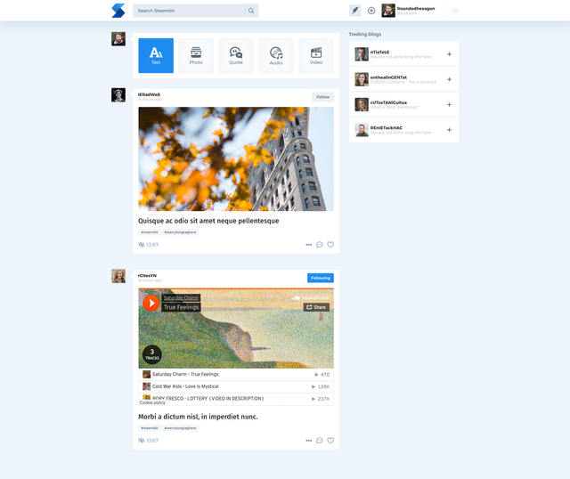
The most challeing part was the post type selector widget, because it was tricky to make it good looking on mobile and desktop too.
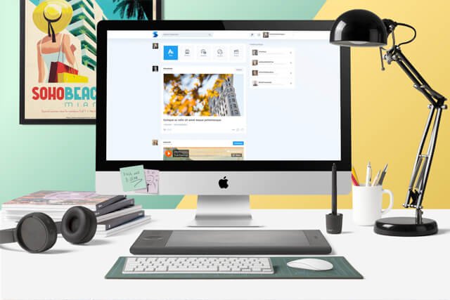
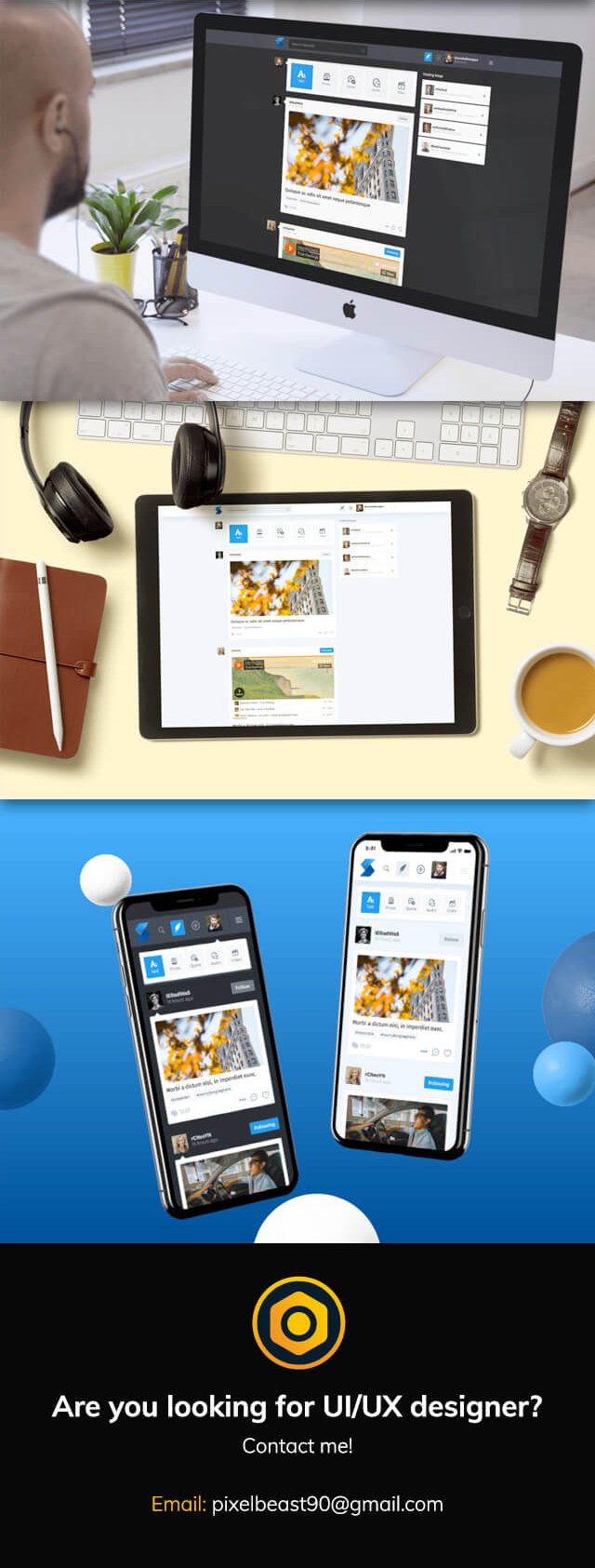
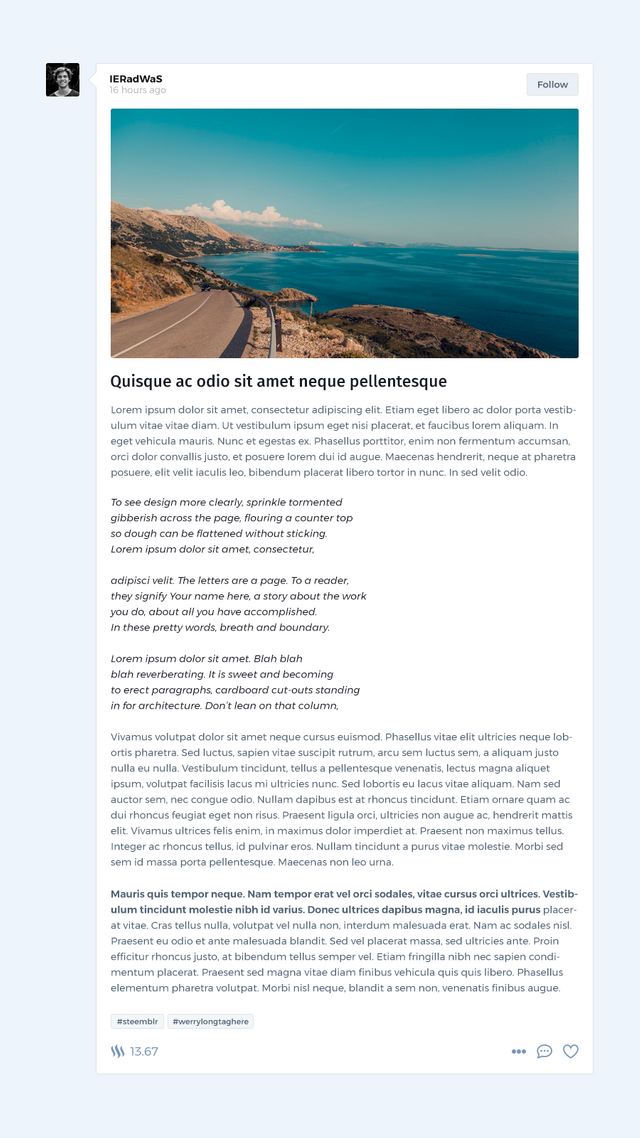
In total it was created 5 screen designs: Two mobile, two desktop (dark and light) and the default post component.

Proof of authorship
Screenshots
Desktop
Mobile
Post content
Tools
I have used Adobe Photoshop.
Original files
This work is licensed under Creative Commons Attribution 4.0 International License
Proof of Work Done
This awesome mockups are made using https://artboard.studio/
Thank you for your contribution. Excellent work!
Your contribution has been evaluated according to Utopian policies and guidelines, as well as a predefined set of questions pertaining to the category.
To view those questions and the relevant answers related to your post, click here.
Need help? Write a ticket on https://support.utopian.io/.
Chat with us on Discord.
[utopian-moderator]
Glad you like it :)
This is really cool, i will definitely use it.
The mockups are crystal clear when i export them, but i have to resize them to 640px wide to make it good looking on steemit and that reduces the quality.
Marvel is cool, but their free plan is limited (only 2 running projects).
Thank you for your feedback Andrej! Really appreciated.
Thank you for your review, @andrejcibik!
So far this week you've reviewed 5 contributions. Keep up the good work!
You do very good work sir. Glad to have your skills on Utopian as you provide excellent contributions to open-source projects!
Thank you! Your words are really encouraging.
This is really a great work. I like both day and night mode colours and the fact that you created colour schemes for both modes.
Glad you like it. Personally i love the dark version, but i am sure lot of people will use the light interface too.
Wow, really cool! Good to know there's someone like you contributing on Utopian if I ever need someone to find someone good at webdesign!
If you are looking for webdesign, feel free to message me on discord: @Istvan Balinth#3371 :)
Thank you for making steemblr look better! Great work :)
I did my best, really love the result. Definitely my most loved design, which I posted on steemit :)
Hi @outwork!
Your post was upvoted by @steem-ua, new Steem dApp, using UserAuthority for algorithmic post curation!
Your post is eligible for our upvote, thanks to our collaboration with @utopian-io!
Feel free to join our @steem-ua Discord server
Hey, @outwork!
Thanks for contributing on Utopian.
We’re already looking forward to your next contribution!
Get higher incentives and support Utopian.io!
Simply set @utopian.pay as a 5% (or higher) payout beneficiary on your contribution post (via SteemPlus or Steeditor).
Want to chat? Join us on Discord https://discord.gg/h52nFrV.
Vote for Utopian Witness!