WIFIANALYZER - VREM SOFTWARE DEVELOPMENT
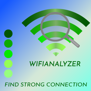
This is my new designed icon for WIFIANALYZER OF VREM SOFTWARE DEVELOPMENT which I designed through the use of Adobe Illustrator CC 2017 version.

CONCEPTUALIZATION
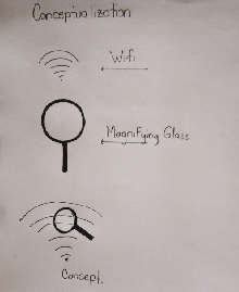
I used two Symbol to Form The logo mark .
First symbol was the original Wi-fi Symbol
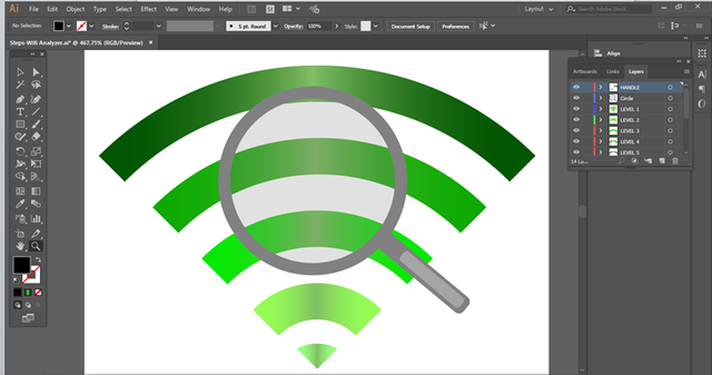
Second The Magnifying Glass- TO tell that the application is for For connection clear view or to search wi-fi clear.
Github Repository
Benefits / Improvements
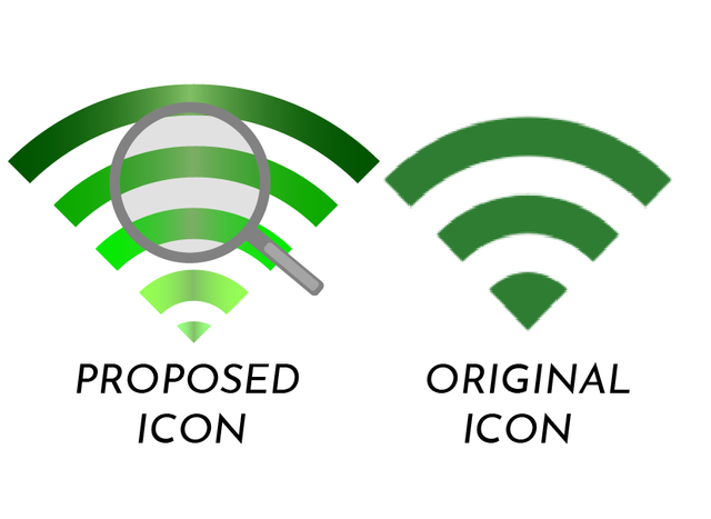
i Just Enhance the original Icon
I retain The Original Color But I make the Color More Eye-catching.
And I Add one symbol(Magnifying Glass) to tell Something that The Apps is not Just a Wi-fi.
My proposed icon can clearly show the uses of the application
Colors Code
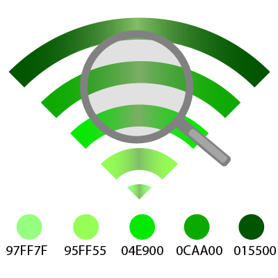
One Color Variation


FONTS
I used Josefin Sans For All The Font Style. Josefin Sans is Included in my original Files.
ABCČĆDĐEFGHIJKLMNOPQRSŠTUVWXYZŽabcčćdđefghijklmnopqrsštuvwxyzžĂÂÊÔƠƯăâêôơư1234567890‘?’“!”(%)[#]{@}/&<-+÷×=>®©$€£¥¢:;,.*
APPLICATION LOADING-Mockup
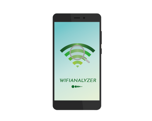
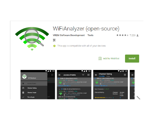
Icon Sizes
36X36 PIXELS

48X48 PIXELS

72X72 PIXELS

96X96 PIXELS

144X144 PIXELS

192X192 PIXELS

Tools And Procedure
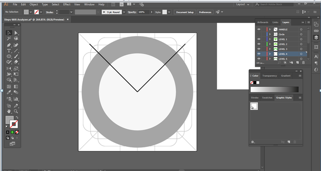
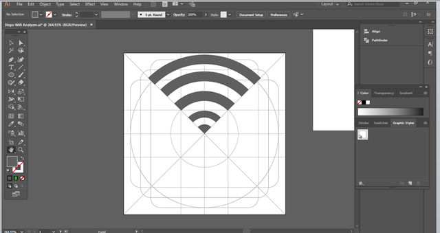
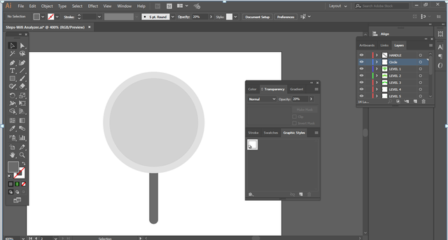
I used Adobe Illustrator CC 2017 version on creating/designing the icon.
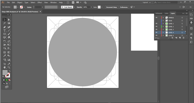
ORIGINAL FILES
You can download all the files by clicking the linkWIFIANALYZER
Thank You!
Posted on Utopian.io - Rewarding Open Source Contributors
Your contribution cannot be approved because it does not follow the Utopian Rules.
You can contact us on Discord.
[utopian-moderator]
Thank you for moderating
1.0 Please elaborate why my proposed icon does not bring any benefits over the original icon.?
2.0 Please also elaborate what utopian quality.?
My icon is in vector form and also in good colors
@rnmn1517 - Putting one more line, adding a gradient an putting a magnifier over the original logo, it's not a benefit. Your logo is too generic , and the colors are not so good as you think.Another problem is you don't have the logo in one color version and in your original files I was unable to find an editable EPS/PSD/SVG.That's why your logo don't meet Utopan Quality standards!
Thank you for your reply.
I just enchance The original logo thats why it become generic to the original logo, thank you nextime i will include editable Eps/psd/svg to meet the utopian quality, thank you for your time sir🙏
Hey @radudangratian, I just gave you a tip for your hard work on moderation. Upvote this comment to support the utopian moderators and increase your future rewards!