My Logo Design For List Launcher
Details
From what I see that the logo of the List launcher is very simple, so I intend to design a newer logo. for info about this application you can read in the following link. GooglePlay

Idea
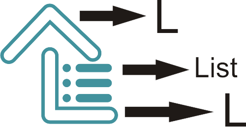
Benefits / Improvements
There are some advantages and advantages of the logo that I made, such as. logo looks more modern and simple, the logo looks more iconic because it starts from the font "L", Logo that I designed also has a distinctive shape, so easily marked.
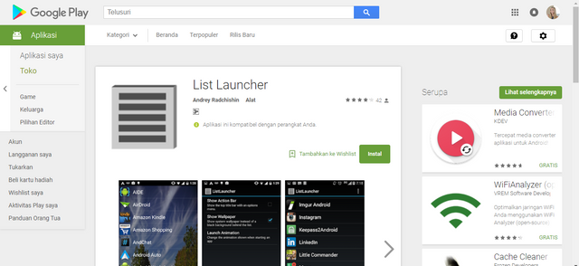
Before
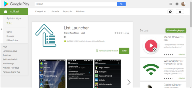
After
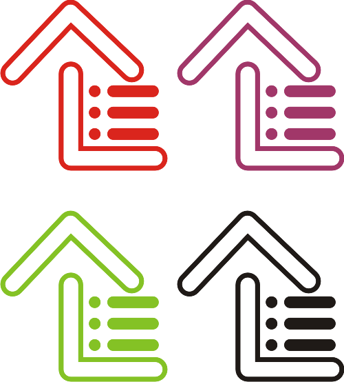
Colors
Sizes
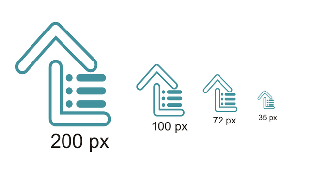
Tools
CorelDRAW
Work
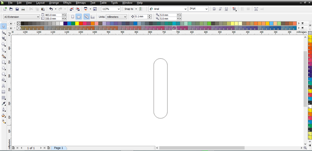
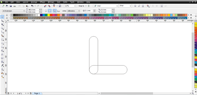

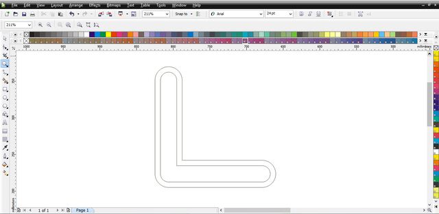
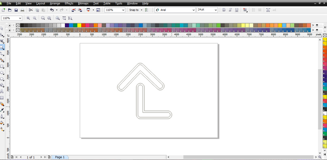
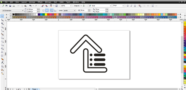
Original files
Posted on Utopian.io - Rewarding Open Source Contributors
Your contribution cannot be approved because it does not follow the Utopian Rules.
HARD rules broken:
"Logo design contributions must contain the actual logo (logomark/logotype)" - no app icon provided. Logo is deformed in your presentation.
Why is there different logo in your source files?
Suggestions:
You can contact us on Discord.
[utopian-moderator]
How is meant by logomark / logotype.
sorry it was my mistake when creating the logo, i do not see if there is a different file in my logo. but the logo is my logo too. Thanks