Planning Your Web Design with Sketches
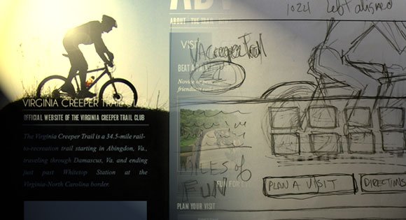
There are plenty of foundational courses taught in design school. And it’s no surprise that big agencies and startups are taking a back-to-basics approach to their design processes.
Whether you’ve been a lifelong doodler or have serious sketch ‘chops,’ being able to use paper to explore new ideas is an important skill in the design field.
Fear not! The analog power of the pencil isn’t dead. In this device-focused era, there’s still plenty of room for a simple, proven design process.
In fact, I’ve heard of a growing backlash against wasted billable hours developing fully-rendered Photoshop comps. Sketching gives you the flexibility to finesse and generate iterative, evolutionary designs without blowing the budget on fully realized spec work and digital comps.
Whether you’re a big agency or freelancer, being able to communicate ideas to clients with a quick sketch is a valuable tool.
Why Sketch?
Sketching has some advantages to digital wireframes or even digital drawing. It’s portable, approachable, creative and time-tested. There’s nothing simpler than paper and pencil — or pen.
I’ve found, too, that clients tend to find the work informal enough that they can suggest changes and make edits. Fully rendered comps look “finished” or nearly complete. I think that can hamper a client’s willingness to suggest improvements or changes. Sketches are loose, friendly, informal… you can erase them and change them.
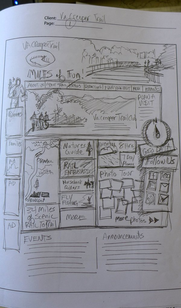
By sketching, you can do rapid, almost train-of-thought development to get your ideas down quickly. It works on-the-fly, so you can spend less billable hours at the monitor and more time generating ideas. Simply roll up your sleeves and find solutions.
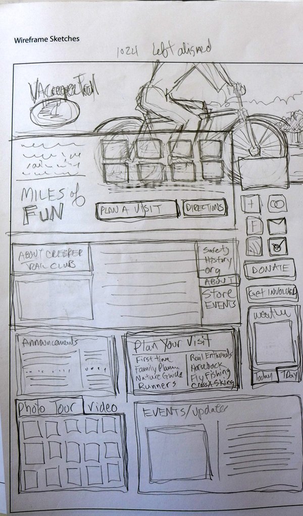
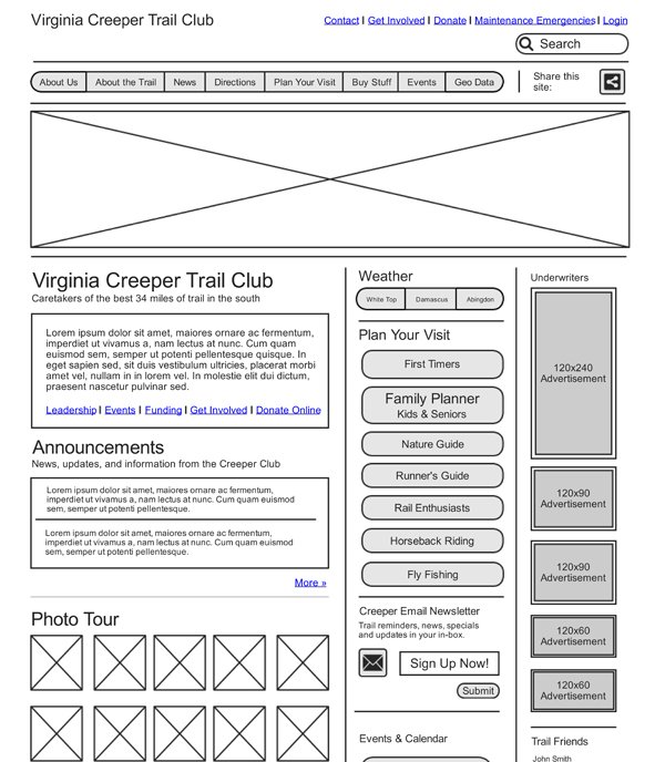
And sketching kills the need for-placement-only (FPO) images. You know, the big “x” images, you put in your mock-ups and comps to show where you’ll put real assets. And you’ll save on using expensive stock photography for FPO.
How to Get Started
One thing is for sure, practice makes perfect. So get those sea-legs in shape with some pocket sketchbook doodles, idea iteration and sketching.
I’ve found that the best way to do this is by sketching whenever you’re queued-up in a line — for coffee, grocery shopping or waiting on the train. Any form of waiting is an opportunity to sketch.
And draw what you see, this skill will help you later, when you want to “perform” for your clients. Sketching everyday things helps you to be prepared with ideas and carrying a sketchbook means you can always be ready to write down ideas for later.
As you sketch more, you’ll learn to refine your sketches and develop them into more formal illustrations or drawings.
Sketching for Web Designers
When planning a website, sketching can be an invaluable part of planning. You can use it for designs, UX testing, UI elements and even trying out typography ideas.
I’ve used it on several websites to ideate the creative assets of a project like photography and icons. And I’ve also used it when faced with critical UI problems, like how to make a button or icon intuitive or user-friendly.
Sketches are perfect tools for communicating inference in design elements, too. And clients love the creativity component. They get into the process. You’ll find that they like to sketch, too.
I had a client once say “wow, it’s like I think it and you just draw it. Incredible!” And that’s the power and magic of sketching on-the-fly in client meetings.
Warning! Practice, Practice, Practice
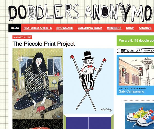
Be warned, the world is a cruel place. Diving into sketches can be rough. If you’re not a seasoned sketcher or don’t have your drawing chops honed and prepared… then take some time to sketch independently of work.
For inspiration, visit sites like the Worldwide Sketchcrawl, Doodlers Anonymous and Urban Sketchers.
Read up on journaling and sketching by subscribing to sketch blogs. Then ask yourself… am I ready to sketch for my client?
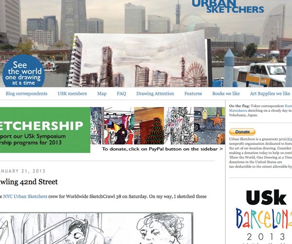
Remember, stick figures don’t impress. So being ABLE to sketch can be an important first step. You might want to take time to “practice” and understand how to sketch your ideas before you dive into client projects.
Questions to Ask When Sketching Design Projects
First I ask myself, do I know all the things I’m going to use on the page I’m designing? If it’s a redesign, I take inventory of the content that exists and also what users will be expecting to see.
If it’s a new site, I’ll review peer sites, do competitive analysis on those sites and then look at the really “clear” user needs and add those bits of content to a list.
Next, I ask if the clients has any sort of design preferences. In many cases, clients have sites they like or admire. Knowing those and understanding the design language they favor is helpful. Color palettes, font uses, language / writing style, visual elements and design trends tend to influence marketing professionals. Pinterest, mood boards and design “treasure hunts” can help understand a client’s personal preferences.
Sketching a Design
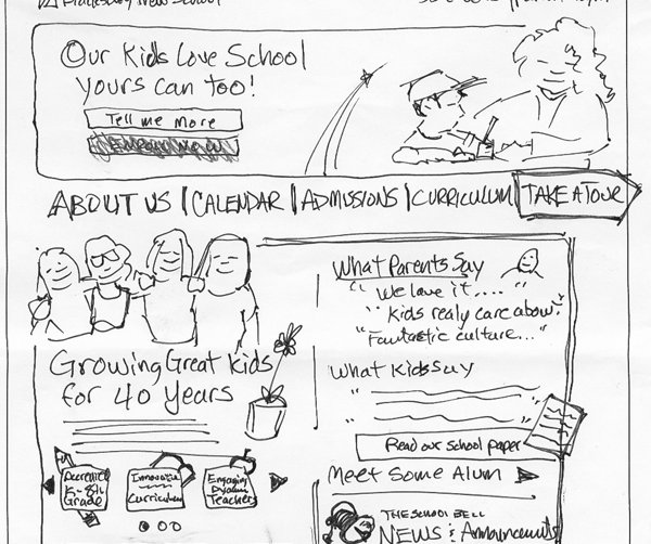
First, gather the critical content for the page. I either do this with sticky notes or I write a document. Sure, I still start with written words on a page, but the words are typically the initial place to get ideas down and have a comprehensive list of all the nav, content and support content I need.
Second, I’ll thumbnail my ideas from the initial list of page items. So I’ll sketch out navigation, content blocks, ads, columns, related support content blocks, headers, footers and so on. If I run out of paper, I just tape more pages at the bottom of the sheet.
Third, I’ll pick idea winners and losers for final sketches. Once I have a series of helpful ideas, I make a design decision and go with it. I usually get lots of feedback at this stage from client and peer designers. Sketching is so visually informal, too, that clients tend to feel more relaxed about picking winning ideas — long before a formal PSD mockup is produced.
Typical Project Process

On most projects, I start with a simple rectangle and sketch a series of thumbnails. This process is super simple, but it helps me generate a solid collection of choices for clients, project managers and peers designers.
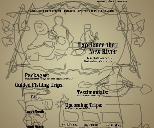
Once we talk about thumbnails and the ideas behind thumbs, I produce some rough sketches from the down-selected thumbnails. These roughs are generally just to help get content priority together and page layout nailed down. I’ll sketch up photography and asset ideas too, for buttons or other iconic / graphic elements of the layout.
In the rough phase I’m looking to answer questions like “what’s the user looking for” and “how can I prioritize content.” This phase is also very collaborative. I’ll share my sketches with clients, managers, project peers and other designers. If needed, we’ll even get the pulse of test users and drop a sketch or two in front of them. Then I refine, iterate and evolve the sketch again by working through this stage again.
Once there’s a clear direction for the rough sketch, I’ll draw a formal sketch wireframe. Like a traditional wireframe, a sketch wireframe has solid content on the page… words, icons and photography. So my art direction ideas for photography are tested and explored in this sketch. I also use the sketch wireframe to flesh out the final UI elements and make sure they will work. We test these, generally and even have “tween” wireframes for working through the very complex screens that a user might encounter in the design.
Many times, if there are formal presentations for clients, I’ll sketch in ink instead of graphite. Ink adds a bit of formality to the sketch and if color is added, I don’t have to worry about losing the real UI elements on the page to soft edges and lines.
In the end, you’ll develop your own process. The fantastic thing about sketching is it leads to complete design freedom. You can capture ideas any time.
Helpful Meeting “Add-Ons” for Good Sketching
So, in general, here are some “meeting” related items that make for good interactive sketching.
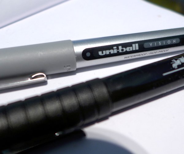
Pens — I love to use pens for sketching. Sure, it takes a level of confidence to dive in with ink, but you can always restate your lines. And clients love the visibility of ink. My favorite pen is the Uni-Ball Vision. It’s waterproof when you want to use watercolor washes to add color.
The “Portable” White Board — Take an old white board and cut it into smaller, more portable “mobile” whiteboards. Your mobile whiteboard can go with you from office to office and be used with Evernote to capture iterative work and sketches.
Big Sketchbook — Don’t wimp out and get the small sketchbook for client work. Find something that’s 14 inches on the longest side. Show up with something you can use.
Flip Charts — Flip charts work like portable white boards… and are incredible tools for getting your clients to congeal around an idea or notion. And the sticky kind can be attached to the wall for long design sessions and afternoon-long work groups.
So What?
As a designer, your best asset is your mind. Your ability to present visual information in quick, improvisational ways sets you apart from others in the web development workflow. And sketching can liberate you from the mouse and monitor to ad lib client solutions.
With solid sketch skills, designers can riff on ideas and turn conversations into genuine paths to innovation. And sketches can be informal and laid-back, keeping projects approachable.
So grab a pen or pencil, a sketchbook and turn your doodling into something marketable to your employer and clients.
Thanks 4 the Share
While I'm a mere dabbler in web design, this is the way to go. Nowadays, you're most likely to use Bootstrap or something similar when designing web pages. To reduce the time for coding, having an sketched out design before you start on the computer is essential. It 's also a good help for other stuff than the coding: you'll have an idea of what photos / graphics you need, the hierarchy of the site, navigation and so forth.
actually we just design every site from sketch. Show them to our clients and then coding. Working from sketch doesn't speed down.