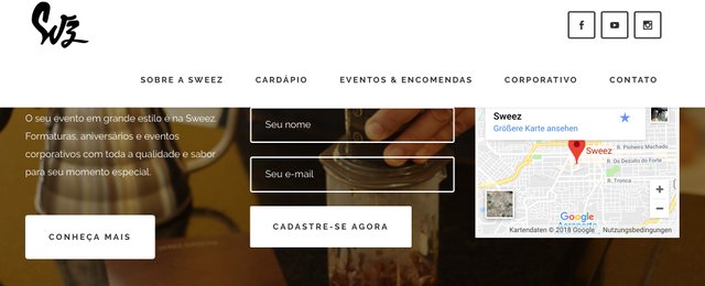
I DON'T LIKE STICKY HEADERS ON WEBSITES

A few years ago a quite unconventional web design trend arose in which the header of websites with logo and often including the top menu remains fixed constantly and visibly, or is pushed opulently into the screen shortly after scrolling. So-called "Sticky Headers" were an innovation in the WWW and many webmasters, who initially only saw it as a technical gimmick, blindly followed the hype without questioning its benefits or even considering its disadvantages.
For me and many others Sticky Headers are just penetrating branding at the expense of usability. After all, what is the purpose of this function? Once the visitor has decided to scroll, he wants to consume content and not be exposed to permanent logo advertising.
Especially on mobile devices, sticky nav elements take up space. A visitor will not forget to be disturbed while scrolling. When I go shopping at Lidl, I don't want a remote-controlled robot following me and holding a flyer with offers in front of my face while I'm browsing the shelves.
Therefore I would be very happy if an anti-trend arises where web agencies are made aware that branding is not everything.
Maybe we can do that together with the hashtag #banstickyheaders
Share this post online so fewer sites use the annoying Sticky Header feature. Thank you!
Also like to comment why sticky headers bother you.
Congratulations @biznulis! You have completed the following achievement on the Steem blockchain and have been rewarded with new badge(s) :
Click here to view your Board
If you no longer want to receive notifications, reply to this comment with the word
STOPCongratulations @biznulis! You received a personal award!
You can view your badges on your Steem Board and compare to others on the Steem Ranking
Do not miss the last post from @steemitboard:
Vote for @Steemitboard as a witness to get one more award and increased upvotes!