harvest finance: felt dark again might delete
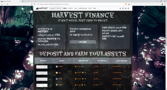
I got a message from @alexbalan the other day, and he told me about this UI design thing...
@alexbalan: "yo, @tomoyan what's up. you got to do that UI s*hit"
me: "😬"
I didn't even know what he was talking about, but later found out that he was talking about @Chad Farmer's a web design contest for Harvest Finance... I think. (still not 100% sure)
Announcing Harvest.Finance Creativity Contest ROUND 2 + bonus Web Design Contest
and he basically forced me to enter the contest so this is what I did at first.
Simple UI:
https://floating-meadow-28045.herokuapp.com/harvest/simple/
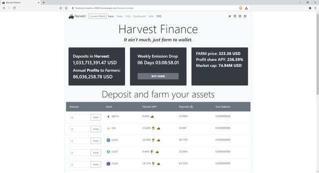
I just made this very simple clean UI
But then he told me,
@alexbalan: "bruh, what the F is this sh*it. boring AF"
me: "😬"
So the next day, I made another one. This time I put more "harvest" into it.
Harvest UI:
https://floating-meadow-28045.herokuapp.com/harvest/
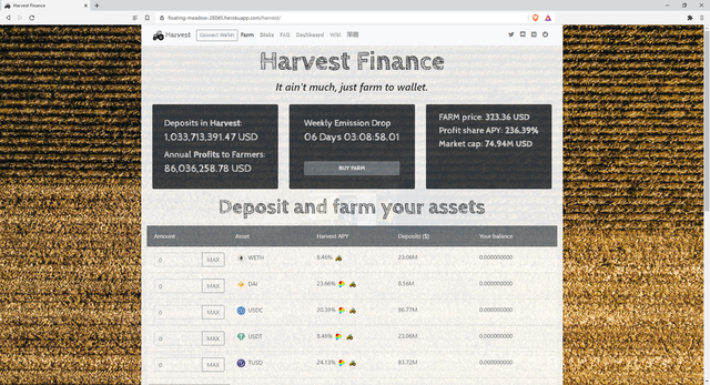
Still simple, but more sophisticated farmer feel to it.
But then he told me,
@alexbalan: "bruh... you need more C O L O R 'n shi*t"
me: "😬"
I think people love dark mode these days even though I personally don't like, I had to make it using dark colors.
Dark UI:
https://floating-meadow-28045.herokuapp.com/harvest/dark/

I think this will be perfect for Harvest Finance and Halloween.
All designs are responsive, mobile ready.
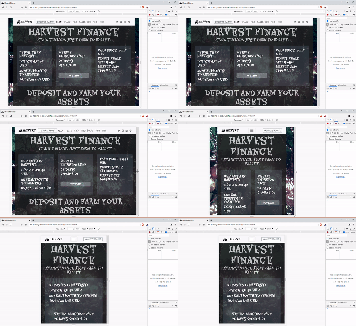
Hopefully @alexbalan will like this one.
me: "😬"
Get Rewarded For Browsing! Are you Brave?

➡️ Website
This guy, @alexbalan, sounds like a jerk to me 😂
😂😂😂
Me: 😬
Me: 😯😦😧😨