How to make a progressbar animation for your website?
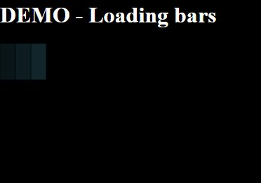
In this tutorial - we will create a loading animation using CSS3 only.

Lets look into the markup code or HTML code:
<!DOCTYPE html>
<html>
<head>
    <meta charset="UTF-8" />
    <meta http-equiv="X-UA-Compatible" content="IE=edge" />
    <title>DEMO - Loading bars</title>
    <style type="text/css" media="all">
    // css styles goes here
    </style>
    <script type="application/javascript">
    // javascript goes here
    </script>
</head>
<body>
<header>
    <h1>DEMO - Loading bars</h1>
</header>
<div id="loading"><span></span><span></span><span></span></div>
<main>
    <p>ADD_YOUR_BIG_IMAGE_HERE</p>
    <p>ADD_YOUR_BIG_IMAGE_HERE</p>
</main>
</body>
</html>
I have made a simple HTML5 starter code with <header> and <main> tags.
I also searched for huge images for the demo: https://www.google.com/search?q=nasa+images&tbm=isch&tbo=u&source=univ&sa=X&sqi=2&ved=0ahUKEwjmqK3RpcbUAhUY7mMKHa56AwMQsAQIMw&biw=1920&bih=901#q=nasa+images&tbm=isch&tbs=isz:lt,islt:70mp
Now let's add some CSS3 code inside the <style type="text/css" media="all">
<style type="text/css" media="all">
        html, body {
            display: block;
            width: 100%;
            height: 100%;
            background: #000;
            color: #fff;
            padding: 0;
            margin: 0;
        }
        body main {
            transition: opacity 2s;
            opacity: 0;
        }
        body.loaded main {
            opacity: 1;
        }
        body main img {
            width: 100%;
        }
        body.loaded #loading {
            display: none;
        }
        #loading {
            display: block;
            width: 100%;
            height: 100%;
            background: #000;
            color: #fff;
            padding: 0;
            margin: 0;
            z-index: 9999;
        }
        #loading > * {
            display: inline-block;
            height:50px;
            width:20px;
            top: 40%;
            background-color: #56bbdb;
            border:1px solid #217c99;
            opacity: 0;
            animation: loading infinite ease-out 2.5s;
        }
        #loading > *:nth-child(1) {
            animation-delay:0.39s;
        }
        #loading > *:nth-child(2) {
            animation-delay:0.52s;
        }
        #loading > *:nth-child(3) {
            animation-delay:0.65s;
        }
        @keyframes loading {
            from {
                opacity: 1;
            }
            to {
                opacity: 0;
            }
        }
    </style>
We have defined the page styles and also the loading styles. You can also see a keyframes animation that will take each shape and make them appears and disappears.
Now let's add the javascript that will enable our loader to be displayed and also to display on <main> content after the image has finished downloading.
<script type="application/javascript">
        var duration = 5;
        var loaded = null;
        var loadListener = function(){
            document.body.className += "loaded";
        };
        window.setTimeout(function(){
            if (loaded === true) { loadListener(); }
        }, duration*1000);
        window.addEventListener("load", function(){
            if (loaded === null) { loaded = true; } else { loadListener(); }
        });
    </script>
So we are done. You can see the demo here - http://nebulastudio.net/steemit/posts/loading-bars-tutorial/index.html
Please do not hesitate to ask me any questions. Enjoy!
Congratulations @spectrum3900! You have received a personal award!
Click on the badge to view your own Board of Honor on SteemitBoard.