How to Choose A Cover Artist (Writer Wednesday) [CC]
Hello, Writer, and welcome back to my life.
It's Writer Wednesday, the day where I give you my tips and advice on the art and the business of writing, and tell you how I do what I do as an indie author.
Today's question comes to us from patron Kristen Stevens, who asks:
"How do you find a cover artist that you like?"
That's it. That's the question.
We've been answering a lot of questions like this recently—questions about people to work with. There's been questions about editors, review teams, and beta readers. I hope that means the Writer Wednesday community is growing up, and we're finding the people we need in order to actually take our books to a done. I hope that's the case with you. Feel free to let me know.
All right. How do you find a cover artist that you like?
This is, again, one of those important ones. Your cover is the number one thing that sells your book.
It's a hackneyed joke in the indie publishing community that "Everybody says you shouldn't judge a book by its cover, but everybody does, haha."
It's 100% true. That's why people design book covers. If people didn't judge books by their cover, every single book would just be white paper.
Before you even begin the search for your cover artist, you need to make several important decisions about your cover. And first you have to decide: what KIND of cover is it going to be?
I've talked about how you need to write what's important to you. You need to write something, not because you think it's going to be the biggest moneymaker, not because you think it's the hot genre right now—that will lead you to a career of misery—but because you WANT to write it, because you are passionate about it.
And it has to be in a genre that you truly love, or a combination of genres, if you're mixing and matching things a bit. That's fine.
Either way, it needs to be something that is important to you—WHEN YOU'RE WRITING YOUR BOOK.
But when it comes to cover design, you need to throw that whole viewpoint away completely.
Every artist, every author, and particularly every indie author, has to be able to switch between the art and the business side of things. When you are working on your book, you wear your artist hat. You with your passion, your tools, and your creativity.
When it comes to your book cover, you need to take off your artist hat and put it far away, where it is not going to influence your decisions in the slightest. And then you need to pull on your business hat and strap it under your chin.
Because if you make cover design decisions based off of the whims of your heart, you just won't sell any books.
Cover design is the number one part of indie publishing where you must be absolutely 100% market-driven in order to get the best results.
Before anybody misunderstands, obviously you still have to be honest. Honesty IS market-driven. Dishonest people don't last long. Don't ever design a cover to "sell a lot of books," but which isn't REPRESENTATIVE of your book.
Theoretically, you could design a cover that looked just like a Jack Reacher novel. They're simple: a textured background with a target symbol.

Shoppers might assume it was a Jack Reacher cover and buy it for that reason. And then they would be very pissed off at you, because you're not Lee Child and it's not actually a Jack Reacher book.
Never do that. That's not being market-driven, that's being dishonest and criminal.
Designing a market-driven cover means finding out what sells well in your market and doing that in a way that is representative of your book.
I think of book cover designs in three broad categories.
THE GRAPHIC COVER
The graphic cover doesn't usually contain illustration. It rarely depicts characters. It's about symbolism.

This is the only one of my books that has a graphical cover. It's a simple symbol, designed to perfectly encapsulate what the reader will find in this literary book.
And graphic covers are primarily seen on literary books, including YA lit, such as John Green's The Fault in Our Stars:

Graphic cover. One of the best graphic covers out there.
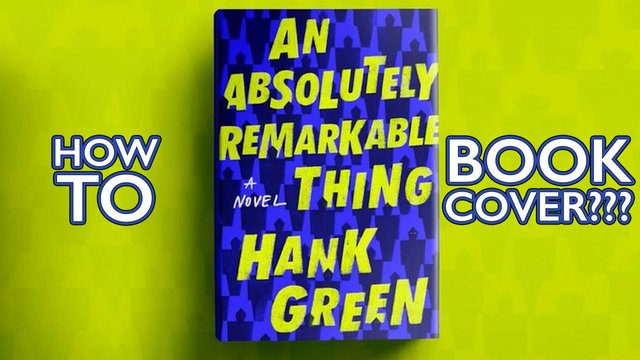
And while we're talking about the Green brothers, the cover of Hank Green's new book was just released:
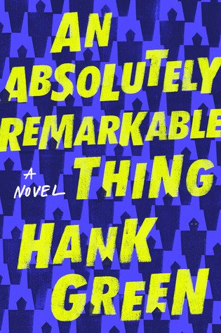
Another graphic cover. No real image, just a simple design communicating a lot of meaning.
In addition to literary and YA lit, nonfiction often features graphic covers.
THE PHOTOSHOPPED COVER
The next broad category is photoshopped covers. That's what I call them. There might be a better name, but you understand me.
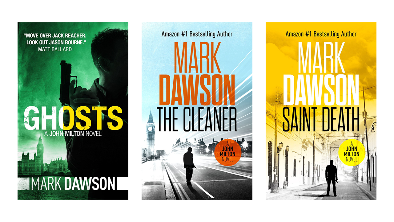
Mark Dawson's books are perfect examples. A man on the run, usually with a gun, on a city background. I'd guess that two or three stock images are combined in each of these, in a very artistic way.
But photoshopped covers CAN get much more complicated.
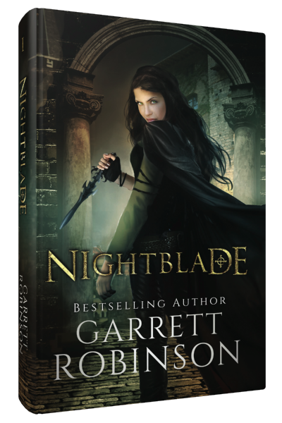
This is the second edition cover of Nightblade, the one I had before my current cover. It's all Photoshop. About fifteen images from stock photo sites, combined to create this image.
Photoshop covers are also massively popular in romance. Two very attractive people, representative of the main characters of your story.
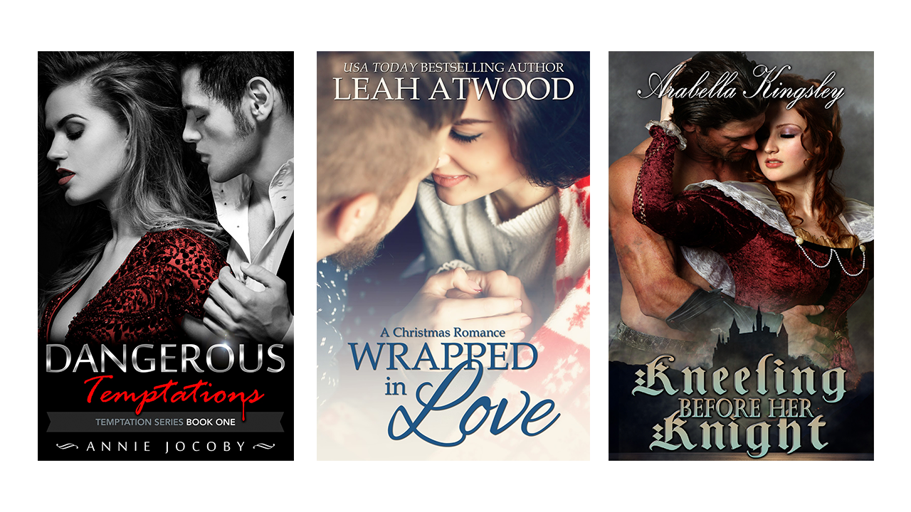
Photoshopped covers are also very popular in urban fantasy, and then there are some very good ones in military sci-fi and other sci-fi. You can definitely do photoshopped covers for genre, it's just more applicable to CERTAIN genres.
THE ILLUSTRATED COVER
The final broad category is the fully Illustrated cover, where every single pixel on the cover (except for the lettering) is hand-drawn by an artist.
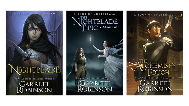
These covers can be complex or simple. My individual books have one character on the front, and then for the bigger volumes, I have multiple characters from an iconic scene.
Illustrated covers are immensely popular in epic fantasy. They're the go-to standard. But illustrated covers are also very popular in sci-fi, particularly space opera—to the point that space opera covers can look a little bit samey.
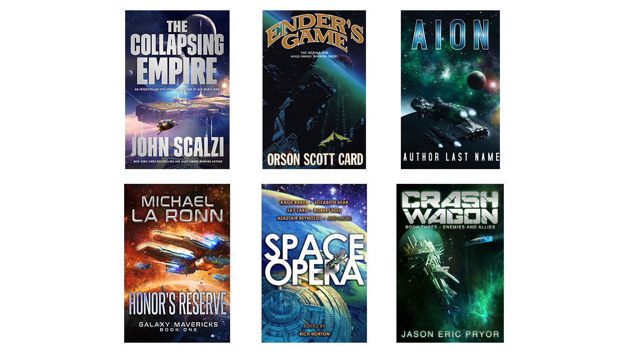
Similar images of a planet in the background and a tiny little ship flying past it. They're great, but I do like some variation from that very common theme.
So the first big decision that you have to make is: what kind of cover are you going to get? And that is entirely dependent on your genre.
If you are writing epic fantasy, I firmly believe that you must do an illustrated cover. The one prominent exception that I can think of is George R.R. Martin and the Song of Ice and Fire books, which LOOK like photoshopped covers. And I'm not even sure about that. They're simple elements on a textured background. They could be illustrated, or they could just be heavily photoshopped.
If you're writing space opera, I think you should have an illustrated book cover, though I haven't done full market research on that. If the biggest space opera books of all time haven't had illustrated covers, don't feel obligated to do so.
If you're writing urban fantasy, paranormal romance, thriller, or regular romance, you almost certainly want a photoshopped cover. That's the standard. That's what your readers are looking for.
And if you're writing YA or literary fiction, consider a graphic cover.
But you have to make this decision first. It does no good to find an amazing Photoshop cover artist if you're writing epic fantasy. It doesn't matter how amazing they are. That's not what your genre demands.
While we're on the subject, because I can just see somebody bringing this up: The Name of the Wind has a photoshopped cover.
It's also an awful cover. It's one of the worst covers I've ever seen come out of traditional publishing.
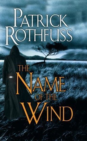
I'm sorry. It's one of my favorite fantasy books. The cover is just not great. It is anti-great.
(And I can say that because it's not MY cover artist. Looking at you, Terry Goodkind.)
Moving on.
So you've determined what kind of cover that you need, based on your genre. Now comes an even harder part. Now you have to find the right person.
Not just the right person, but the right person who you can easily communicate and work with.
Not just the right person who you can easily communicate and work with, but the right person who you can easily communicate and work with, and who you can afford.
And I have no easy solution for you. I looked for a very, very, very long time before I found my current three cover artists, and I tried lots of covers before them that didn't work out, for one reason or another.
I have designed entire covers that were taken to full completion—and of course I paid for them—and I didn't use them, because the vision was not executed correctly. It was executed WELL, but that artist and I didn't jive on what we were going for.
That's the thing. It doesn't mean that that artist was bad. It just means that we aren't in sync enough to work together as author and cover artist.
I know they can turn out great work. I looked at their portfolio before I hired them.
But people can have compatibility issues, as I have discussed before. You can find a really good editor who YOU cannot work with. That doesn't mean they're a bad editor.
So you've got to do the grind, walk the beat. You have to look at art websites. Spend a lot of time on deviantart, if you need an illustrated cover. (There's good Photoshop work on deviantart as well.)
Talk to other authors. Find out who they used. Find covers from your contemporaries and ask where they got them.
Talk to a bunch of artists. Find out how their process works. Find out how much they charge.
You might go through five artists who you don't work well with—who would be perfect, and their art is very good, but something's off. You don't work well with them, or you can't afford them.
And then, finally, you'll find the person. You work well together, you're in sync, and you can afford them.
I can make a couple of recommendations. These are people I know and have worked with in one capacity or another over the years.
My three cover artists for illustrated covers for the Underrealm books are Sutthiwat Dechakamphu, Sarayu Ruangvesh, and Miguel Mercado. Their names are linked to their artist accounts.
If you're looking for illustrated covers, you should absolutely hire them. I don't generate enough work to keep them working full time, and they deserve stunning careers as artists.
If you're looking for Photoshop covers, Domi over at Inspired Cover Designs designs my text templates, and she does a lot of Photoshopped cover work for indie authors.
For more graphical covers, the best person I can think of is Risa Rodil. I've never commissioned a book cover from Risa, but she is an amazing graphical artist who has done lots of work with the vlogbrothers (and with me) for merch.

You've seen my "Have I Mentioned I Write Books?" t-shirt. That's a Risa piece of artwork. If I had a book named Have I Mentioned I Write Books? (maybe one day) I would totally take that piece of artwork and slap it on the cover.
Again, all these artists are amazing people. They're easy for me to work with, they're super flexible, and I have had a great experience with them every single time.
They might not work for YOU, because some people just don't work together. So if you do happen to reach out to one of these people, and it doesn't work out for whatever reason, it doesn't mean they're bad. It doesn't mean you're bad. It just means you need to keep searching until you find the people you click with.
That has been what I feel like was a very, very long answer. Thank you so much for the question, Kristen. I hope that you and others found the answer helpful.
A reminder to everybody else watching this video that my $5 patrons on Patreon, like Kristen, are the only people who get to ask questions for Writer Wednesday, and they get these videos two weeks ahead of everybody else. If that sounds interesting to you, <a href="https://patreon.com/garrettbrobinson>check out my Patreon.
Thank you so much, and I will see you next Wednesday. Bye!


BE A PATRON
GET FREE BOOKS
SIGNED BOOKS
EMAIL LIST
OTHER CHANNELS:
TWITCH
VLOGANOVEL
GARRETT’S GAMES
MERCH
SOCIAL MEDIA:
I’m on Tumblr
Like on Facebook
Circle on Google+
Follow on Twitter
Join Underrealm Fb Group
Hi steemit friends please support the votes for me and I will vote you. hopefully healthy always. Thank you
Congratulations @fortinbuff! You have completed some achievement on Steemit and have been rewarded with new badge(s) :
Click on any badge to view your own Board of Honor on SteemitBoard.
For more information about SteemitBoard, click here
If you no longer want to receive notifications, reply to this comment with the word
STOPCongratulations @fortinbuff! You have completed some achievement on Steemit and have been rewarded with new badge(s) :
Click on the badge to view your Board of Honor.
If you no longer want to receive notifications, reply to this comment with the word
STOPDo not miss the last post from @steemitboard!
Participate in the SteemitBoard World Cup Contest!
Collect World Cup badges and win free SBD
Support the Gold Sponsors of the contest: @good-karma and @lukestokes
Congratulations @fortinbuff! You have completed the following achievement on Steemit and have been rewarded with new badge(s) :
Click on the badge to view your Board of Honor.
If you no longer want to receive notifications, reply to this comment with the word
STOPCongratulations @fortinbuff! You have received a personal award!
Click on the badge to view your Board of Honor.