Shades of The Seasons- My Entry For Zen Colouring Contest #5 & My First Time Editing In Krita!
Hello, Steemians!
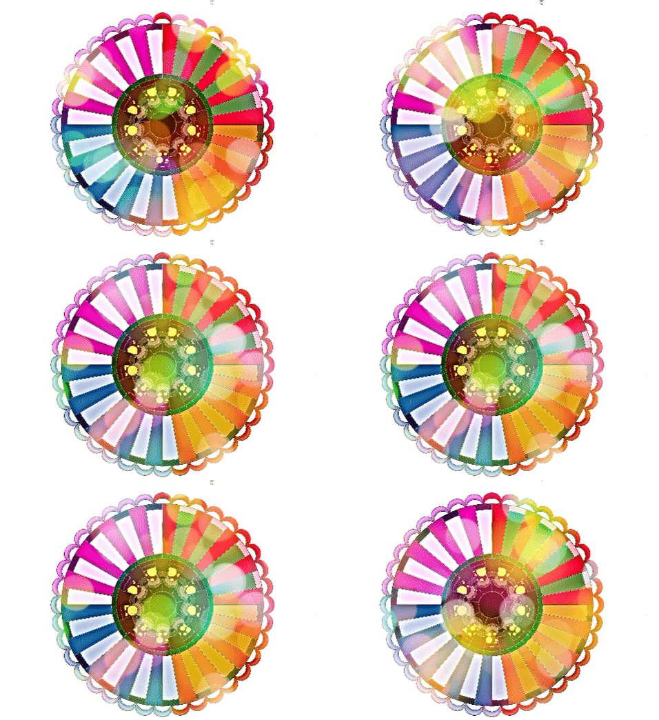
This is my entry for @magiccleatus's Zen Colouring Contest #5:
.gif)
Believe it or not, how this came to be is kind of a long story! I feel like I went in circles with this. But I am happy with the result! This was actually my first time ever using Krita, too.
I have Photoshop and Illustrator on my Mac desktop. However, I now have a Surface Pro 4, which I am soo excited about because it has a pen. If you design stuff, you know how many more capabilities a pen gives you than drawing with a mouse!
Anyway, I was trying to get around needing to buy Photoshop for this computer, because I know there are other programs that work that aren't that expensive (especially to have on two different computers). I know Gimp is supposed to be pretty good, but for some reason I just don't think Gimp agrees with me. Compared to Photoshop for some reason I just do not like using Gimp, and I don't seem to usually be able to make it do what I want (lol).
I've recently been hearing a lot of good things about Krita, so I decided to give it a go. Also because I think it will be useful in some of the courses I am taking. However, it also never hurts to use a variety of different programs!
I will tell you, I think Krita and I have a lot of potential together.
First of all, I can. not. believe. this program is free. The interface is almost exactly like Photoshop CS6. It doesn't seem to be lacking in very many areas. In fact, I think I like this filter gallery more than the filter gallery in Photoshop.
Anyway, for switching between Photoshop, I think Krita is a good option!
So back to my colouring creation.
This turned out absolutely nothing like my original plan. But I think that's ok. As a designer, I have learned to kind of work with the flow of things, and if something isn't working to not keep forcing it.
As soon as I saw this pattern, with the Spring equinox coming up I knew I wanted to do something inspired by Spring and/or the other seasons.
My first thought was to take four different images I have taken (each representing a different season), turn them into a pattern, and fill the different segments with those patterns. Wellll, I tried that, but it didn't work how I had envisioned. So instead, I separated the stencil into 4 segments (one for each season) and I used the color picker to pick the color scheme for each segment from those pictures.
I used the colors from this picture for the summer segment (top right). Yes, all of these pictures are mine.
I used the colors from this picture for the autumn segment (bottom right):
I used the colors from this picture for the winter segment (bottom left):
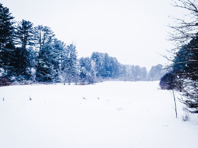
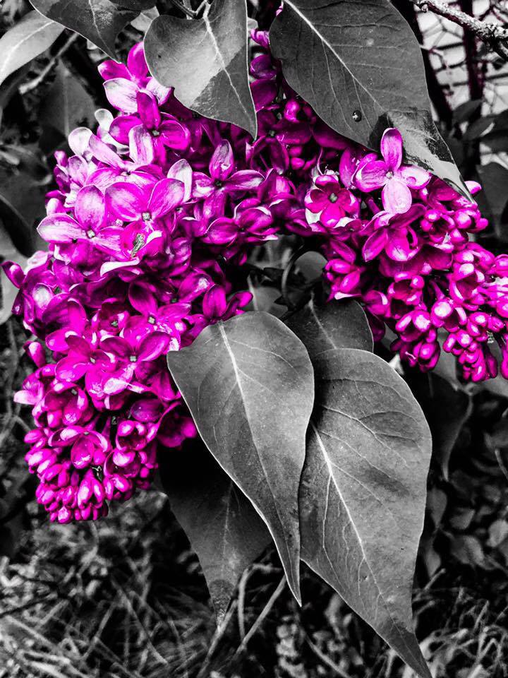
And I used the colors from this picture for the spring segment (top left). I chose this one for spring, because spring is the only season when the lilac plants blossom!
The featured color for this week is brown. Brown also made me want to do something natural, inspired by nature. The very first thing I did was color the center in brown. This represents the ground, the earth, and the tree roots. You know, the stuff inside the earth that stays brown all year long, no matter what the season is.
I then made a red and yellow polka dot pattern and filled that in near the center with the fill tool. This represents the mushrooms and fungus on the ground throughout the year.
And then, I added bokeh on top to represent the sun shining throughout all of the seasons. I kept randomizing the seed of the bokeh and saving the picture to make a GIF with in Giphy. I did this to give it a little extra.... I don't know, just extra. I really like the moving bokeh effect, and it does very much have the effect of the sun shining bright throughout the daytime.
This is what the image looked like before I added the filter gallery effect and the bokeh. I stared at this picture right here trying to figure out what to do with it for like 2 hours. Ok, I might be exaggerating a little, but not much.
This is how I randomized the seed of the bokeh in Krita:
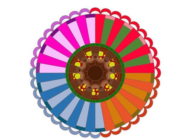
Here is the stencil @magiccleatus provided
This is what my colored-in version looked like before turning it into a GIF:
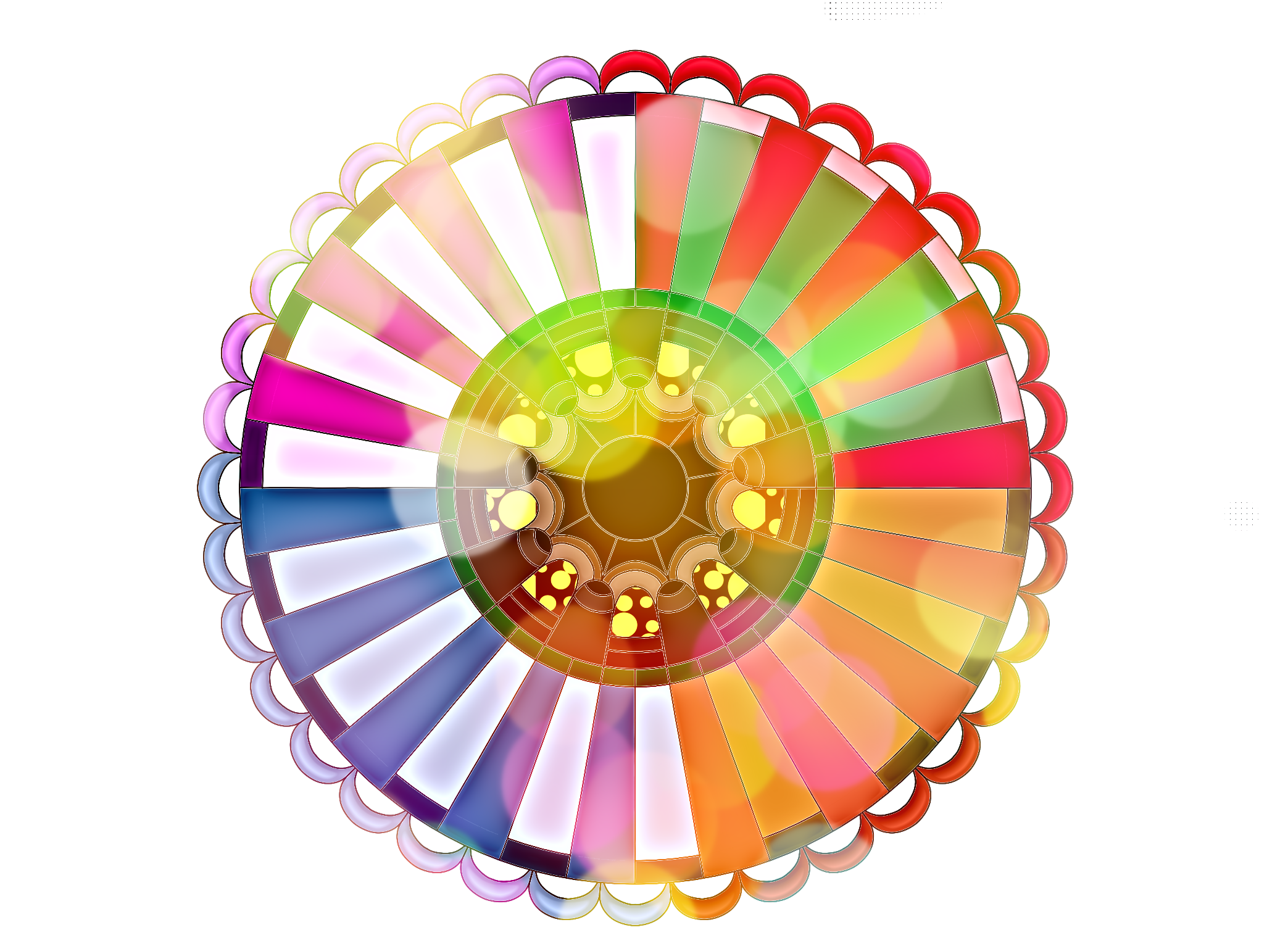
And here, again, is the completed version:
.gif)
What do you think steemians? I would love to hear your thoughts in the comments! For next week's featured color, I would pick lilac! For spring!
Until next time!


For more feel free to check out my website!
Also, I am working on launching my own web design business. As a student building my portfolio I can give you a really great deal on a website. If you or anyone you know needs a website feel free to contact me! Will accept payments in STEEM :)
Until next time,
~Zoey

WOW! Another Krita user, It's really good for a free program eh? Glad you gave it a go.
I love that you used colours from your own photos to represent the seasons and the animated bokeh really gives the feeling of the sun shining though!
Thank you for entering!
p.s. You can get a plugin for Krita to make GIFs. See here
Yes, I definitely think it has potential!
I'm glad you like it! :D
Also, thanks for the link to that plugin! I will have to check it out. I have noticed that Giphy really does reduce the quality of the images a bit which I don't like. It's a bit of a trade off I guess. But maybe it doesn't have to be!
Hello! I find your post valuable for the art community! Thanks for the great post! ARTzone is now following you! ALWAYs follow @artzone and the artzone tag, and support our artists!
Awesome, thanks! :D
Great Entry! Thank you for participating!
Please name the colour you'd pick for next week's featured colour!
Oops! I would pick.... lilac! For spring!
amazing photography, good work
nice one!