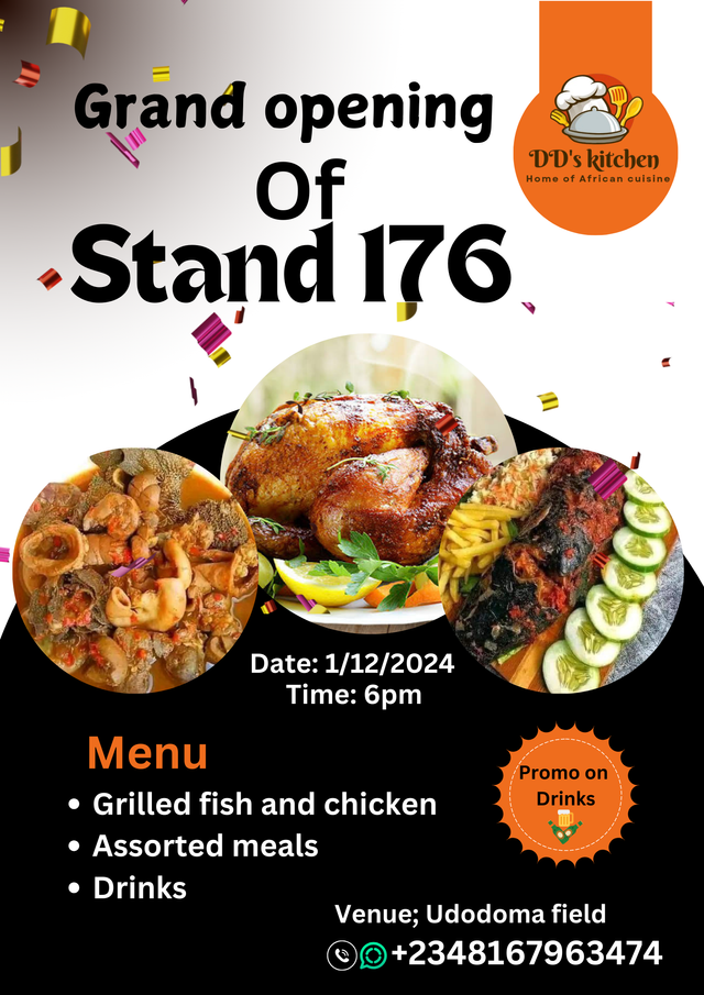
SLC21/WK5: Hands-On Practical

This graphic design really gives me joy as I gain more confident in myself after making it. Thank you teacher @lhorgic for this lectures as it has make me learn additional skill for my self.
I used canva app to create this design as seen, be free to go through and see how I create this beautiful flyers for the grand opening of my koisk.
Design A logo for your brand, if you already have one, this would be optional for you.

I already had a logo of this my kitchen, I personally designed it using canva from our previous graphic lessons. And DD's kitchen is my restaurant name.
Design a promotional flyer/banner/poster for your brand using any design app/software of your choice. Kindly be sure to be very detailed, showing every relevant detail as this could be your leverage.
To to design this promotional flyer, I used canva app in this.
To begin making this flyers, I drafted how it would be piece of paper and the information that needs to be reflected on the flyers I read it out so I won't miss any out.
 |  |  |
|---|
I created my work space as seen above
I added my background colour which is orange but I later change it to white.
I added an element, expand it and added colour to it as well.
 |  |  |
|---|
Positioned the elements, demacating the upper side and the down part
Added the logo
Added the main text and selecting the font and size, indicating emphasis on the text that I want to draw the attention of my viewers to.
 |  |  |
|---|
Added more elements which I will use to display images of my advert.
Added the image, arranged it well and then added more promotional text.
I changed the position of my text, logo and I changed the orange to white as it wasn't blending fine.
 |  |  |
|---|
I decided to create a beautiful background for the logo so as for it to be more visible. So I added 2 element a circle and rectangle.
I successfully positioned the two elements well to my desire.
I positioned the logo on the elements
 |  |  |
|---|
I added another promotional text, this time it is the advertisement of promo from the restaurant.
I zoom it to make some adjustments in the picture.
Finally, I added the address and phone number for smooth contact, I also added the opening time and date. As this will help my viewers to know the time and date of the opening.

Finally done
Dedicate a section to talk about the graphics design principles engaged in making your design. You might want to revisit the lecture on graphic design principles to refresh your memory.
Contrast: helps viewers to differentiate between multiple elements in a graphic which has the same similarities. In this case, designing something that has opposite value such as colour, pattern, shape etc will helps to make the main point stand out from the design.
 |  |
|---|
In my design, I have many circular designs and so to highlight the main point of my promotion which is the promo aspect, I used another pattern in my circle where I design "promo on drinks" it has some pattern on the edge.
Balance: this principle is easy to take note and also very easy to be noticeable. If your work is not not balance then it will be noticeable by your viewers. Therefore, all elements should be evenly drawn, all corners should be balanced. I applied this on my design, it is balanced.
Alignment: all elements, text should be properly aligned making it easy for the viewers to glance through as everything is properly aligned.
 |  |
|---|
From the flyers my text and elements are aligned and the flyer is not too busy or tilting to one side.
Rythm: by using this principle, I created some repeated elements. I used this principle when I created a circular elements to add images on the flyers, it makes it look more organised.
 |  |
|---|
This will help the viewer to at least glance through the pictures and have an understanding of how our menu looks like this creates eagerness to continue reading the flyer.
Emphasis; this principle is applied to stress the main point in a graphic. It can be done by either increasing the font or colour or anything that will make the main point stand out.
 |  |
|---|
In my design, emphasis is laid on the "Stand 176" I used a bold and a larger font to make it more visible because I want this to be noticeable most.
I don't want people to forget this stand number, so it really stands out
Once again use a suitable mockup to promote your design.
To choose a suitable mockup to promote this advert I selected outdoor and print types of mockups. My reason because it is an advert and it needs to get to as much people as possible. Therefore, printing out a flyer and using a billboard will be very suitable for the promotion.
The aim is for more people to be aware of it and to patronise me as soon as possible.
 Outdoors Mockups
 Printing mockup
 Outdoor mock-up
 Outdoor mock-up
In previous years, I have been paying for this design for my advert each year, but I'm grateful that I can make this myself for my advert. Meanwhile, you can read about this advert through this post here using this link It is that time of the year, you are invited to our stand 176 opening
I so much enjoyed this course thank you, I wish to invite @dequeen and @adylinah to join this contest and showcase their talent

Wow! This design is so lovely!
I am glad you could create this for yourself this year without getting to pay someone. I can attest to that satisfaction after producing something meaningful through this class.
Well done and many success in your business 🤗
Thank you for the invitation, I have shared my participation few hours ago.
Oh I'm grateful thank you so much, I will check your entry
Congratulations, your post has been upvoted by @scilwa, which is a curating account for @R2cornell's Discord Community. We can also be found on our hive community & peakd as well as on my Discord Server
Felicitaciones, su publication ha sido votado por @scilwa. También puedo ser encontrado en nuestra comunidad de colmena y Peakd así como en mi servidor de discordia
Hello @eliany thank you for participating in this week's lesson. We have assessed your entry and we present the result of our assessment below.
Feedback:
Welcome back to class dear student.
Let me start by commending you for a job weldone, the effort put in this work is quite commendable.
Your logo appears cool, but you didn't get to show us the procedure for making your logo for the task.
Your flier design is nice and simple, however it still needs a lot to make it look very professional. The upper part of the design if divided into segment does not look so cool aesthetically but the other segment which is the one below looks better, moreso,you didn't perfectly follow your alignment thoroughly which I assume to be center alignment...continuous exposure to the lessons you've learnt so far would help you further in your quest to get it right.
You mockup looks good and suitable for your design. I wish you all the very best, Weldone!
Regards
@lhorgic❤️
Please I don't really understand this part.
Thank you for your response
My bad! am just getting to reply this... What I mean is this, let assume the design is divided into two equal halves, the upper part and the lower part...now I meant the lower part seems to be more beautiful due to the attention given to that part while the upper part seems to be a bit scanty. Your choice font too didn't do much justice to it... All the same, I commend your effort.
Okay thank you I understand you now, i keep improving